
Infographics are fast becoming the preferred method of delivering government, corporate, and other organizational information to large numbers of information consumers. Infographics are replacing dashboards and large reports, and information consumers love them because infographics are quick and easy to understand. Information Builders WebFOCUS Infographics offer the ability to use your existing data to build powerful, visual stories that can be personalized and bursted to millions of users.
The Infographics Advantage
Science provides clear evidence about the power of infographics as a communication tool and its advantages over traditional corporate presentations of data and information, such as dashboards and reports:
- 90% of information transmitted to the brain is visual.
- Visuals are known to improve learning and retention by 400%.
- Visuals are processed 60,000 times faster than text.
- People remember 80% of what they see versus only 20% of what they read.
- 65% of people are visual learners.
To sum it up, visual stories (infographics) offer an advantage that enables users to comprehend the message and reach a conclusion at a glance, which in turn allows them to remember the details easily and clearly.
Communicating information and knowledge in the form of visual stories facilitates learning, decision-making, and quick actions, which in turn leads to higher organizational alignment and performance.
How Infographics Are Elevating Business Intelligence
Infographics are enabling a Business Intelligence industry transition from insights discovery to insights communication, from showing data in dashboards and reports to communicating corporate information using stories, which are easier and faster to comprehend than charts and reports or grids. Infographics also reduce the time required to analyze and draw conclusions. For these reasons, infographics are replacing long and wordy reports with visual stories that allow you to more quickly and effectively engage information consumers—expanding the reach of traditional business intelligence.
Highly visual and aesthetically appealing, infographics are creating new expectations for information visualizations and presentations in the Business Intelligence industry.
Infographics vs. Dashboards and Reports
In today’s Business Intelligence industry, infographics are appearing on the scene in increasing numbers. Short and concise, the best infographics can relay a story (i.e., unit of information) at a glance. Conclusions are more obvious, and user comprehension is instantaneous and effortless.
By comparison:
- Dashboards are becoming boring. Users have too many dashboards that look the same. Conclusions do not jump out at you by just looking at a dashboard. Dashboards still require users to examine the data points and perform analysis.
- Users do not have the attention span to read through long reports. Similar to Twitter messages, they want to be able to quickly reach conclusions and act on the information provided.
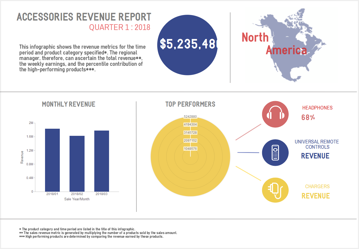
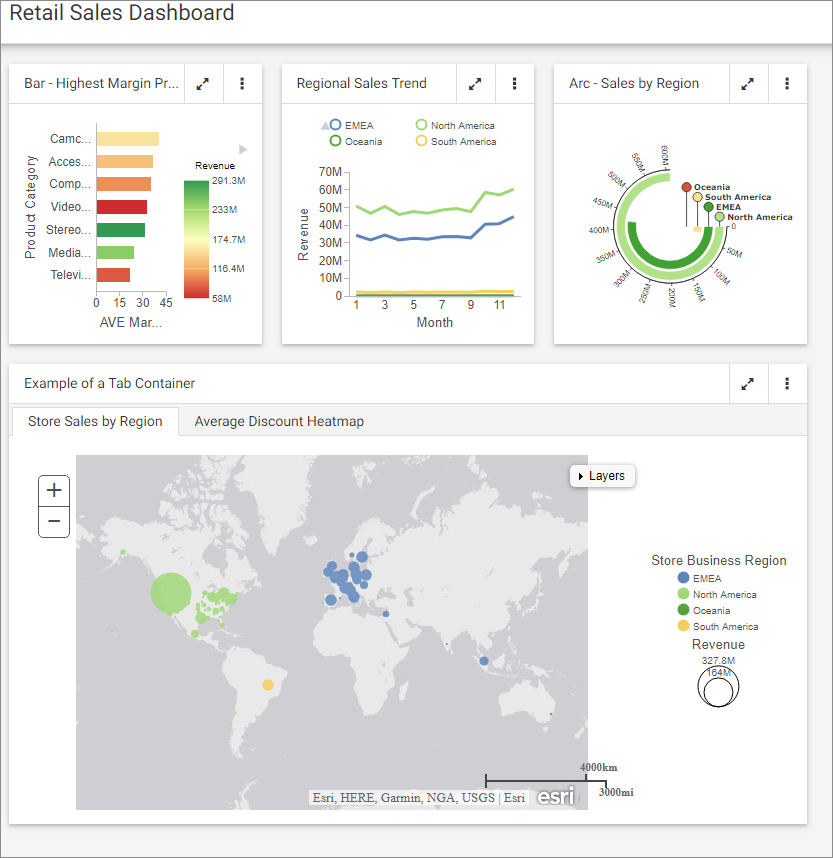
See below for an example of a dashboard and an infographic. Which would you rather read?
The WebFOCUS Infographics Advantage
The advantage of a WebFOCUS Infographic is defined by its major attributes – design flexibility, data connection potential, automation, and distribution capability.
- Design – to tell your story, establish a connection with the user through unique design and aesthetics that reinforce your brand. Choose from hundreds of design templates or create your own design using the rich library of elements available to you.
- Data Connection – populate the infographic with data from your own corporate data sources and parametrize key elements, such as filters, etc., to dynamically change the content based on user selections.
- Automation and Distribution – personalize the infographic and/or distribute it to one person, a select group, or everyone in your email directory. Or burst it to millions of users.
WebFOCUS Infographics offer fully customizable, data-driven infographics in each of these areas:
- Design - We provide every WebFOCUS user with a connection to our partner Easel.ly, offering easy-to-use tools and a rich library of graphical elements to design amazing infographic templates.
- Data Connection – Using WebFOCUS InfoAssist, you can build data queries from corporate and personal data sources and connect them to the driven elements in your infographic.
- Automation and Distribution – Using WebFOCUS ReportCaster, the connected-to-data infographic can be generated and personalized dynamically and distributed to any number of recipients.
Find out more about our partner Easel.ly at https://www.easel.ly/.
Creating a WebFOCUS Infographic
With WebFOCUS Infographics, creating a professional infographic is easy.
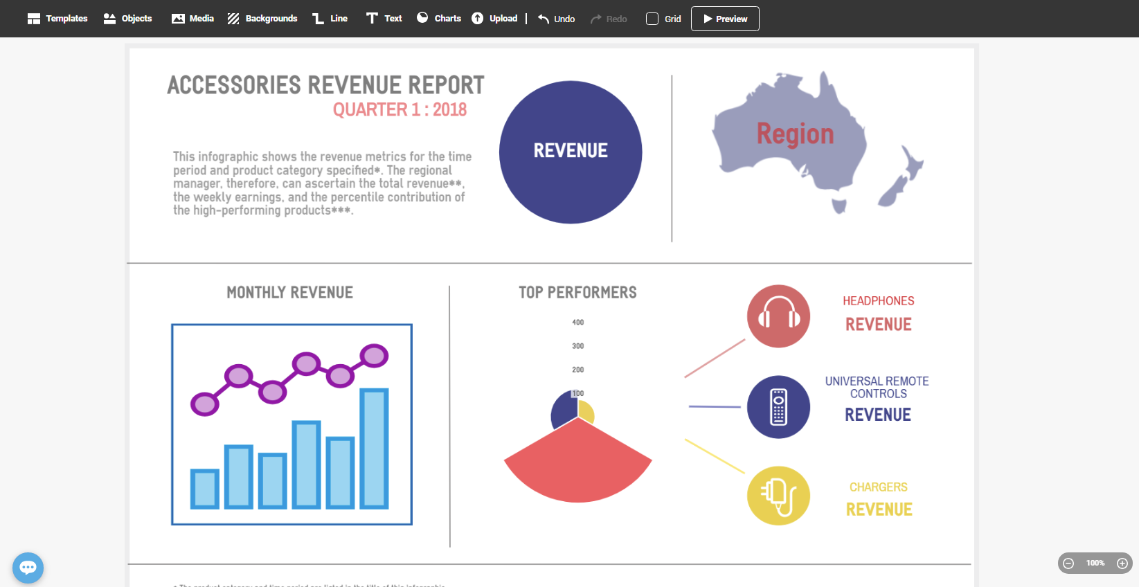
Step 1. Design the Infographic Template
- Use Easel.ly, our high-end, easy-to-use design tool that contains thousands of visual elements to design your infographic template.
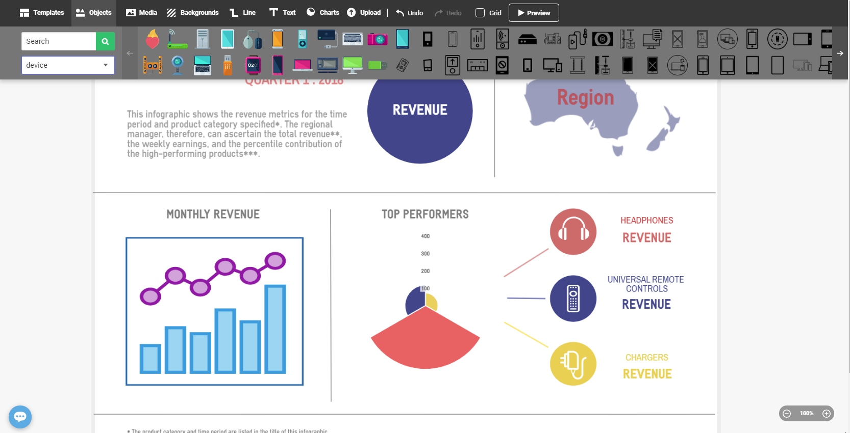
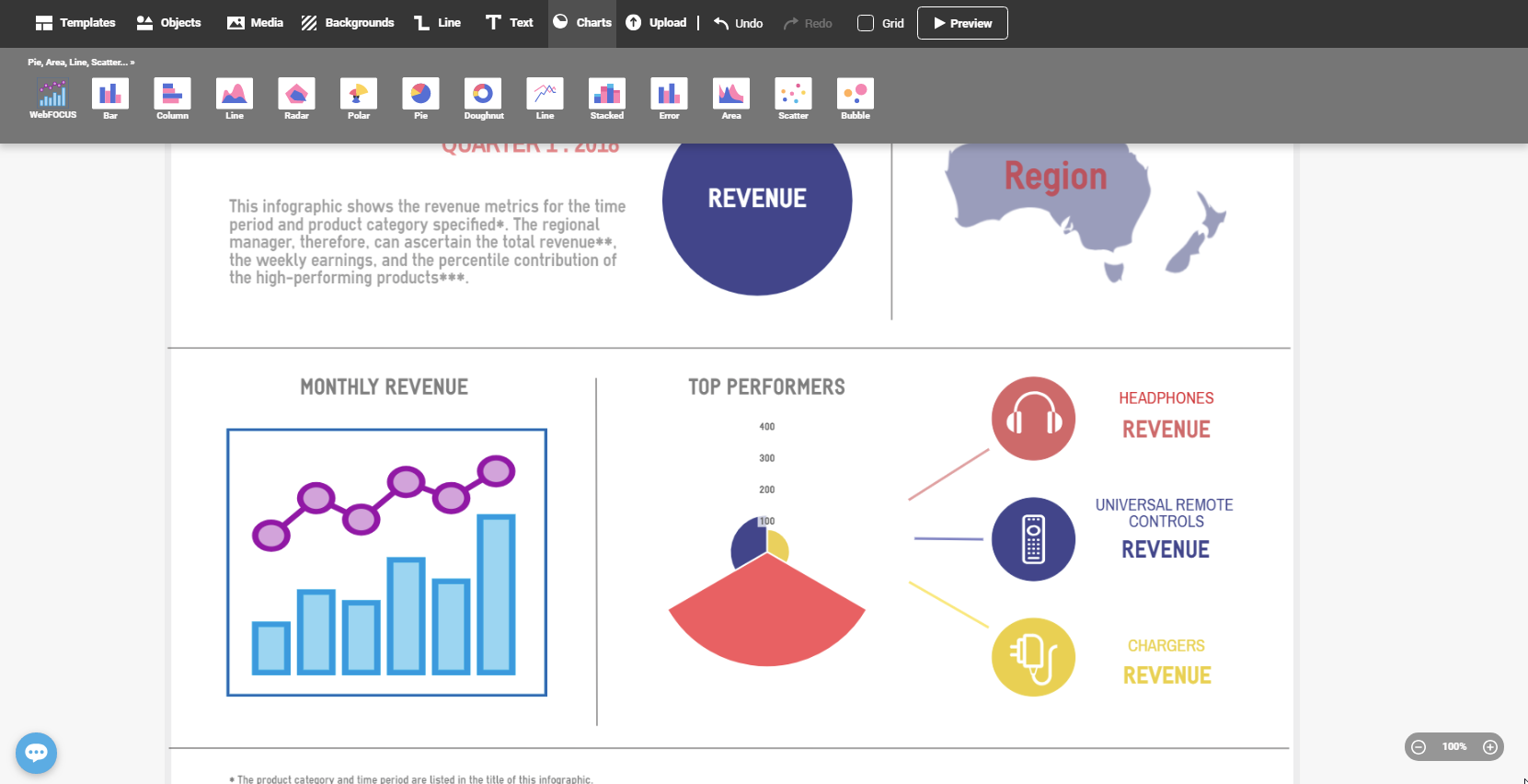
- Select from a wide variety of graphs to display data from your corporate systems.
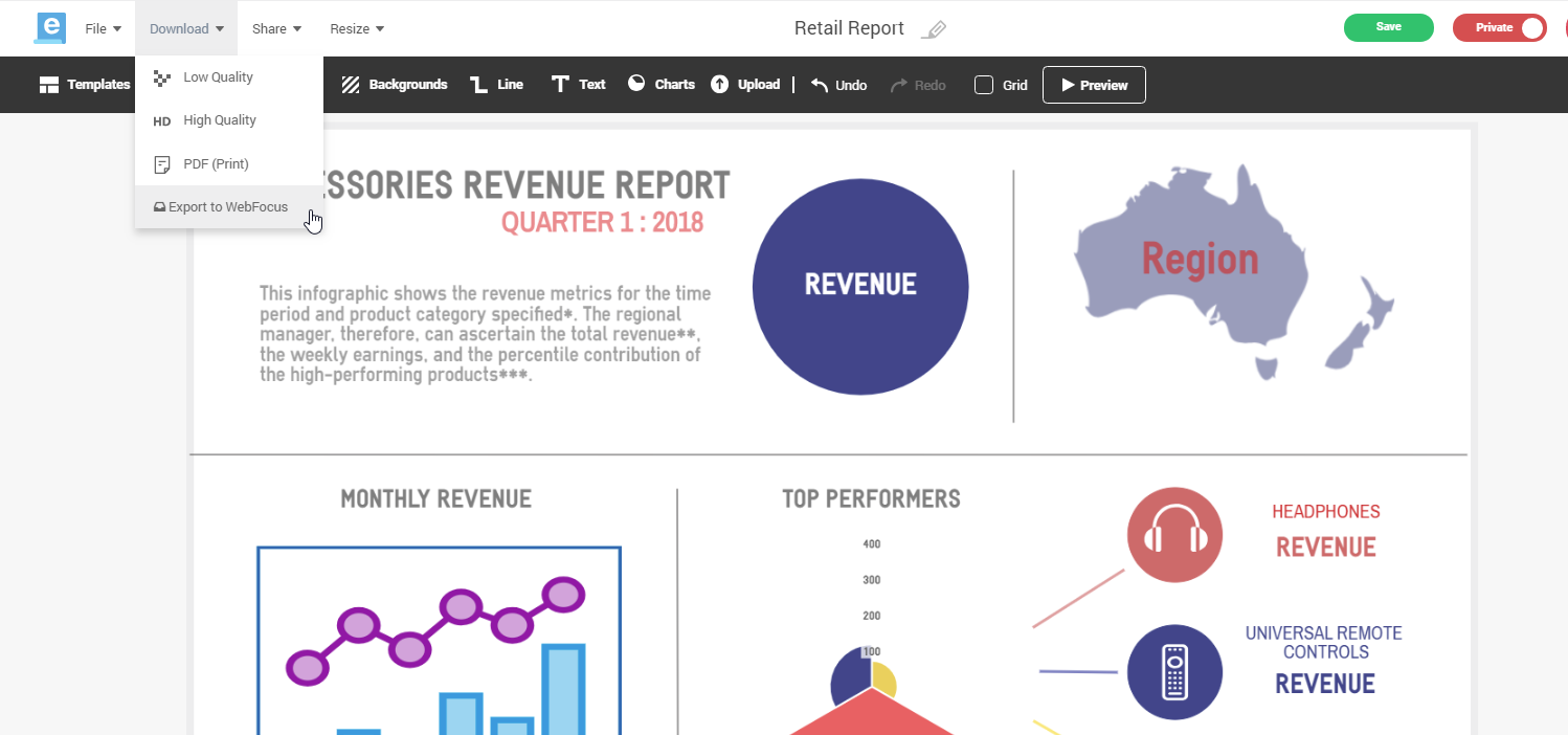
- After the design is complete, download the infographic template and import it into our ad hoc tools, where you can bind it to data.
Step 2. Bind to Your Data and Distribute
Next, use WebFOCUS InfoAssist to bind to your data and distribute the infographic.
- Connect to a corporate or personal data source or file.
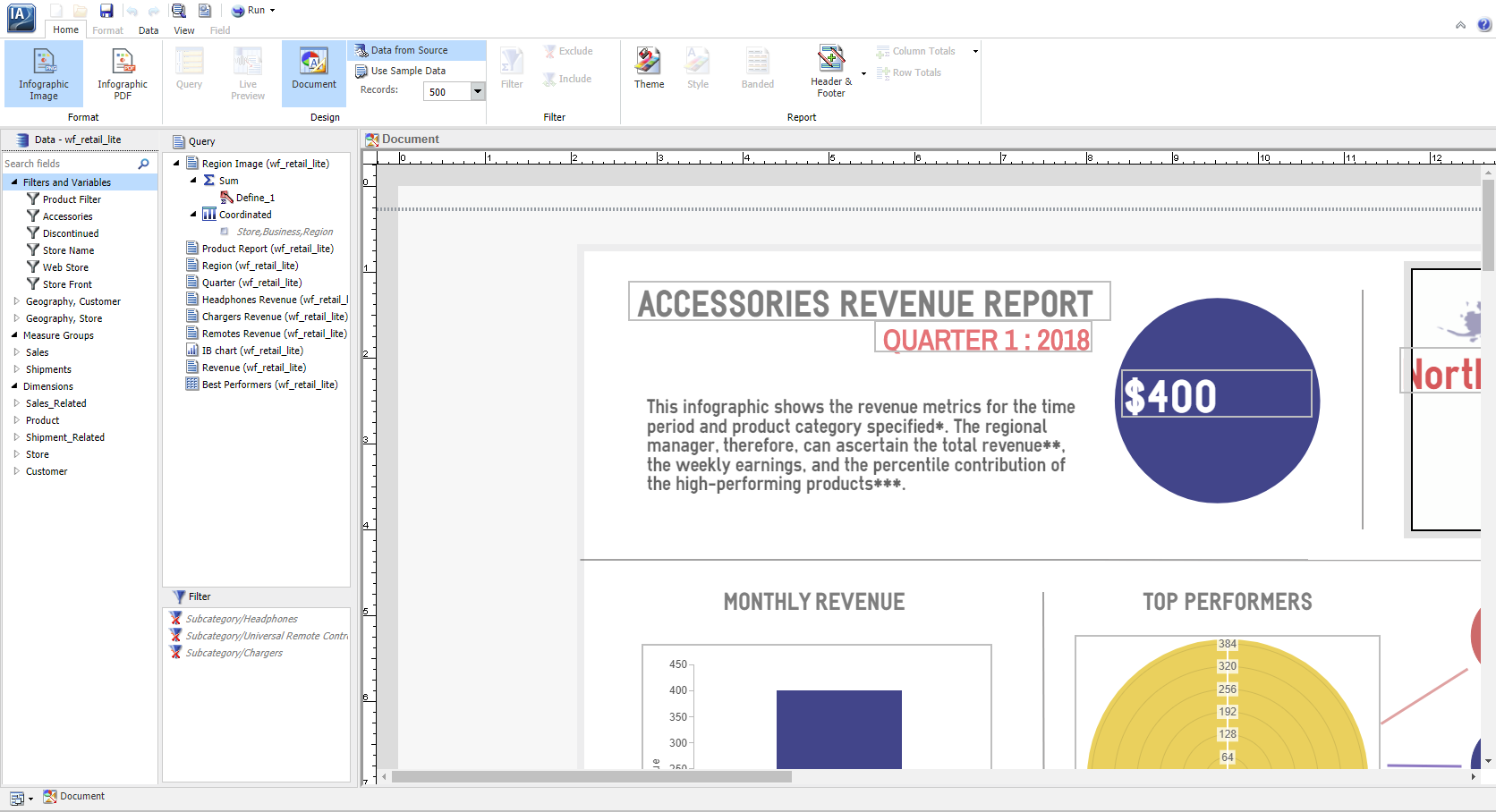
- Select the chart in the template to bind to your data.
- We display the required inputs and you build the query.
- You can insert user-controlled parameters (e.g., filters) and schedule the infographic to be sent to any number of users with personalized information.
Try It for Yourself!
If you like what you have learned about WebFOCUS Infographics here, sign up to join our WebFOCUS Infographics focus group, where you can learn more about how to replace your dashboards and reports with powerful infographics that tell your corporate story. Join now by contacting Customer_Success@ibi.com.
Recent Posts
Learn More
- Category: Creating Content
- Product: WebFOCUS Infographics
- Tags: Release Features