Choosing an Event Model for Your Page Filter
WebFOCUS Designer supports two event models for passing parameters to your page content:
WebFOCUS Designer supports two event models for passing parameters to your page content:
When you have required parameters in your content, WebFOCUS Designer interprets them as required filter controls. Required controls are marked in red, prompting you to make a selection for the request to be processed. The image below shows an example of a required filters control.
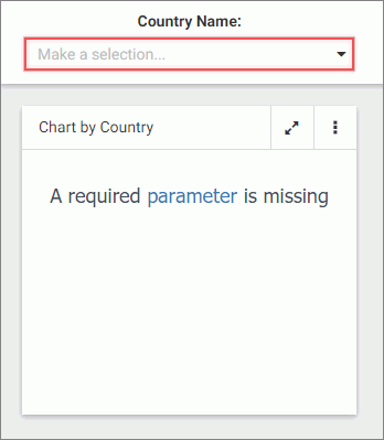
With a required parameter in place, your content does not refresh until you select filter values.
There are two ways to create a required filter control:
There are two types of list controls in WebFOCUS Designer:
An example of a single select list control is shown in the following image.
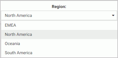
Once you have made a selection in a single select list, your content instantly refreshes to reflect that selection.
Parameters that contain dates are recognized by WebFOCUS Designer as date controls. An example of the date controls on the page is shown in the following image.
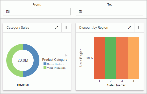
In this example, each of the controls is associated with a distinct parameter. One parameter uses the Greater Than WHERE condition, the other parameter uses the Less Then WHERE condition.
The Global Name property is a powerful tool that allows you to quickly synchronize filter control values between different pages. The Global Name property is configured on the Settings tab of the Properties panel for a filter control. Once enabled, it allows you to match your filter selections across multiple pages at run time within the same browser session.
While customizing your page, you can apply themes and styles to various page elements. The general theme of the page is defined by the Theme setting, which you can configure in the Properties panel, on the page level. A theme affects the look of the entire set of elements on the page, including colors, opacity, and typeface styles. Themes also dictate the color scheme for the Styles setting, which you can configure in the Properties panel, on the section and container levels.
There are three themes that WebFOCUS Designer offers:
The Mobile Viewer is a web-based interface that you can use to access content and share it with other users, from a basic URL. When you use the Mobile Viewer, you do not need to save content as a Favorite or create a portal. Instead, you can organize content in a folder and distribute the URL to this folder to other users who can bookmark the URL and run that content online at any time.
You can personalize default values for filters in a page based on users or conditions. This feature uses the amper (&&) global variable to specify the default option for a filter control. For example, you can set the Region value for a user, using the && global variable, and link it to the filter control to show their region as the selected value.
Procedure: How to Personalize Default Values for Filter Controls
Learn more about the new features introduced in the 8206.07 releases, what's been fixed, upgrade notes, and known issues. This topic also provides you with the gen information and system requirements.
You can utilize responsive panel in panel behavior by adding items to a panel group container. When you run the page, top-level containers in the page, including the panel group container, fold responsively based on the size of the browser, and the panels within the panel group container fold based on its current size, independent of the rest of the page. Items in the panel group container are also kept together when folding occurs, which makes a panel group container a good way to keep related content together.