Visualizing Data


Styling Column and Row Totals in a Report

As with the data values in a report, you can apply styling to the row and column totals and subtotals in a report to visually separate them from the rest of the values in your report and to draw attention to them. To add row and column totals to a report, on the Settings tab, in the Content Settings area, select Enable column totals and Enable row totals. To add subtotals, right-click a field in the Rows bucket of a report, point to Insert breaks, and select an option from the Subtotals section of the Insert breaks menu.

Formatting Cells in a Report

You can style the body of your report by specifying cell background colors, and setting cell margins. These options can help to make your report more legible by separating and spacing out the text, and by delineating different rows of data. On the Format tab, select General from the quick access menu to apply this formatting to the entire report. Select Columns and then make selections from the Select Elements and Column menus to apply cell formatting to the data values, column headers, or both areas of the selected column or columns.

Applying Themes to Reports

On the Format tab, in the General settings, in the General Options section, you can select a theme (.sty file, or StyleSheet), to apply to your report from the Theme menu. Themes style multiple components of a report, such as headers, column titles, and data text, all at once. Themes include associated cascading style sheet files along with a StyleSheet to help coordinate styling between an individual report and the entire visualization.

Setting General and Columnar Report Properties

When you select General from the quick access menu on the Format tab, you are presented with options to style and format the entire report. These options include the ability to set a theme, change the output format, change the font style and size, set cell margins, and configure how column widths are set. Font and cell styling options can be set for the entire report, or for specific columns within it.

Adding Filters to Pages Assembled From External Content

When you assemble a page from existing content, using the Assemble Visualizations option, the Filters tab on the sidebar allows you to display and chain filter controls. When you add an existing chart or report to a page, WebFOCUS Designer identifies any parameters present in the item. A badge appears on the Filters tab on the sidebar, indicating that you can add filters to the page, as shown in the following image.


390S8207: Self-Service Analytics With InfoAssist (Basic Techniques) (Self-Study)

This course shows you how to perform basic self-service reporting, analytics, and data discovery using WebFOCUS InfoAssist. It also introduces you to the WebFOCUS BI infrastructure that forms the basis for creating a variety of comprehensive reports, graphs, charts, and maps.

Learn how to:

Formatting Box Plots

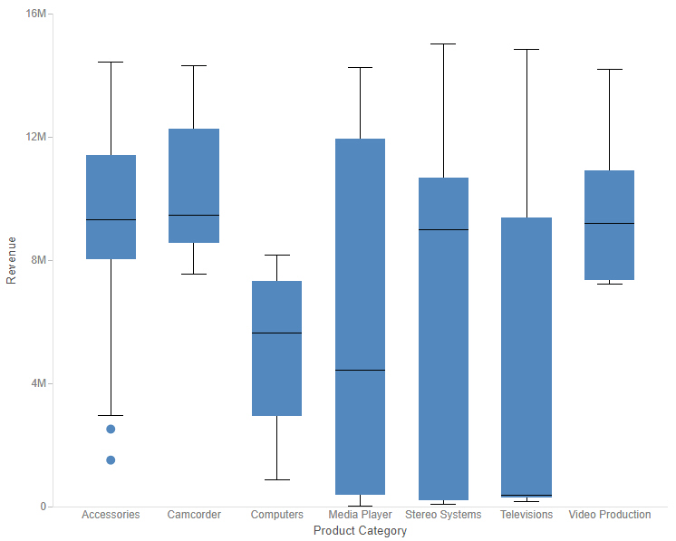
A box plot is a common chart type used to show key distribution information for a set of data points. A box plot displays outliers, the median, the upper and lower quartile, and the maximum and minimum with outliers excluded, by default. However, you can use the Box Plot options on the Format tab to show the mean, or average, as well. Additionally, you can change the display of the whiskers from lines to boxes, and change the style of the median and whisker lines.

Creating Statistical Box Plot Charts

A box plot, also known as a box-and-whisker plot, is a chart type that provides distribution information about your data. The box represents the range between the upper and lower quartiles, and the line inside the box represents the median. The whiskers represent the maximum and minimum with outliers excluded, and outliers are represented by individual points. An example of a box plot is shown in the following image.


boxplot