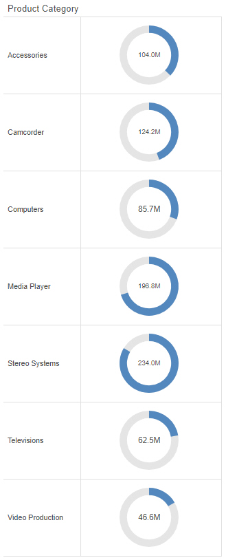
WebFOCUS Designer


Configuring Sample Data Settings

When you create charts, reports, and pages in WebFOCUS Designer, the canvas displays a design-time preview of your content. By default, the preview uses a subset of the data available in your selected data source, saving on the resource usage required in running a full data set, while still providing a representative and useful preview of your content.

Video: How to Create Statistical Box Plots

A box plot is a type of chart that shows multiple standard distribution metrics for a data set. They show outliers, the maximum and minimum values with outliers excluded, the upper and lower quartile, and the median, allowing you to quickly analyze the spread and skew of your data values. 

Selecting a Data Source

To create a new visualization, such as a chart or report, you must first select a data source. This data source provides the fields and values that display in your content. It can be either a Master File, which is a data source description that allows you to structure the fields in a database or flat file into a more logical structure, or it can be a Reporting Object, which allows you to enhance a Master File with additional filters, default content items, and pre- and post-processing code.

Creating Streamgraphs

A streamgraph is a simplified area chart. It does not show labels for measure values, but makes it easy to identify trends for different dimension values over time. An example of a streamgraph is shown in the following image.


streamgraph

The following display options are available for a streamgraph:

Creating Tag Clouds

A tag cloud allows you to see the most frequent or largest values in a dimension field based on the size and color of the text, making it easy to identify the most important values. An example of a tag cloud is shown in the following image.


tag cloud

The following display options are available for a tag cloud:

Creating Mekko Charts

A Mekko chart allows you to see proportional values of a measure field for two dimension fields. The intersections of these dimension fields and their relative sizes make it possible to quickly identify the most significant combinations of values. An example of a Mekko chart is shown in the following image.


mekko chart

The following display options are available for a Mekko chart:

Creating Funnel Charts

A funnel chart shows values of a dimension field as a proportion of the whole, similar to a bar in a stacked bar chart. The shape of the funnel makes it useful to show information about processes that involve cascading or narrowing down due to the hierarchy it implies. For example, the following image shows revenue by year in a funnel chart. The entire funnel can be taken to represent all sales, with the top segment representing the most recent year, the top two segments the two most recent years, and so on.

Creating Gauge Charts

A gauge is a simple visual that shows a measure value. These can be used to create straightforward KPI graphics, or use matrix rows and columns to compare data for different sort values. The following example shows a gauge chart with matrix rows.


matrix gauge chart

The following display options are available for a gauge chart: