WebFOCUS Designer


Creating Waterfall Charts

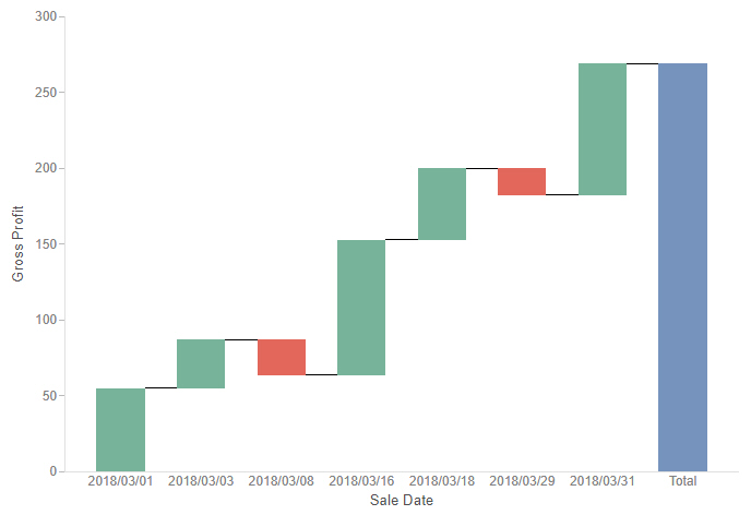
Waterfall charts allow you to see incremental positive and negative changes in your data, resulting in a rolling total. Positive and negative values are represented by different colored risers that start at the end point of the previous riser. Waterfall charts can be a good way to show change over time. An example of a waterfall chart is shown in the following image.


waterfall chart

The following display options are available for a waterfall chart:

Video: How to Pass Parameter Values to a Page Using Drill-Down Links

You can use parameterized drilldowns to connect to a page in your repository. Whereas in InfoAssist you must use a URL to drill to the page, when you create charts and reports in WebFOCUS Designer, you can simply select the page that you want to drill to using a file picker. The value that you click or select in your content can be passed to the page as a parameter. The page opens with your selections already applied as filter values, creating a seamless transition between content items. 

Generating a Data Extract or Image From Content

In addition to the output formats that you can use when running your content, you can export a snapshot of a single chart or report as a data extract in an Excel spreadsheet, or as a .png image, which are downloaded from your browser. This allows you to quickly generate a representation of your content at any time, in a format that can be easily saved and distributed.

To generate the image or data extract, click the Application menu and, in the Export As section, click Data or Image. The file is downloaded using your browser.

Displaying Measure Values in Charts

In most chart types, measure values for different categories are communicated based on visual cues. For example, the height of a riser in a bar chart, the size of a slice in a pie chart, or the color or an area of a heatmap all communicate the measure value of the dimension value that they represent. By comparing different areas of the chart, and by using the legend and tooltips, you can quickly identify overall trends in your data.

Adding Drill-Down Links to Content

Drilldowns are a powerful feature that allows users to navigate from one content item to another, providing access to additional, related information at run-time. Drill-down links can also be used to pass parameters, so that the target content is automatically filtered for the value that a user selects, allowing you to maintain context between items. By linking content with drilldowns, you can vastly expand the amount of information that is available from a single chart or report.

Chaining Filter Control Selections

When a content item or page includes multiple filters, chaining ensures that those filters always return valid values to your content. When you select a value from one of the filter controls, the other controls can be filter and updated based on the value that you select, if chaining is applied. For example if you have a filter for Sale Quarter chained to a filter for Sale Month, then when you select Q1 from the Sale Quarter filter, the Sale Month filter updates to show only the months of January, February, and March, and automatically excludes any month values that were not in Q1.

Video: How to Use Report Patterns

WebFOCUS Designer includes three common patterns that you can instantly apply by selecting one from the report picker. By using report patterns with different combinations of fields in the Row, Column, and Summary buckets, you can quickly transform a report into a number of common layouts.
First, let’s create a default, standard report, by adding Product Category and Sale Quarter to the Rows bucket and Quantity Sold, Cost of Goods, and Revenue to the Summary bucket.

Using the Visualization Toolbar

The Visualization toolbar includes contains options that are specific to the Designer Visualization tool. The Visualization toolbar is only accessible from the Visualization tab. The Visualization toolbar is shown in the following image.


Visualization toolbar

The following table lists the controls that you can access from the Visualization toolbar.

Icon

Description

Navigating WebFOCUS Designer With Keyboard Controls

You can use keyboard commands to navigate through the WebFOCUS Designer interface, allowing you to perform certain content creation tasks without a mouse.

Press the Tab key to navigate between adjacent sections of the user interface, or press Shift+Ctrl+F10 to open a menu of sections of the user interface, allowing you to quickly jump from one section to another if they are not near each other. You can jump to one of the following areas of the interface:

Video: How to Group Numeric Values With Binning

Hello, and welcome to this video on Binning, which allows you to group numeric data values to plot the frequency distribution of values in your data.
Bins are a standard data analysis technique. With bins, you group number values in continuous increments that you control. This lets you summarize large amounts of data across measures, and lets you analyze trends and quickly identify outliers.