Applying Prompted Filters From External Content
Importing a filter from external content in WebFOCUS Designer is a quick and intuitive process. Additionally, parameter filters added to a page from existing content can be rearranged and styled with options unavailable to filters created for new content in a page.
Whenever you add a parameterized content item to the canvas, such as a chart or report that uses a prompted filter or dynamic parameter, the parameters are recognized and you can create filters for them automatically. A badge count is overlaid on the Filters tab on the sidebar, as shown in the following image.

The Filters tab provides options to add filters to your page and apply chaining to them. Open the Filters tab and then click Add all filters to page to create filters for all identified parameters. Alternatively, right-click a parameter in the list to create a single filter control.
After you add filters from external content to a page, you can right-click a filter control to access formatting options. For example, you can convert a list control to radio buttons, check boxes, or a button pane, merge two related controls, and access configuration and format options on the Properties panel.
You can interact with the filter controls in an assembled page at design time to see how different filter selections affect your content. However, these filter selections are not retained at runtime. To change the default value for a filter in an assembled page, select the filter and, on the Settings tab, in the Data Settings section, type a value into the Default value text box.
As an alternative to using the Filter toolbar, or in addition to it, you can also add a grid container to a page assembled from existing content by dragging it from the Resources panel when you select the Container tab on the sidebar. A grid container includes multiple cells into which filter controls can be placed. You can also move the original filter toolbar or have it display in a modal window by selecting the entire page and then clicking one of the filter location options on the Settings tab of the Properties panel.
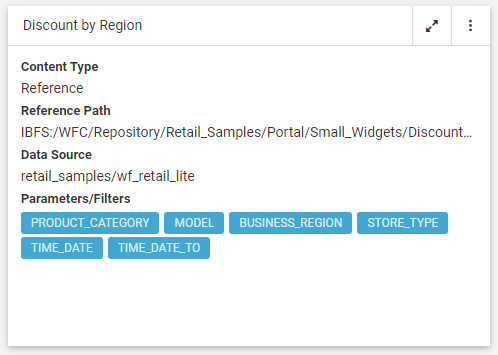
To see which filters apply to which external content items, click Info on the Visualization toolbar. Each content item on the page lists the parameters by which it is filtered. The chart displayed in the following image is affected by filters for six fields, listed under Parameters/Filters.
Procedure: How to Automatically Add Filters to a Page Using the Quick Filter Button
- Open WebFOCUS Designer. On the WebFOCUS start page or the WebFOCUS Home Page, click the plus button and then click Assemble Visualizations.
WebFOCUS Designer opens in a new browser tab.
- In WebFOCUS Designer, select a template for the page. You can use a predefined template, or select Blank to build the page from scratch.
- With the Content tab selected on the sidebar, drag a parameterized item of your choice from the Resources tree to the canvas.
A badge appears on the Filters tab icon on the sidebar, indicating that there are unbound filters.
- Optionally, add more content.
Note: The quickest way to create stand-alone content featuring the same set of parameters is to start by creating a Reporting Object with desired parameters, and then using the Reporting Object to create content. To do so, on the WebFOCUS start page, click the plus menu and click Create Visualizations, or on the WebFOCUS Home Page, click Visualize Data. When Designer opens, select a Reporting Object as your data source.
- Click the Filters tab on the sidebar. Click Add all filters to page to create controls for all listed parameters, or right-click each parameter for which you want to create a filter control, and click Add to page.
The filter bar appears above your content with the controls that you chose to create.
- Optionally, customize your filter bar as described below.
- Change the location of the filter bar from below the page toolbar to above it or into a modal window. Select the entire page and, in the Properties panel, on the Settings tab, select Below Header, Above Header, or In Modal.
- Move filter controls to a filter grid. When assembling a page from existing content, you can create a filter grid by dragging a grid container from the Resources panel with the Container tab selected. You can then resize and reposition the filter grid to customize where the filter controls should display on your page.
- Right-click a cell to access shortcut menu options, as shown in the following image.
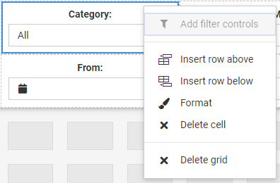
To right-click a cell, right-click the margin above or to the left of a filter control.
The available options are:- Add filter controls. Opens the Add Filter Controls dialog box, where you can choose from the list of available controls and add them to the filter grid.
Note: If all available filters display on the page, the Add Filter Controls setting is inactive.
- Insert row above. Inserts an empty row above the current row in the filter grid.
- Insert row below. Inserts an empty row below the current row in the filter grid.
- Format. Opens the Properties panel to the Format tab, where you can customize the grid style and cell alignment.
- Delete cell. Deletes the current cell.
- Delete grid. Deletes the entire filter bar.
- Add filter controls. Opens the Add Filter Controls dialog box, where you can choose from the list of available controls and add them to the filter grid.
- Right-click a control to access shortcut menu options, as shown in the following image.
The available options are: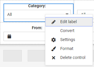
- Edit label. Selects the label text for editing.
Note: Another way to edit a control label is to double-click the filter label, type the new text, and press the Enter key.
- Convert. Opens the Convert Control To dialog box, where you can choose between various control types.
You can convert a list control, created for alphanumeric fields, to radio buttons if single-select, check boxes if multiselect, or a button panel. You can convert a single-headed slider, created for single-select numeric fields, to an input box.
- Settings. Opens the Settings tab of the Properties panel, where you can customize control configuration options.
- Format. Opens the Format tab of the Properties panel, where you can customize control styling options.
- Delete control. Removes the filter control from the visualization.
- Edit label. Selects the label text for editing.
- Drag any filter cell to a new location in the grid to reposition or reorder the filter controls.
- Multi-select two related controls, right-click one of them, and then click Combine to combine the two controls into one. An example of two combined controls is shown in the following image.

The Combine option only applies to single-select date and numeric slider controls. They can be combined into a single control with a start and end point.
- Drag a control into a cell with other controls. This action puts two separate controls into one cell. The drag marker is shown allowing you to position one controls in front or behind another control. You can separate the controls again by dragging one control out of the cell.
- Save your changes.
- Release: 8207
- Category: Adding Content to Pages
- Product: WebFOCUS Designer
- Tags: How-to's