Configuring Filter Control and Filter Grid Properties
You can configure the properties of the filter grid using the Properties panel, which is context-sensitive. For example, when you click a filter cell, the cell style properties open in the Properties panel. When you click a filter control, the general and style properties for this control open in the Properties panel.
The Properties panel for a cell is shown in the following image. When you configure these properties, you modify the alignment of content within a cell or change the style layout of the filter grid.
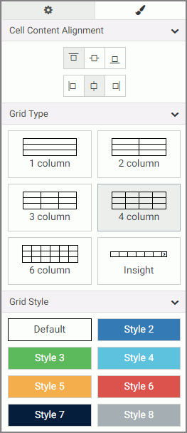
The properties for a grid cell are:
- Cell Content Alignment. Controls the alignment of the label and control inside the cell. The options include top, middle, bottom, left, center, and right.
- Grid Type. Controls the grid layout of the filter bar. The options include 1-Column, 2-Column, 3-Column, 4-Column, 6-Column, and Insight.
- Grid Style. Controls the style of the filter bar.
The Properties panel for a filter control is comprised of two tabs: general and style properties. The settings tab is displayed in the following image. Using these properties, you can view the type of filter control that shows on the page, add a tooltip or placeholder text, and set the default value.
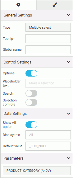
The settings tab contains the following properties:
- General Settings. This section includes the following options:
- Type. Displays the type of the control.
- Tooltip. Displays a tooltip when you hover over the filter control.
- Global name. Designates a global name to the control.
- Control Settings. This section includes the following options:
- Optional. Toggles between optional and required control.
- Placeholder text. Enables a configurable placeholder text that you can show users inside a required control when it has no value. The default text is Make a selection.
- Search. Adds a search field to the filter drop-down menu.
Note: If the select list contains 50 or more values the Search option is enabled automatically.
- Selection controls. Adds Select all and Clear buttons to the filter drop-down menu. This property is only available for multiple select lists.
Note: The Selection controls and Show All options cannot be selected at the same time.
- Data Settings. This section includes the following options:
- Show All option. Adds an All option to the control that the user can select.
Note: Choosing this option results in the parameter receiving a _FOC_NULL value. If this parameter is used in a WHERE condition, it results in the WHERE condition being removed from the request and all data values for this field displaying the page.
- Display text. Allows you to specify a custom value for the Show All option in the control. The default text is All.
- Default value. Displays the default value of the control. For optional parameters you can edit this field and override the control value.
- Show All option. Adds an All option to the control that the user can select.
- Parameters. Shows the name of the parameters that are associated with this control.
The style tab is displayed in the following image. Similar to the properties of a cell, you can modify the positions of labels in a control, define the alignment, and set the object width.
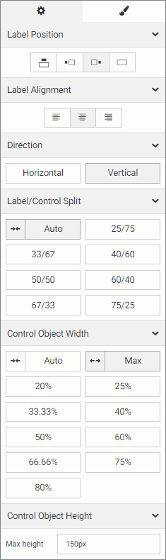
The style properties are:
- Label Position. Controls the position of the filter label in the relation to the control. The options are above, right, left, and no label.
- Label Alignment. Controls the alignment of the filter label. The options are left, right, and center.
- Direction. Controls the alignment of the elements inside the control. This property is available for radio button, check box and button set controls. The options are horizontal and vertical. The vertical option is enabled, by default, when the control has five or more values.
- Label/Control Split. Controls the space ratio between the label and control inside the cell. This option is only available when the label position is set to right or left.
- Control Object Width. Sets the width of the control in relation to the filter cell. The options are:
- Auto. Adjusts the width of the control automatically to accommodate the name of each value.
- Max. Fills the entire filter cell. This is the default value.
- Percentages. Set the control width to various percentages, as they relate to the filter cell.
- Control Object Height. Sets the maximum height of the control. If the list of elements exceeds the maximum height of the control, a scrollbar is added to this control. This property is available for radio button, checkbox and button set controls when their Direction property is set to vertical. The default value is 150px. You can change this value as necessary.
- Release: 8205
- Category: Adding Content to Pages
- Product: WebFOCUS Designer