Controlling the Display of Time-Based Axes
By default, when you create a chart that has a dimension on an axis, missing values are not displayed on that axis. For example, if you create a bar chart showing revenue by product category, but there are no revenue values, including zero, for televisions, then televisions will not appear on the horizontal axis in the bar chart.
However, when you create a line or area chart using a date or date-time field as one of the axes, this is not the case. In these chart types, when a date or date-time field is used, the time axis option is enabled by default. This option allows you to show the entire, continuous range of time encompassed by your data, even if there are missing values in between. Missing values are extrapolated based on the nearest values. The time axis option allows you to see changes in your data over time on a continuous scale, displaying date values more intuitively and making it easier to recognize gaps in your data.
When the time axis option is enabled, the values in the chart are plotted along a continuous date axis, as shown in the following image.
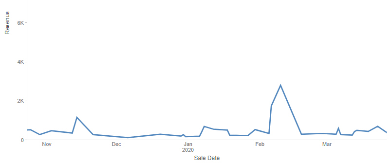
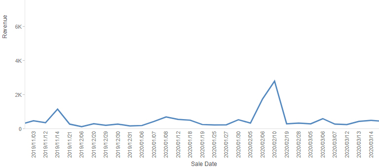
Although there were no sales between December 6 and December 20 in the image shown above, those days occupy the same amount of space on the x-axis as the days in which there were sales, and the line is extrapolated for them. The same chart with the time axis option disabled is shown in the following image. Only dates with values in the data set of the chart display. Since not all dates appear in the chart, each existing date value is labeled on the axis.
To disable the time axis option and show only the date values in your data source, right-click the date or date-time field in the Horizontal or Vertical bucket of your chart and deselect Time axis, as shown in the following image.
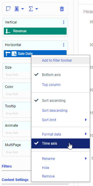
To re-enable the time axis option, right-click the date or date-time field and click Time axis again.
- Release: 8207
- Category: Visualizing Data
- Product: WebFOCUS Designer
- Tags: Enhancements