Controlling Font Display in a Chart
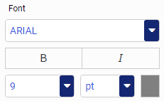
You can use the font formatter in WebFOCUS Designer to control how fonts are displayed in your chart. This is a quick way to apply styling, colors, or a specific font type for any text within your chart. The font formatter displays in different areas of the Format tab (for example, Legend, Axis, Series, and Matrix options). Depending on the chart type and what you want to format, you can use these options to enhance the fonts in your charts. The font formatter is shown in the following image.
You can also change the font of a header or footer in your chart. This allows you to control how a chart is labeled or highlighted, which is useful when the chart will be distributed. For headers and footers, you can:
- Change the font type and font size.
- Add bold, italic, and underline emphasis to your text.
- Set the justification of text in your header or footer. For example, left-aligned, centered, or right-aligned.
- Change the font color or background color.
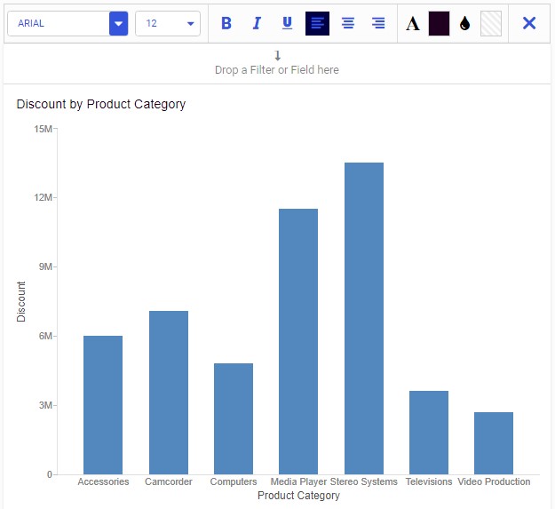
The styling toolbar for header and footer text is available along the top of the canvas, as shown in the following image.

When reviewing text that displays in your chart, you might want to increase the font size of the header text to enhance its visibility. Editing the font types and styles in your chart gives you more control over how information is displayed and presented.
Procedure: How to Change the Font Type in Your Chart
Changing the type, size, and emphasis of a font improves the impact for the user that is analyzing this chart. To change the font of a chart header:
- Open WebFOCUS Designer. On the WebFOCUS start page, click the plus menu and then click Create Visualizations, or, on the WebFOCUS Home Page, click Visualize Data.
WebFOCUS Designer opens in a new browser tab.
- Select a workspace and a data source available from that workspace.
Once you select a data source, WebFOCUS Designer loads with options to create a single content item.
- Add one or more measures and dimensions to your chart.
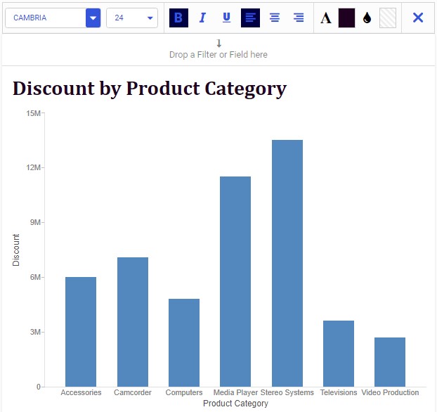
- Double-click Chart Heading to enable it for formatting, and change this text to Discount by Product Category.
The styling toolbar displays along the top of the screen, as shown in the following image.
- Ensure that the header Discount by Product Category is selected or highlighted.
- From the styling toolbar, change the font type to Cambria, size 24, Bold.
The revised chart header displays and reflects the new font type and styling, as shown in the following image.
Note: You must select the text you want to modify in your header or footer before you apply any changes to the font.
- Release: 8207
- Category: Visualizing Data
- Product: WebFOCUS Designer
- Tags: How-to's