Creating Charts
Charts communicate overall trends quickly with eye-catching and intuitive graphics. Charts come in many different varieties that allow you to communicate information with varying degrees of complexity and specificity. You can use simple charts to effectively communicate simple metrics, and more complex charts to clearly display relationships between different aspects of your data, making it easy to identify less obvious trends.
Different chart types utilize different kinds of data and enable different styling options. You can easily change chart types by selecting a different option from the Content picker, making it easy to ensure that you choose the chart type that best represents your data.
When creating your visualization, you can use tooltips and on-chart filtering to get the necessary information from your chart, and you can also enhance the chart with run-time capabilities such as drill-downs and In-Document Analytics to make even more information available from a single chart.
Procedure: How to Create a Chart Using WebFOCUS Designer
- Open WebFOCUS Designer. On the WebFOCUS start page, click the plus menu and then click Create Visualizations, or, on the WebFOCUS Home Page, click Visualize Data.
WebFOCUS Designer opens in a new browser tab.
- Select a workspace and a data source available from that workspace.
Once you select a data source, WebFOCUS Designer loads with options to create a single content item.
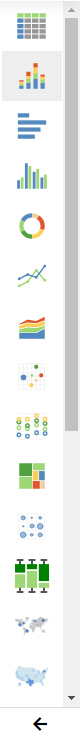
- Use the Content picker to change the chart type, or use the default vertical stacked bar chart. The Content picker is shown in the following image.
- Add measures by dragging them onto the canvas.
Note: You can also double-click a measure to add it to the default measure bucket or drag it into an appropriate bucket of your choice.
- Add dimensions by dragging them onto the canvas.
Note: You can also double-click a dimension to add it to the default dimension bucket or drag it into an appropriate bucket of your choice.
The chart refreshes with your selections.
- You can format your chart in the following ways:
- Edit the style, size, or format of your fonts.
- Modify the appearance or location of your legend.
- Modify axis options.
- Add a header and footer.
- Customize the series in your chart.
- On the WebFOCUS Designer toolbar, click Save to save your chart.
When you create a single chart and save it for the first time, it is saved as a stand-alone chart, which allows you to add it as external content to pages. If you click Convert to Page or Add visualization on the Designer toolbar, your content becomes a page to which you can add more content and containers. After this point, it is saved as a multi-content page.
You can now continue editing your chart, or add more charts to the visualization to turn it into a page.
- To reopen your chart once you have exited WebFOCUS Designer, locate it on the WebFOCUS start page, right-click it, and click Edit from the shortcut menu.
- Release: 8207
- Category: Visualizing Data
- Product: WebFOCUS Designer
- Tags: How-to's