Creating Choropleth Maps
Choropleth maps can be used to create geographically-based heat maps. They are useful for visualizing location-based data, trends, and distributions across a geographic area, as shown in the following image.
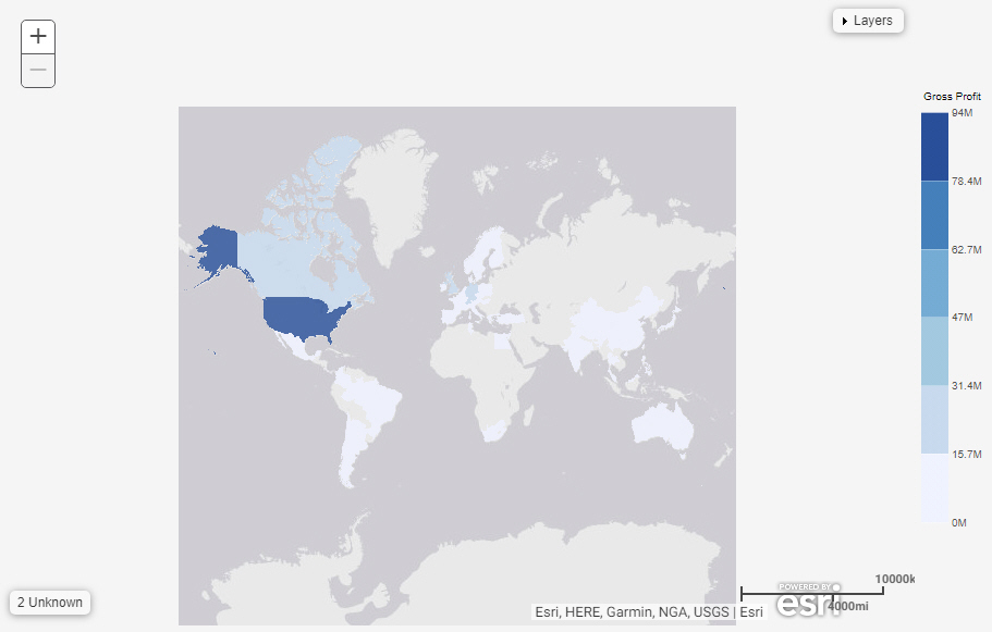
Note: Choropleth maps require at least one measure and one Georole, which contains geographic location information. You can add a field to the Color bucket to color the map.
The following display options are available for a choropleth map.
- Calculation options:
- Summaries. Sums measure values for each sort value. This is the default.
- Counts. Provides a count of records in the selected measure field, for each sort value.
- Details. Displays the value of each individual record.
- Clear buckets content. Empties all buckets.
You can add fields to the following buckets for a choropleth map:
- Color. Use a measure field to apply a color scale to the areas on the choropleth map. You can also use a dimension to color the areas on the map. Each area can show one color, so it is advisable to use overarching categories that apply to distinct sets of points. For example, you could use a country field in the Color bucket to categorize states shown on the map.
- Location. Enables you to specify a Geolocation field for use in a map. Each value from the field is plotted on the map if it is recognized. A choropleth can plot geographic areas, such as cities, states, or countries.
Note: Geolocation fields must be configured in the data source to use a corresponding geographic role. Values from the field are matched to values from the geographic role to plot them in the correct location. For example, if your field contains country names, use the Country Name geographic role.
- Tooltip. The data placed in this bucket displays in the tooltip at run time. Can be used to make additional information available without changing the appearance of the chart.
- MultiPage. Enables the creation of multiple graphs based on the field that you place in this bucket. The MultiPage bucket is available for stand-alone charts. If you convert the chart to a page created from new content, the MultiPage bucket disappears.
Procedure: How to Create a Choropleth Map
- Open WebFOCUS Designer. On the WebFOCUS start page, click the plus menu and then click Create Visualizations, or, on the WebFOCUS Home Page, click Visualize Data.
WebFOCUS Designer opens in a new browser tab.
- Select a workspace and a data source available from that workspace.
Once you select a data source, WebFOCUS Designer loads with options to create a single content item.
- On the Content picker, change the chart to a choropleth map.
- Add a measure to the Color bucket and one field with an assigned geograhic role to the Location bucket.
The choropleth map refreshes with your selections.
- You can perform the following tasks with your choropleth map:
- Change the field in the Location bucket to analyze other trends.
- Zoom in or out to see different views of the data.
- Save your choropleth map.
- Release: 8207
- Category: Visualizing Data
- Product: WebFOCUS Designer
- Tags: How-to's