Creating Content Using the Chart Rollup Tool
You can access the Chart Rollup Tool from the column menu in an interactive report that uses In-Document Analytics. There are three tabs: Chart, Rollup, and Pivot. As you create charts, rollups, or pivot tables, each artifact displays in the analysis panel.
You can use the Chart Rollup Tool to select multiple group fields to generate the chart, rollup or pivot table.
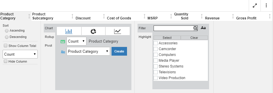
For the Chart tab, you can select a chart type, an aggregation, and a column for the chart, as shown in the following image.
How to use the Chart tool:
- Create a report with multiple dimensions and measures.
- Click on the primary dimension.
- From the Chart Rollup tool, select a chart type.
- Optionally, add an aggregation for the currently selected dimension.
- Select a dimension or measure from the field list.
- Click Create.
The chart displays in the analysis panel. You can interact with the chart in the same way as any other artifact.
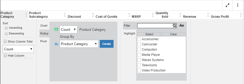
For the Rollup, you can perform an aggregation on the current report column. You can also select a Group By value, which lists all columns in the report, as shown in the following image.
How to use the Rollup tool:
- Create a report with multiple dimensions and measures.
- Click on the primary dimension.
- From the Chart Rollup tool, select the Rollup tab.
- Optionally, select an aggregation to be applied to the selected column.
- For the Group By field, select a dimension or measure for which to perform the rollup.
- Click Create.
The Rollup displays in the analysis panel.
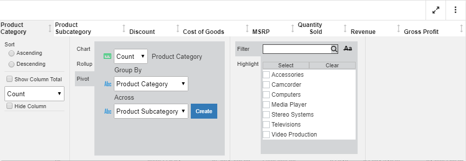
For Pivot tables, you can similarly select an aggregation for the currently selected column in the report. You can select from the existing dimensions for the Group By and Across fields, as shown in the following image.
To use the Pivot tool:
- Create a report with multiple dimensions and measures.
- Click on the primary dimension.
- From the Chart Rollup tool, select the Pivot tab.
- Optionally, select an aggregation to be applied to the selected column.
- For the Group By field, select a dimension by which to group the table.
- For the Across field, select another dimension that will display as an across field.
- Click Create.
The Pivot table displays in the analysis panel.
- Release: 8207
- Category: Visualization and Analytics
- Product: In-Document Analytics
- Tags: Enhancements, How-to's