Creating Content in WebFOCUS Designer
You can visually convey the information in your data source using a wide variety of chart types and tabular reports with different layouts and sort orders. You can save and share content items individually, create multiple content items as a page, or edit existing content should a scenario change. Because of its flexibility, WebFOCUS Designer provides you with the platform and tools you need to create charts that communicate overall trends quickly with eye-catching and intuitive graphics, enhanced with automatic tooltips and filtering capabilities, reports that allow you to organize even the most granular data into an easy-to-understand tabular format, and maps that make it easy to display geographic data to make it clear which areas are hotspots or may deserve more investigation. You can create multiple items together in pages for easy cross-comparison or use them as standalone components. You can then share them with others in your organization to facilitate collaboration, which is central to effective business practices.
Many charts, reports, and maps show contrasting intersections of data, giving you the opportunity to share useful information that conveys patterns in your data. WebFOCUS Designer provides you with access to different types of simple and complex charts in a suite of charting options. You can use simple charts to communicate important KPIs and other straightforward metrics to get communicate information clearly and memorably. More complex charts can be used to investigate numerous relationships between different aspects of your data, giving you a more overarching view.
You can focus in on precise data values in a report, where you can supply large quantities of information in a digestible format that makes it easy to identify and locate key values. A report thereby allows you to combine a broad overview of your enterprise data with exact values for every data point.
Maps take the effectiveness of chart based reporting and tailor it to display geographic data. You can communicate simple information with a basic bubble map or choropleth map, or create maps with multiple levels to show the interplay of different metrics in locations around the globe. You can create maps that are as precise as you need, from a regional level all the way down to postal codes.
All of these content types can be enhanced with run-time capabilities such as prompted filters and In-Document Analytics, which allows users to transform content and modify the display of data at run time. For single items, you can also enable Auto Drill, which makes it possible to navigate data hierarchies, Auto Linking which allows you to connect to and from other content with related parameters, and Insight, which allows you to modify and build content at run-time.
Creating a visualization with new content begins with the selection of a data source, which provides the underlying data that is used to create your content. You can select a Master file (.mas) as your data source.
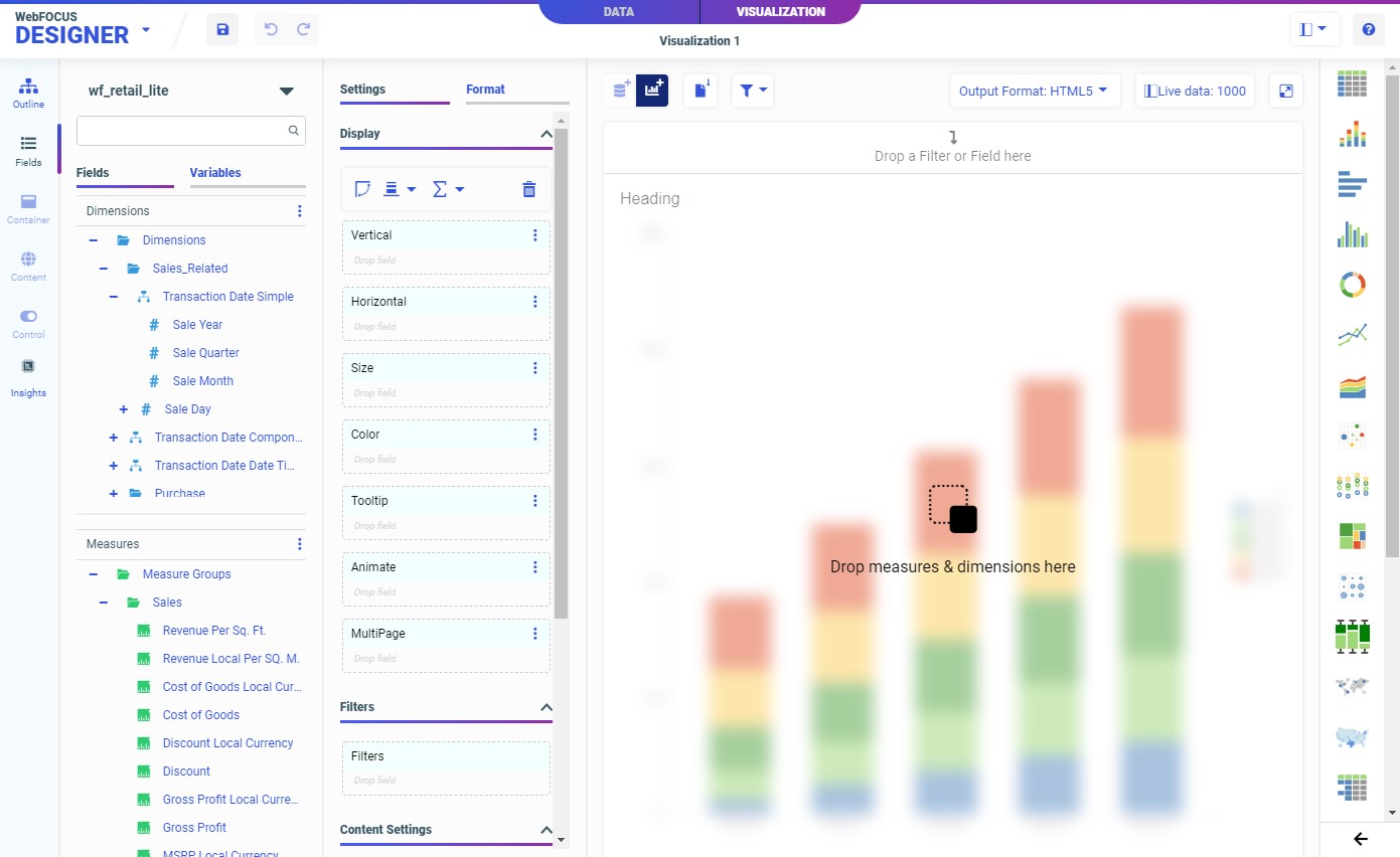
The following image shows the default WebFOCUS Designer interface when you create a visualization.
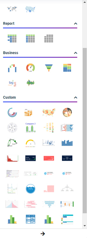
The default content type is a bar chart, but you can change it to another chart type, a report, or a map by using the Content picker, which is located to the right of your canvas. When you choose between the different chart types in the chart picker, you can hover over each content type to display the name and the minimum data requirements to run it (for example, one measure and one dimension). You also have access to a number of chart extensions from the chart picker, which are custom-made charts that can be installed by your administrator. You can view these by expanding the chart picker. Chart extensions display in the Custom section, as shown in the following image.
You select measures and dimensions from the Resources panel with the Fields tab selected on the sidebar. The Resources panel displays the fields that were populated from your data source. You can add fields to your content in the following ways: drag a field to the canvas, double-click a field, or drag a field into one of the buckets.
Once you have created some content, you can format it to enhance its appearance or style. For example, you might want to add a header and footer to identify your content and prepare it for distribution. Depending on the content type, you can access targeted formatting options that allow you to customize the Legend, Series, and Axis in a chart, the theme of a report, the background of a map, and more. Additional options display when working with certain content types. For example, there are special Matrix options to define the style of gridlines and labels for a matrix chart.
If you save your content as a single item, you can add it to visualizations that reference external content.
Alternatively, you can create multiple new content items within a single visualization. To add more content, click the Add Content button on the Designer toolbar. The visualization transforms from a stand-alone content item to a page, and a new container is added. Select the content item with a container to edit it with the same set of options used to edit a stand-alone content item. Once a visualization is transformed into a multi-content page, you can add new content by clicking the Add Content button again, dragging a field from the Resources panel onto an empty area of the canvas, or by dragging a container onto the page.
If you have any multi-content containers in your visualizations, such as tabbed, accordion, or carousel containers, you can create content by dragging a field into the toolbar area of a container. The entire container is highlighted. When you drop the field, the Add Content dialog box appears, prompting you to replace the content in the container or create content with the field in a new tab, accordion panel, or carousel slide.
- Release: 8207
- Category: Visualizing Data
- Product: WebFOCUS Designer