Creating Gauge Charts
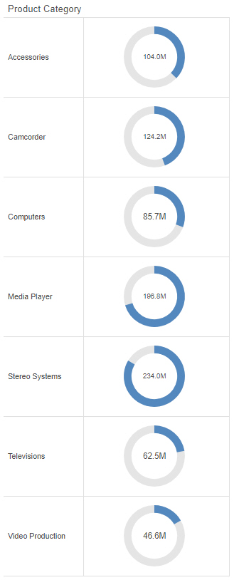
A gauge is a simple visual that shows a measure value. These can be used to create straightforward KPI graphics, or use matrix rows and columns to compare data for different sort values. The following example shows a gauge chart with matrix rows.
The following display options are available for a gauge chart:
- Change chart orientation. Switches the vertical and horizontal matrix axes.
- Chart layout options:
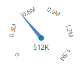
- Circular. Shows the measure value using a pointer with values arranged in a semicircle starting at the bottom left, similar to a speedometer. A circular gauge is shown in the following image.
- Simple. The default value, shows the measure value as a clockwise, colored fill on a circle starting at the top. The value is also displayed as text inside the circle. A simple gauge is shown in the following image.

- KPI. Shows the measure value as text. A KPI gauge is shown in the following image.

- Circular. Shows the measure value using a pointer with values arranged in a semicircle starting at the bottom left, similar to a speedometer. A circular gauge is shown in the following image.
- Calculation options:
- Summaries. Sums measure values for each sort value. This is the default.
- Counts. Provides a count of records in the selected measure field, for each sort value.
- Details. Displays the value of each individual record.
- Clear buckets content. Empties all buckets.
You can add fields to the following buckets for a gauge chart:
- Vertical. A dimension field used to generate matrix rows.
- Horizontal. A dimension field used to generate matrix columns.
- Measure. The measure field whose value is represented by the gauge.
- Tooltip. The data placed in this bucket displays in the tooltip at run time. Can be used to make additional information available without changing the appearance of the chart. The KPI style gauge does not show a tooltip.
- Animate. Enables you to animate time progression using a slider control. As you move the control along the slider bar, an animation effect results. The slider control has a Play button that allows you to play and pause the animation. When you click Play, the Pause option is activated, enabling you to pause the progression and analyze your data. Slider controls are limited to one sort field and should be time or sequence related, such as month or year.
- MultiPage. Enables the creation of multiple graphs based on the field that you place in this bucket. The MultiPage bucket is available for stand-alone charts. If you convert the chart to a page created from new content, the MultiPage bucket disappears.
Procedure: How to Create a Gauge Chart
- Open WebFOCUS Designer. On the WebFOCUS start page, click the plus menu and then click Create Visualizations, or, on the WebFOCUS Home Page, click Visualize Data.
WebFOCUS Designer opens in a new browser tab.
- Select a workspace and a data source available from that workspace.
Once you select a data source, WebFOCUS Designer loads with options to create a single content item.
- On the Content picker, change the chart to a gauge chart.
- Choose a gauge type from the display options. Simple, Circular, and KPI gauge types are available.
- Add one measure to the Measure bucket.
The gauge loads to display the value of the measure field.
- You can make the following additional customizations to your gauge chart:
- Create a matrix chart by adding dimension fields to the Vertical and Horizontal buckets.
- Add additional measures or dimensions to the Tooltip, Animate, or MultiPage buckets of the chart, where applicable.
- Change the fields to obtain different information.
- Format the chart (for example, customize the header and footer or change the series color).
- Save your gauge chart.
- Release: 8207
- Category: Visualizing Data
- Product: WebFOCUS Designer
- Tags: How-to's