Creating Horizontal Bar Charts
Use a horizontal bar chart when you want to emphasize a ranking relationship in descending order. This chart type can also be used when the x-axis label is too long to fit legibly side-by-side.
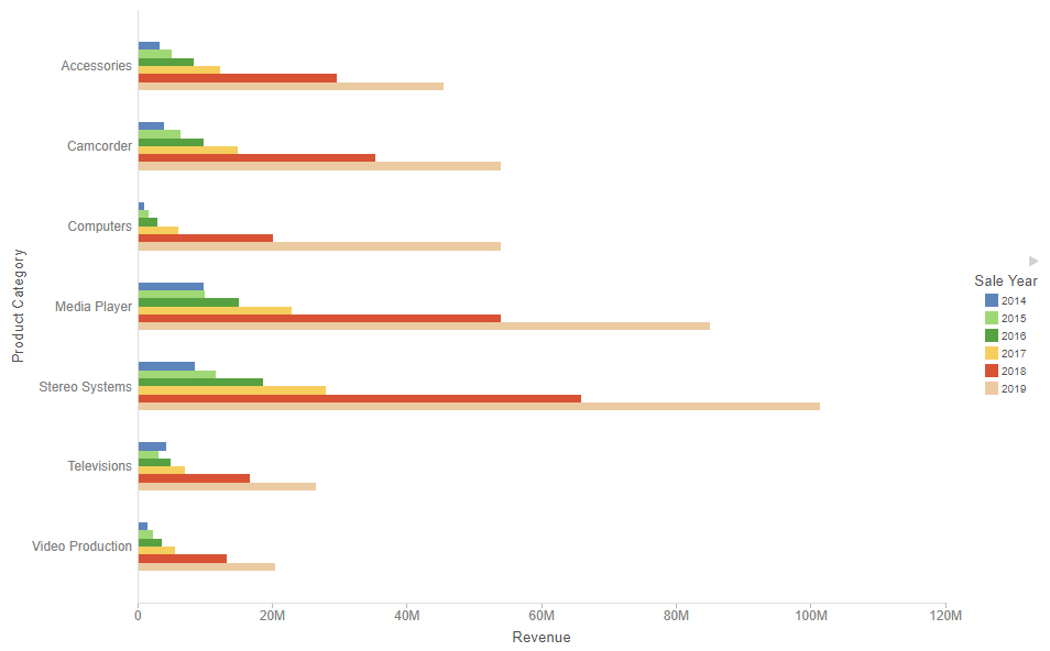
If you add additional measure fields to the Horizontal bucket or add dimension fields to the Color bucket, additional bars are placed in groups for each vertical axis value. A horizontal bar chart with multiple dimension fields is shown in the following image.
Note: Horizontal bar charts require at least one measure and one dimension. Add measures as required to compare additional values.
To sort the bars from high to low, right-click a measure value in the Horizontal bucket and click Sort descending.
The following display options are available for a horizontal bar chart:
- Change chart orientation. Switches the horizontal and vertical axes, making the bars vertical.
- Chart layout options:
- Stacked. When selected, creates a vertical stacked bar chart.
- Side-by-Side. When selected, creates a vertical side-by-side bar chart, in which the series are placed side-by-side in groups.
- Absolute. When selected, creates a vertical absolute bar chart, in which the series are layered in front of one another.
- Percent. When selected, creates a vertical percent bar chart. Each series is stacked to show a proportion of each bar instead of their actual value.
- Calculation options:
- Summaries. Sums measure values for each sort value. This is the default.
- Counts. Provides a count of records in the selected measure field, for each sort value.
- Details. Displays the value of each individual record.
- Clear buckets content. Empties all buckets.
Note: When sorting a bar chart, each series is treated as a unique bar. As a result, groups of series such as stacked bar segments, side-by-side groups, or absolute overlapping bars may be separated.
You can add fields to the following buckets for a horizontal bar chart:
- Vertical. The first field is added to the vertical axis to create a bar for each unique value. You can click the icon in the bucket field label to toggle between using the field as a vertical axis sort field
 or matrix row
  .
. - Horizontal. The first field added to the vertical axis determines the height of each bar. Additional measures create additional series for each bar. Additional dimensions create matrix rows. You can also choose to display multiple measures on different axes in a dual-axis chart by clicking the axis icon
 . Additional dimensions create matrix rows.
 - Size. Controls the width of the bars based on a measure value.
- Color. If a dimension field is used, creates a new series for each value. If a measure field is used, applies a color scale to the bars.
- Tooltip. The data placed in this bucket displays in the tooltip at run time. Can be used to make additional information available without changing the appearance of the chart.
- Animate. Enables you to animate time progression using a slider control. As you move the control along the slider bar, an animation effect results. The slider control has a Play button that allows you to play and pause the animation. When you click Play, the Pause option is activated, enabling you to pause the progression and analyze your data. Slider controls are limited to one sort field and should be time or sequence related, such as month or year.
- MultiPage. Enables the creation of multiple graphs based on the field that you place in this bucket. The MultiPage bucket is available for stand-alone charts. If you convert the chart to a page created from new content, the MultiPage bucket disappears.
Procedure: How to Create a Horizontal Bar Chart
- Open WebFOCUS Designer. On the WebFOCUS start page, click the plus menu and then click Create Visualizations, or, on the WebFOCUS Home Page, click Visualize Data.
WebFOCUS Designer opens in a new browser tab.
- Select a workspace and a data source available from that workspace.
Once you select a data source, WebFOCUS Designer loads with options to create a single content item.
- On the Content picker, change the chart type to a horizontal bar chart.
- Add a measure and a dimension to the chart.
- You can perform the following tasks with your horizontal bar chart:
- Add additional measures or dimensions to the chart, where applicable.
- Change the fields to obtain different information.
- Format the chart (for example, customize the header and footer or style the legend).
- Save your horizontal bar chart.
- Release: 8207
- Category: Visualizing Data
- Product: WebFOCUS Designer
- Tags: How-to's