Creating Ring Pie Charts
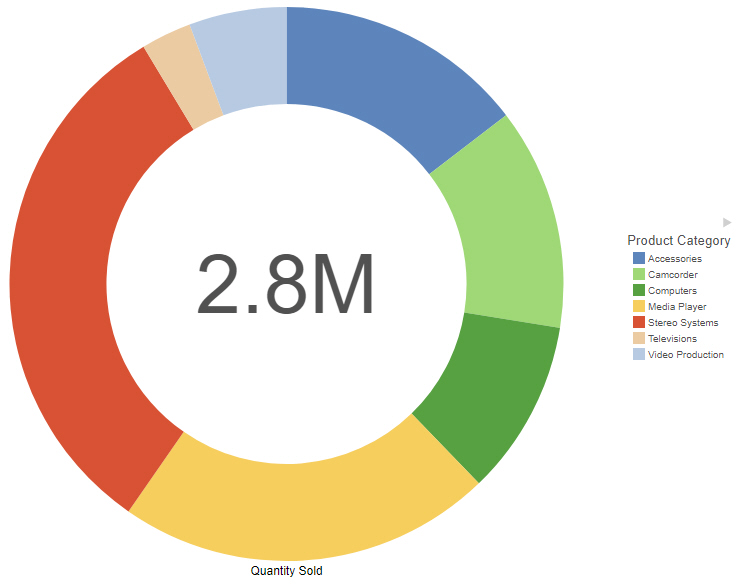
Use a ring pie chart when you want to review the value of each segment, which represents the measure value for the selected dimension, as it relates to the total for the selected measure. The total value represented by all segments displays in the middle of the ring pie chart. The following image shows a ring pie chart.
Note: Ring pie charts require at least one measure (placed in the Measure bucket) and one dimension (placed in the Color bucket). Add additional measures as required to create a separate ring pie for each measure.
The following display options are available for a ring pie chart:
- Calculation options:
- Summaries. Sums measure values for each sort value. This is the default.
- Counts. Provides a count of records in the selected measure field, for each sort value.
- Details. Displays the value of each individual record.
- Clear buckets content. Empties all buckets.
You can add fields to the following buckets in a ring pie chart:
- Vertical. Enables you to specify a field to display row data in a matrix chart. The use of measure fields is supported. Row data is displayed on the left side of the chart, along the y-axis.
- Horizontal. Enables you to specify a field to display column data in a matrix chart. The use of measure fields is supported. Column data is displayed at the top of the chart, along the x-axis.
- Measure. Use this bucket to specify a measure that will define the size of segments in a pie chart. The Measure metric is used with the Color bucket for pie charts to create sections based on your field selections. Each field in the Measure bucket results in a separate ring pie chart.
- Size. When creating a matrix chart that contains ring pie charts, the size bucket controls the diameter of each chart based on a measure value.
- Color. Add a dimension field to the Color bucket to create a segment in the ring pie chart for each value.
- Tooltip. The data placed in this bucket displays in the tooltip at run time. Can be used to make additional information available without changing the appearance of the chart.
- Animate. Enables you to animate time progression using a slider control. As you move the control along the slider bar, an animation effect results. The slider control has a Play button that allows you to play and pause the animation. When you click Play, the Pause option is activated, enabling you to pause the progression and analyze your data. Slider controls are limited to one sort field and should be time or sequence related, such as month or year.
- MultiPage. Enables the creation of multiple graphs based on the field that you place in this bucket. The MultiPage bucket is available for stand-alone charts. If you convert the chart to a page created from new content, the MultiPage bucket disappears.
Procedure: How to Create a Ring Pie Chart
- Open WebFOCUS Designer. On the WebFOCUS start page, click the plus menu and then click Create Visualizations, or, on the WebFOCUS Home Page, click Visualize Data.
WebFOCUS Designer opens in a new browser tab.
- Select a workspace and a data source available from that workspace.
Once you select a data source, WebFOCUS Designer loads with options to create a single content item.
- On the Content picker, change the chart to a ring pie chart.
- Add one measure and a dimension to the chart.
The ring pie chart refreshes with your selections.
- You can perform the following tasks with your ring pie chart:
- Add additional measures or dimensions to the chart, where applicable.
- Change the fields to obtain different information.
- Format the chart (for example, customize the header and footer or style the legend).
- Change the size of the hole in the ring pie chart. On the Format tab, select Series from the area menu, then adjust the value of the Hole Size % property. Setting this property to 0 removes the hole entirely, creating a standard pie chart.
- Save your ring pie chart.
- Release: 8207
- Category: Visualizing Data
- Product: WebFOCUS Designer
- Tags: How-to's