Creating Waterfall Charts
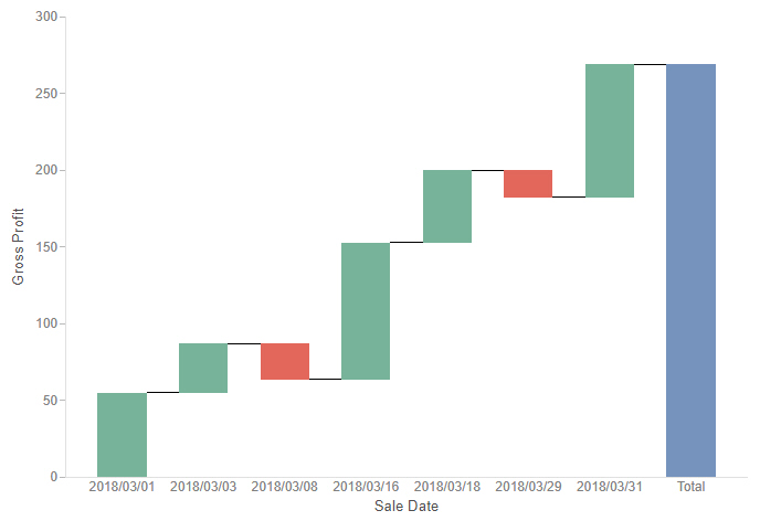
Waterfall charts allow you to see incremental positive and negative changes in your data, resulting in a rolling total. Positive and negative values are represented by different colored risers that start at the end point of the previous riser. Waterfall charts can be a good way to show change over time. An example of a waterfall chart is shown in the following image.
The following display options are available for a waterfall chart:
- Change chart orientation. Switches the vertical and horizontal axes so that the risers draw horizontally.
- Calculation options:
- Summaries. Sums measure values for each sort value. This is the default.
- Counts. Provides a count of records in the selected measure field, for each sort value.
- Details. Displays the value of each individual record.
- Clear buckets content. Empties all buckets.
You can add fields to the following buckets for a waterfall chart:
- Vertical. Specifies the measure field used in the chart to set the riser height. Negative values of this field display in red by default.
- Horizontal. A sort field whose values are represented by each riser.
- Tooltip. The data placed in this bucket displays in the tooltip at run time. Can be used to make additional information available without changing the appearance of the chart.
- Animate. Enables you to animate time progression using a slider control. As you move the control along the slider bar, an animation effect results. The slider control has a Play button that allows you to play and pause the animation. When you click Play, the Pause option is activated, enabling you to pause the progression and analyze your data. Slider controls are limited to one sort field and should be time or sequence related, such as month or year.
- MultiPage. Enables the creation of multiple graphs based on the field that you place in this bucket. The MultiPage bucket is available for stand-alone charts. If you convert the chart to a page created from new content, the MultiPage bucket disappears.
Procedure: How to Create a Waterfall Chart
- Open WebFOCUS Designer. On the WebFOCUS start page, click the plus menu and then click Create Visualizations, or, on the WebFOCUS Home Page, click Visualize Data.
WebFOCUS Designer opens in a new browser tab.
- Select a workspace and a data source available from that workspace.
Once you select a data source, WebFOCUS Designer loads with options to create a single content item.
- On the Content picker, change the chart to a waterfall chart.
- Add one measure to the Vertical bucket, and one dimension to the Horizontal bucket.
The waterfall chart refreshes with your selections. Any positive values display in green, and any negative values display in red, by default. There is also a Total column, which displays in blue by default.
- You can perform the following tasks with your waterfall chart:
- Add additional measures or dimensions to the Tooltip, Animate, or MultiPage buckets of the chart, where applicable.
- Change the fields to obtain different information.
- Format the chart (for example, customize the header and footer or add data labels).
- Save your waterfall chart.
- Release: 8207
- Category: Visualizing Data
- Product: WebFOCUS Designer
- Tags: How-to's