Developing Interactive Content
This topic describes how you can develop and enhance interactive content that has enabled In-Document Analytics capabilities.
Interactive Reports
As a developer, you can create effective, useful reports and share them easily using In-Document Analytics for offline analysis.
A report is used to show the intersections of data between rows and columns. Once created, you can style your report, add headers, and footers, and apply other formatting options to make your data stand out. When you have completed creating your report, you enable In-Document Analytics. Using this format, your users can interact with data, using analysis options similar to those found in an Excel workbook. Since no connection to a server is required to view the data or use the analysis options (for example, filtering, charting, and sorting), you can save and use the report anywhere.
Note: All reports display with HFREEZE ON, a feature that freezes the headings in your report, in In-Document Analytics.
Configuring Analytic Document Options for Reports
You can configure analytic document options for interactive reports, including menu options, based on user role, through the Analytic Document Options dialog box.
You can access the dialog box on the Format tab, in the Features group, by clicking the Analytic Document Options button. The button is available when HTML Analytic Document or PDF Analytic Document is selected as the output type.
The Analytic Document Options dialog box contains the following tabs:
- General
- Menu Options
- Colors
- Advanced Tab
General Tab
Use the General tab to set common properties specific to interactive, analytic reports.
The General tab contains the following options:
Display: This area contains options to set the window to cascade or tabs, and options to freeze columns.
- Window. Select the window setting. The options are Cascade and Tabs.
Note: You can use the Cascade or Tabs options to modify how the output window displays. The Tabs option can be used with the Legacy style only.
- Freeze Columns. Select the columns you would like to freeze. You can also select None.
Page Options: This area contains options to set the number of records per page, enable the display of page information, edit the alignment, and set the location of the page information.
- Records Per Page. Select or type the number of records that you would like to display per page. The default value is 57.
- Display Page Information. Select this option to display page navigation information. Clear this option to disable the display of page navigation information.
- Alignment. Click the appropriate button to set the alignment of the page navigation information. Options are Left, Center, and Right.
- Location. Select the location for the page navigation information. The options are Top Row and Bottom Row.
Chart Options. This area contains options that pertain to charts when the output format is PDF Analytic Document.
Note: Chart Options do not display when the output format is HTML Analytic Document.
- Legend (check box). Select this option to collapse the legend if necessary. Clear this option if you do not want the legend to collapse.
- Legend (menu). Select the location for the legend. The choices are:
- Bottom Left
- Bottom Center
- Bottom Right
Menu Options Tab
Use the Menu Options tab to select a user type and which options to display in the menu.
The Menu Options tab contains the following options:
User Type. The options are Power, Analyst, Basic, and Custom.
- Power. This is the default user type. It enables all functionality.
- Analyst. This user type has the following functionality: Show Records, Freeze, Hide/Unhide, Export, Sorting, Pivot, Filter, Calculations, Chart, Visualize, Restore Original, Save Changes, and Accordion.
- Basic. This user type has the following functionality: Show Records, Freeze, Hide/Unhide, Sorting, Filter, Calculations, Visualize, and Restore Original.
- Custom. If you select a combination of options that does not match one of the existing user types (Power, Analyst, Basic), the User level name that appears in the User Type field is Custom. This is not a default user type or a selectable user type. It indicates that options for this user do not match any of the existing user types.
The options available according to user type include the following:
- Show Records. Shows all records or specific numbers of records.
- Freeze. Freezes and unfreezes columns.
- Hide/Unhide. Hides and shows columns.
- Export. Exports data to HTML, CSV, Excel, or PDF if cache is enabled, or to HTML, CSV, or XML (Excel) if cache is disabled.
Note: If cache is disabled, the output is automatically sent to the Downloads folder. This applies to all interactive outputs, across all browsers, as well as when you are working with a disconnected file for offline analysis.
- Sorting. Sorts data in ascending or descending order.
- Pivot. Lists the fields available to create a Pivot table.
- Window Type. Shows windows as cascade or tabs.
- Send as Email. Enables you to save the current changes and send a report as email.
- Print. Prints all records or filtered-only records.
- Advanced Tools. Accesses the Chart/Rollup, Pivot, and Grid Tools.
- Filter. Opens the Filter Selection dialog box.
- Calculations. Performs the following calculations: Sum, Avg, Min, Max, Count, Distinct, % of Total.
- Chart. Converts a report to a pie, line, bar, or scatter chart.
- Visualize. Adds data visualization bars to a report.
- Rollup. Performs rollup on data.
- Comments. Adds comments.
- Restore Original. Restores the In-Document Analytics enabled report to the default state specified in the report procedure.
- Save Changes. Saves the current changes.
- Accordion. Produces Accordion reports.
- Grid Tool. Opens the Grid Tool dialog box.
Colors Tab
Use the Colors tab to select colors for various objects on the report.
The Colors tab contains the following options:
Page. This area contains options to set the colors for the font and background of the page text.
- Font. Opens the Color dialog box, where you can select the font color.
- Background. Opens the Color dialog box, where you can select the background color for the page text.
Row Selection. Contains options to set the colors that appear when you point to or select a row on the report.
- Hover. Opens the Color dialog box, where you can select the color that the row becomes when you hold the mouse over the row.
- Selected. Opens the Color dialog box, where you can select the highlight color that the row becomes when you use the highlight option.
Visual. Contains options to set the colors for the data visualization bars.
- Positive. Opens the Color dialog box, where you can select the color for a data visualization bar that represents a positive number.
- Negative. Opens the Color dialog box, where you can select the color for a data visualization bar that represents a negative number.
Calculations. Contains options to set the colors for values in a calculation.
- Font. Opens the Color dialog box, where you can select the font color for the calculation.
- Background. Opens the Color dialog box, where you can select the background color for the calculation.
Menu. Contains options to change the color of the menu.
Normal.
- Font. Opens the Color dialog box, where you can select the color for the text of the options on the column menus.
- Background. Opens the Color dialog box, where you can select the background color for the column menus.
- Border. Opens the Color dialog box, where you can select the color for the border of the column menus.
Hover.
- Font. Opens the Color dialog box, where you can select the color for the text of the options on the column menus when you point to them.
- Background. Opens the Color dialog box, where you can select the background color that appears behind options on the column menus when you point to
them.
Advanced Tab
Use the Advanced tab to control the number of rows retrieved from cache and to add security settings.
Note: Cache is enabled when you select HTML Analytic Document as the output type, and click Pages On Demand on the Format tab, in the Navigation group.
The Advanced tab contains the following options:
Cache: Enables a report to cache the data in a binary file and return the data to the output window in pre-set increments.
- Rows Retrieved. Select the number of rows retrieved in the output. The default value is 100.
Security. This area allows you to set a password to access the report and enable expiration by date or by days. This option is only available for the reports that have enabled an In-Document Analytics report output.
Note: When setting security options for interactive reports, be aware that security options can be set for each individual component on the canvas, but only one password can be set for the entire document.
Interactive Charts
Charts are graphical representations of data, showing trends, tendencies, and even possible predictions. A chart often conveys meaning more clearly and effectively than data displayed in tabular form. Charts show summaries on a higher level, giving you a better view of your most important data.
A chart enables you to visually communicate quantitative information. Using a chart, you can give data a shape and form, and reveal patterns and relationships among many data values. A chart can highlight anomalies that require further investigation.
It is important that you choose a chart that is appropriate for your data. InfoAssist provides a complete chart library of both basic and advanced charts. You can choose from a wide variety of charts to best represent the data that you want to display.
In InfoAssist with In-Document Analytics enabled, you can create an interactive chart, change the type of chart, and run the chart to take advantage of the tools that are available to you for online or offline analysis.
Interactive charts support the use of HTML5 extensions, which are user-supplied, custom chart types that access resources external to WebFOCUS. For details on the structure of an extension and the steps for creating your own, as well as the process for adding it to the chart library, see the Adding Your Own Chart Types to the Chart Library chapter in the Creating HTML5 Charts With WebFOCUS Language manual.
If you are working with an AHTML chart that does not have the new chart properties (specifically, non-bucket AHTML charts), you will encounter problems if you change the chart type to one of the following chart types using the Advanced Chart tool at run time:
- Tag Cloud
- Funnel
- Pyramid
- Waterfall
- Histogram
- Radar Line
- Radar Area
- 3D Area
By default, these chart types are hidden in the Advanced Chart tool when the original chart is an AHTML bucket chart. These chart types are available under the following circumstances:
- When the original chart is a non-bucket chart
- When the chart is created from a tabular report
Interactive Dashboards
You can create an interactive dashboard by inserting multiple content types, such as reports, charts, images, and text, into a document. It will run any report or chart using
the In-Document Analytics output format, even if the report or chart itself is not interactive.
You can also insert interactive prompts into a document to act as filters for the reports and charts on the dashboard, as well as cascading (chaining) prompts to populate them based on the selections from the previous prompts.
The output format of the interactive dashboard must be HTML Analytic Document or PDF Analytic Document in order to add interactive dashboard prompts.
Analytic Document Prompts
The Analytic Document prompts group contains buttons that insert components in your dashboard. This group is only visible when the output format of the dashboard is set to HTML Analytic Document or PDF Analytic Document. You can access these options from the Insert tab, in the Analytic Document Prompts group.
The following are the types of prompts that you can use to apply filters to a dashboard:
- Drop Down. Inserts a drop down prompt placeholder in the upper-left corner of the canvas.
- List. Inserts a list prompt placeholder in the upper-left corner of the canvas.
- Checkbox. Inserts a check box prompt placeholder in the upper-left corner of the canvas.
- Radio Button. Inserts a radio button prompt placeholder in the upper-left corner of the canvas.
- Text. Inserts a text area prompt placeholder in the upper-left corner of the canvas.
Note: The display of values populated in the prompts is dependent on the data setting. For example, if sample data is turned on, then the prompts will show sample
data, such as:
WF_RETAIL1
WF_RETAIL2
WF_RETAIL3
Target Reports
When you bind a field to an Analytic Document prompt, the default target report is the report from which you dragged the field. You can add or remove target reports from the prompt through the Analytic Document Options dialog box.
A report must meet one of the following requirements to be a target report:
- The report must contain a field with the same name as the source field (actual field name or AS name).
- The Master File of the report must contain a field with the same name as the source field.
If a report is eligible to be a target report because the field has the same user-supplied title and the title is changed, the report is automatically removed as a target.
How to Add an Analytic Document Prompt to a Dashboard
This procedure describes how to begin to create a dashboard by creating one report and binding a single prompt to one of the fields of the report.
- On the status bar, in the Output Types menu, accept the default output type, or click PDF Analytic Document.
- On the Insert tab, in the Reports group, click Report.
A placeholder appears on the canvas. - Drag fields onto the canvas. or into the Query pane, to create the report and start building the dashboard.
- On the Insert tab, in the Analytics Document Prompts group, select a prompt type, such as Drop Down, List, Checkbox, Radio Button, or Text.
The prompt type you selected now appears in the upper-left corner of the canvas. If the report is located in the upper-left corner of the canvas, you will have to drag the prompt off the report. - Select the report and bind one of its data source fields to the prompt in one of the following ways:
- Query pane: Select the report. From the Query pane, drag the field that you want to bind onto the prompt.
- Report on the canvas: Click the report on the canvas. You can now edit it. Highlight the column that contains the data that you want and drag it onto the prompt.
Once you have bound the field to the prompt, the values of the field appear in the prompt.
Note: Once a prompt is added to the canvas, the document is locked in an In-Document Analytics output format, and you cannot change the format. To switch to a non-interactive output format, you must remove all prompts.
Using Multiple Reports as Target and Sources
You can add multiple reports and charts to an interactive dashboard. Each report can have multiple prompts associated with it.
How to Build a Dashboard with Multiple Reports
The following procedure describes how to set up Analytic Document Prompts for two reports on a dashboard. In the example that is used, the first report contains information about the categories of electronics products sold in various regions. The Product,Category field will be bound to a group of radio buttons. Each radio button will represent a particular product category of electronics. When you select a radio button for a product category, for example, Accessories, the report will be filtered by your selection.
The second report contains information about the gender and geographic location of electronics consumers. The Gender field will be bound to a drop-down list. The
list will display the values, F (female) and M (male). When you select a gender from the drop-down list, the report will be filtered by your selection.
1. Open InfoAssist in Document mode using the wf_retail_lite Master File.
2. Create an interactive dashboard by adding two reports with the following components, respectively:
Report 1:
- Product,Category
- Store,Business,Region
- Discount
- Gross Profit
Report 2:
- Gender
- Customer,Continent
- Product,Category
3. On the Insert tab, in the Analytic Document Prompts group, add the following prompts to the dashboard, positioning the relative to each respective report.
- Radio Button: This will be used for Report1.
- Drop Down: This prompt will be used for Report2.
4. Right-click the radio button prompt for which you want to bind a field to and click Properties.
The Analytic Document Prompt Properties dialog box opens.
The Prompts list displays the two prompts (for example, radiobutton_1 and combobox_2) that were added to the dashboard in step 3.
5. From the Report drop-down menu, select the report that contains the field to which you want to bind a prompt.
In this example, the radio button list (radiobutton_1) has been selected as the prompt for the region report (Report1), as shown in the following image.
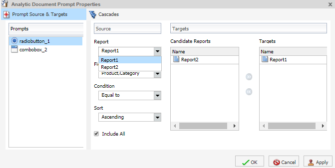
The next step describes how to bind the Product,Category field from the region report to the radio button list to filter that report.
6. From the Field drop-down menu, select the field to which you want to bind the prompt.
In this example, the Product,Category field has been selected for the radio button list (radio_button1), as shown in the following image.
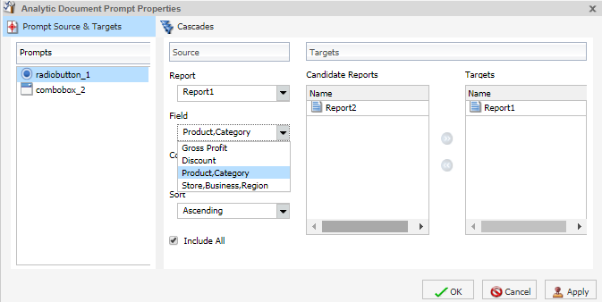
Note: You can optionally specify and ascending or descending sort order for the current scenario.
7. Click OK.
The prompt is now bound to the field on the dashboard.
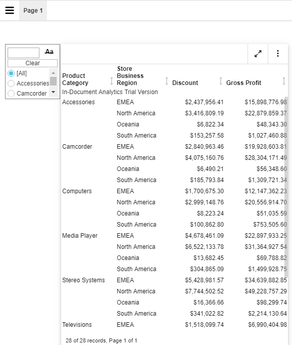
In the following image, the radio button list is bound to the Product,Category field. It displays all product categories by which you can filter the report.
The following steps describe how to bind the Gender field in the gender report (Report2) to the drop-down list prompt.
8. Right-click the Drop Down prompt for which you want to bind a field and click Properties.
The Analytic Document Prompt Properties dialog box opens again.
Notice that combobox_2, the prompt selected on the dashboard, is selected in the Prompts list.
9. From the Report drop-down menu, select the report (Report2) that contains the field to which you want to bind a prompt.
The next step describes how to bind the Gender field from the gender report to the drop-down list to filter that report.
10. From the Field drop-down menu, select the field (Gender) to which you want to bind the prompt.
Once the Gender field has been selected, Report2 (gender report) appears in the Targets list and Report1(region report) appears in the Candidate Reports list.
Note: To move a report from the Candidate Reports list box to the Targets list box, select it and click the Add to List arrow. To remove a report from the Targets list box, select it and click the Remove from List arrow. You can select multiple reports by holding down the Ctrl key and clicking each one.
11. Click OK.
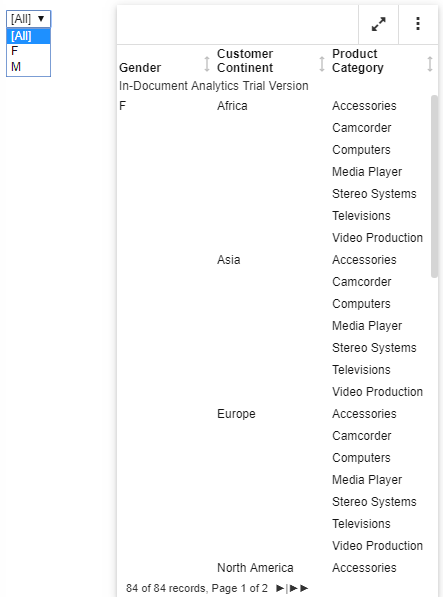
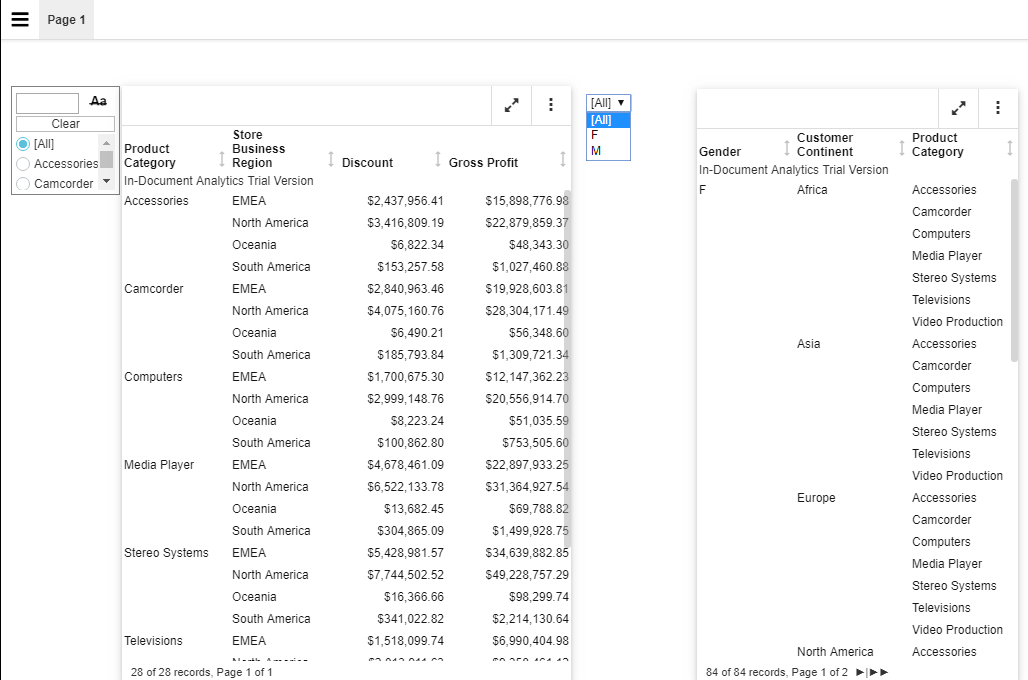
The prompt is now bound to the Gender field on the dashboard. You can now filter the gender report by female or male, as shown in the following image.
The final dashboard displays, as shown in the following image.
How to Change the Field
You can change the field to which the prompt is bound.
- Create an interactive dashboard in Document mode, or open an existing dashboard, and bind a prompt to a field.
- Right-click the prompt that you waant to configure, and click Properties.
The Analytic Document Prompt Properties dialog box opens. - From the Field menu, select a different field.
A warning message alerts you that changing the source field for the prompt will remove the existing prompt and any dependent (child) prompts from the cascades) - Click OK to close the warning.
- Click OK to close the Analytic Document Prompt Properties dialog box.
The prompt is updated with the new source field.
How to Change the FIlter Condition
- Create an interactive dashboard in Document mode, or open an existing dashboard, and bind a prompt to a field.
- Right-click the prompt that you want to work with, and from the shortcut menu, select Properties.
The Analytic Document Prompt Properties dialog box opens. - From the Condition drop-down menu, select the filter condition for the prompt. The options are Equal to, Not equal to, Less than, Less than or equal to, Greater than, and Greater than or equal to.
- Click OK.
The filter condition is applied to the prompt.
How to Add Multiple Prompts to a Dashboard
- Create an interactive dashboard in Document mode, or open an existing dashboard containing at least one report, and add at least two prompts.
- Bind the fields to prompts that you have added.
How to Cascade Prompts
When you have more than one prompt on the canvas, you can cascade prompts to populate them based on the selections of the previous prompts. Cascading prompts have a parent-child relationship, in which the parent filters the available options of the child.
A prompt can be the parent of more than one other prompt, but cannot be a child of more than one prompt.
- Create an interactive dashboard in Document mode, or open an existing dashboard, and bind at least two prompts to fields.
- Right-click the prompt that you want to configure, and click Properties.
The Analytic Document Prompt Properties dialog box opens. - Click Cascades.
By default, a cascade name Cascade1 appears in the Cascades section of the Analytic Document Prompt Properties dialog box.
- You can click the Create a new cascade button to create a new cascade.
- You can click the Delete selected cascade button to delete the selected cascade.
- Select the cascade to which you want to add prompts.
- From the Available Prompts list box, select the prompt that you want to add.
- Click the Add to List arrow to move the selected prompt to the Selected Prompts list box.
Note: You can remove prompts from the Selected Prompts list box by selecting them and clicking the Remove from List arrow. - Add any additional prompts you want to be part of the cascade by repeating steps 5 and 6./
By default, the hierarchy of the prompts is determined by the order in which they are added to the Selected Prompts list. The cascade of the prompts is from top to bottom. The prompts that come first in the Selected Prompts list are the parents of the lower prompts. - You can change the hierarchy of the prompts by selecting a prompt in the Selected Prompt list box and clicking the Move Up and Move Down arrows.
- Click OK.
The cascade is created. - Run the report.
Note: If you set up more than one cascade, the cascade that you interact with last is the one that filters the report.
- Release: 8207
- Category: Visualization and Analytics
- Product: In-Document Analytics
- Tags: How-to's