In-Document Analytics Options for Charts
If you are working with a chart using the Chart Rollup Tool and you subsequently create a new chart, the new chart launches with a metadata tree, buckets, and the chart picker. This look and feel is similar to the common interface of WebFOCUS Designer, as shown in the following image.
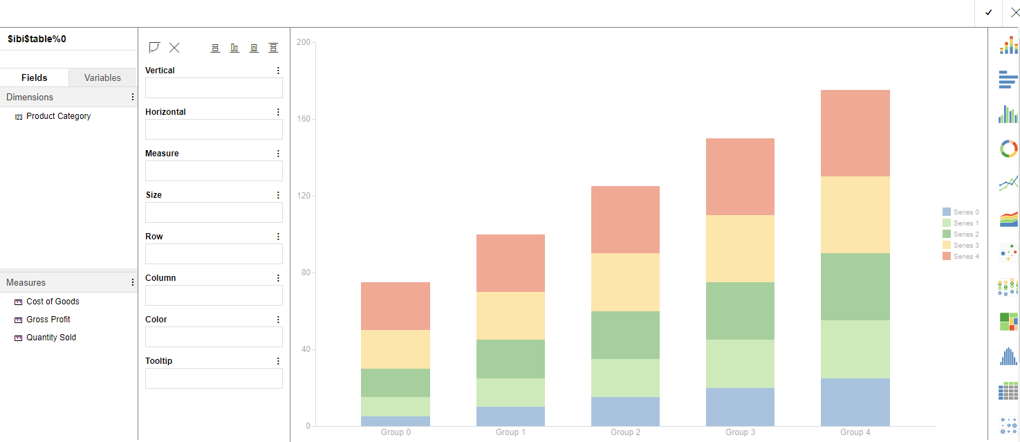
The interface loads with the fields that you had originally selected. This makes it easy to select different fields to create different types of charts at run time.
You can drag or double-click items to add items into the buckets. In this way, you can model different scenarios to create a chart that meets the needs of your organization. Once you have selected the fields to include, you can select a chart type from the chart picker, which displays on the right of the interface.
Note: To use auto drill with an AHTML chart, the chart window closes if you drill up or drill down on a dimension from the hyperlink in the report at run time. In order for this to work correctly, you must be in connected mode in order to make a new call to the reporting server.
When you are done, click the checkmark, located at the top right of the interface, to apply the specified changes to your chart and return to the original canvas.
You can test out various scenarios and review different results, all within one session.
Legacy Style Chart Options
Options for an interactive chart that uses the Legacy styling are described in the following table.
| Option | Definition |
| More Options | New. Creates a new instance of the chart. This option is available only when the chart is created from a column menu on a tabular report. |
| Group By (X). Changes groups by the horizontal sort field. | |
| Add (Y). Adds a vertical sort field. | |
| X-Axis. Specifies a measure or dimension sort field. Applies to scatter charts. | |
| Y-Axis. Specifies a measure. Applies to scatter charts. | |
| Arrange By. Specifies the marker color. The marker color depends on the field assigned to the color attribute. If no field is assigned to this category, then all of the markers will be the same color. Applies to scatter charts. | |
| Export to. Exports to Excel, Word, or PowerPoint. | |
| Stacked. Stacks the risers on top of each other, with the length of each riser representing the data value. Applies to column charts. | |
| Top. Displays the top values. Options are Top 3, Top 5, Top 10, and Clear Top. Applies to pie charts. | |
| Trend. Draws a trendline and equation label for an individual series. Applies to scatter charts. | |
|
Chart/Rollup Tool. Opens the Chart/Rollup Tool, which you can use to select multiple group fields in the chart or rollup table generated. The Chart/Rollup Tool contains a list of columns available in the report and Group By and Measure sort fields. Drag the columns into the desired sort field. Note: When working with the Chart/Rollup Tool for charts (specifically those with the new chart attribute syntax), the Series tab is not supported. It is available with charts that are created with tabular reports or stand-alone charts that do not use the new chart attribute syntax. |
|
| Restore Original. Restores the chart to its original state. | |
| Column | Displays data as a column chart. |
| Pie | Displays data as a pie chart. |
| Line | Displays data as a line chart. |
| Scatter | Displays data as a scatter chart. |
| Rollup | Displays data as a rollup table. |
| Advanced Chart | Opens the Chart/Rollup Tool. |
| Original Chart | Restores the chart to the chart type specified in the report procedure. |
| Lock/Unlock |
Freezes the chart or rollup table. You can link or unlink a chart or rollup table to the filters that you have applied in your report using the Freeze Chart or Freeze Rollup icon. The icon indicates whether the report is linked to the filter (Freeze Chart or Freeze Rollup) or not (Unfreeze Chart or Unfreeze Rollup). This option is available only when the chart is created from a column menu on a tabular report. |
| Aggregation | Applies the following options to a Measure field: Sum, Avg, Min, Max, Count, and Distinct. The default value is Sum. |
| Remove Filter | Removes a filter from a chart. You can apply a filter by pointing to or lassoing an area of the chart and then clicking the Filter Chart or Exclude from Chart option from the chart tooltip. |
- Release: 8207
- Category: Visualization and Analytics
- Product: In-Document Analytics
- Tags: Enhancements, How-to's