Formatting Box Plots
A box plot is a common chart type used to show key distribution information for a set of data points. A box plot displays outliers, the median, the upper and lower quartile, and the maximum and minimum with outliers excluded, by default. However, you can use the Box Plot options on the Format tab to show the mean, or average, as well. Additionally, you can change the display of the whiskers from lines to boxes, and change the style of the median and whisker lines.
To access the Box Plot properties when creating a box plot, click the Format tab and select Box Plot options from the Quick Access menu. The following options are available:
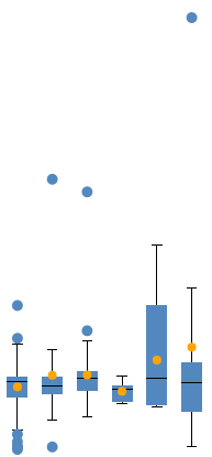
- Show Mean. Displays a marker at the mean point, which you can compare with the median to get an idea of the skewness of your data.
An example of a box plot with mean markers enabled is shown in the following image.
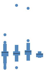
- Show Hat as Box. Changes the appearance of the whiskers in the box plot from lines to boxes.
An example of a box plot with the Show Hat as Box option enabled is shown in the following image.
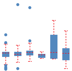
- Line style. You can change the pattern of the median and whisker lines from a solid line to a dotted or dashed line, and change the width and color of the lines.
Procedure: How to Format a Box Plot
- Open WebFOCUS Designer. On the WebFOCUS start page, click the plus menu and then click Create Visualizations, or, on the WebFOCUS Home Page, click Visualize Data.
WebFOCUS Designer opens in a new browser tab.
- Select a workspace and a data source available from that workspace.
Once you select a data source, WebFOCUS Designer loads with options to create a single content item.
- From the Content picker, select the Statistical Boxplot chart type.
- Add a measure to the Vertical bucket and a dimension to the Horizontal bucket.
A single measure value displays as a line in each column.
- Use one of the following methods to generate a set of data for each column:
- Add a dimension field to the Detail bucket. This field should provide multiple records for Horizontal bucket value.
- Change the calculation option from Summaries to Details
 . If you have a very large data source, this may generate too many records to evaluate in the box plot.
A set of box plots appears on the canvas, showing indicators for outliers, maximum and minimum, median, and upper and lower quartiles.
- On the Format tab, click General and select Box Plot options from the Quick Access menu.
- Optionally, select the Show Mean check box to display a marker in each box plot indicating the location of the mean.
- Optionally, select the Show Hat as Box check box to display the whiskers as narrow boxes on either side of the box showing the interquartile range.
- Optionally, change the style of the median lines and whisker lines.
Click the box showing an image of the line to change the line pattern to one of a variety of dashed and dotted lines. Use the spinner to change the width of the lines, in pixels. Click the color swatch to change the color of the lines.
The box plot updates on the canvas as you make your changes.
- Once you finish creating and formatting your box plot, save it, or convert it to a page to develop more content.
- Release: 8207
- Category: Visualizing Data
- Product: WebFOCUS Designer
- Tags: How-to's, Release Features