Formatting Matrix Charts
If you are working with a chart type that supports a matrix format (for example, Matrix Marker, or another chart type utilizing matrix rows and columns), WebFOCUS Designer provides a selection of formatting options that you can use to customize and enhance the styling of your chart. A matrix format is a grid that contains values based on the intersecting data points, which is useful for reviewing changes and trends over time. Available formatting options for matrix charts include Headers and labels, and Lines, as shown in the following image.
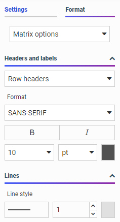
You can customize the row and column headers and their corresponding values in a matrix chart. Specifically, you can change the font type, font size, and color. You can also change the emphasis of the font using bold or italic styling. You can also change the alignment of row values text.
When working with lines in your matrix chart, you can change the line style (for example, solid or dotted) and the thickness. These formatting options allow you to make visible enhancements that will improve the appearance and presentation of your matrix charts.
Procedure: How to Format a Matrix Chart
To format a matrix chart:
- Open WebFOCUS Designer. On the WebFOCUS start page, click the plus menu and then click Create Visualizations, or, on the WebFOCUS Home Page, click Visualize Data.
WebFOCUS Designer opens in a new browser tab.
- Select a workspace and a data source available from that workspace.
Once you select a data source, WebFOCUS Designer loads with options to create a single content item.
- From the Content picker, select the Matrix Marker chart type.
- Add two dimensions and two measures to the chart. These data fields should be placed in the Vertical, Horizontal, Size, and Color buckets.
- On the Format tab, click General and then click Matrix options from the drop-down list.
- Apply formatting changes for the matrix chart, including:
- Headers and labels, which allow you to customize the font options for row and column headers and values. Font options include font type, bold, italic, font size, and font color.
- Line style, which allows you to adjust the type, size, and color of the lines for the matrix chart.
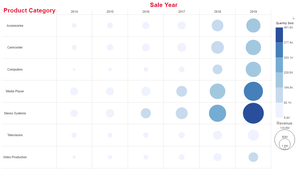
- Change the font being used for row and column headers to bold, red, and size 16 font.
The updated matrix chart now displays customized row and column headers, as shown in the following image.
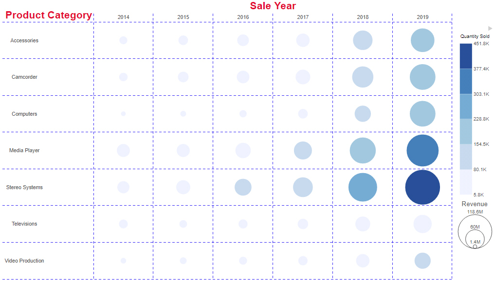
- Using the options in the Lines section, change the line style to blue, dashed lines.
The resulting matrix marker chart resembles the one shown in the following image.
- Release: 8207
- Category: Visualizing Data
- Product: WebFOCUS Designer
- Tags: How-to's