Formatting Series in a Chart
A series represents a set of related values in a chart. These could be different measure fields in a chart, or different dimension field values in a chart. You can format all series together, or format each separately, including color, shape, display options for labels, and other options, including the ability to hide overlapping labels. You can select a specific series in a chart to which to apply changes, or you can select All Series, which applies changes to all series in the chart.
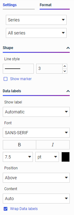
Having the ability to format by series gives you control over your content and allows you to customize display options at the series level. For example, you might want to color code a chart based on a range of values. You can also specify options for the data labels of the series. By default, these are enabled or hidden automatically depending on the chart type, but can be turned on or off. You also have the standard suite of font options, as shown in the following image.
Different kinds of charts allow you to make different series-level style changes. For example, in a bar, area, or line chart you can set the width of all bars, or change a series to display as a line or area instead of a bar or bar segment. In a ring pie chart, you can change the size of the hole in the middle when viewing the options for all series, and on a scatter plot or bar, area, or line chart, you can add and style a trend line with different formulas for all series or an individual series. Other chart types allow different styling changes.
Additionally, some series styling options are only available when modifying all series in a chart, or only available when editing a single series. For example, when creating a bar chart, you can set the bar width for all series, but not for a single series. On the other hand, you can change the fill color for a single series, but not for all series in the chart.
When working with series in a chart, you can also set an option to control the display of data labels in your chart. The default is Auto. This gives you the ability to specify how your data will be presented (for example, by Value or Percentage), which is particularly useful in cases where you want to save real estate when using data labels in your chart, or show additional information. You can click the drop down to access a full list of content options, as shown in the following image.
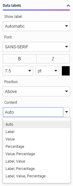
You can use the following terms to decide the best way to display the content of your data labels.
- Auto. The chart engine decides what data label information to show. This is usually the value.
- Label. Shows the series label of the riser, marker, or slice (same as legend label)
- Value. Shows the value of the riser, marker, or slice, using the numeric format of the field. For example, if the field defined in the master file is US Currency with two decimal places of precision, then that is what the dataLabel will be ($123.45).
- Percentage. Shows the percentage of the riser/slice based on the group to which it belongs.
- Value,Percentage. Shows the value of the riser, marker, or slice, with numeric formatting and the percentage of the riser/slice based on the group to which it belongs.
- Label,Value. Shows the series label of the riser, marker, or slice (same as legend label) and the value of the riser, marker, or slice, with numeric formatting.
- Label,Percentage. Shows the series label of the riser, marker, or slice (same as legend label) and the percentage of the riser/slice based on the group to which it belongs.
- Label,Value,Percentage. Shows the series label of the riser, marker, or slice (same as legend label), as well as the value of the riser, marker, or slice, with numeric formatting. It also shows the percentage of the riser/slice based on the group to which it belongs.
When creating a stacked bar, stacked area, or stacked line chart, you can also select the Show stacked totals option to show the summed total of all series at the top of each bar or sort-value point.
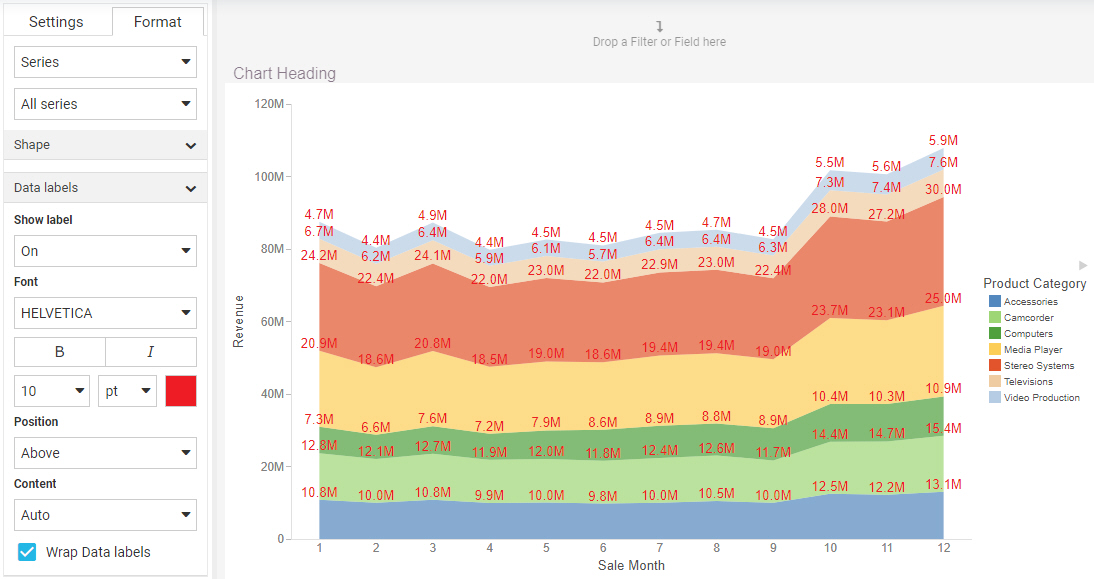
You can also Wrap Data labels, which allows you to truncate available chart space or show your data on multiple lines. The following examples show how the wrapping option works.
Example of WrapDataLabel=True:
"France
$123.4
23.4%"
Example of WrapDataLabel=False:
"France, $123.4, 23.4%"
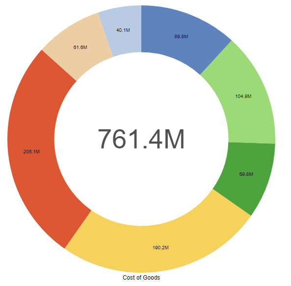
Specifically, the data label options allow you to determine what is shown when Show label is ON. For example, Label,Value,Percentage. If the option is set to Auto, the chart engine decides what it thinks is the best content to show. Typically, this is the value of the riser or slice. For example, on a basic pie chart, the Auto setting produces the following result.
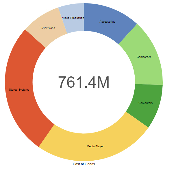
You have additional content choices. For example, you can choose Label, which corresponds to the series label that is shown in the legend. When you select the Label option, you also have the option of turning the legend off, so as not to duplicate the information that is displaying in your chart. The Label option is shown in the following image.
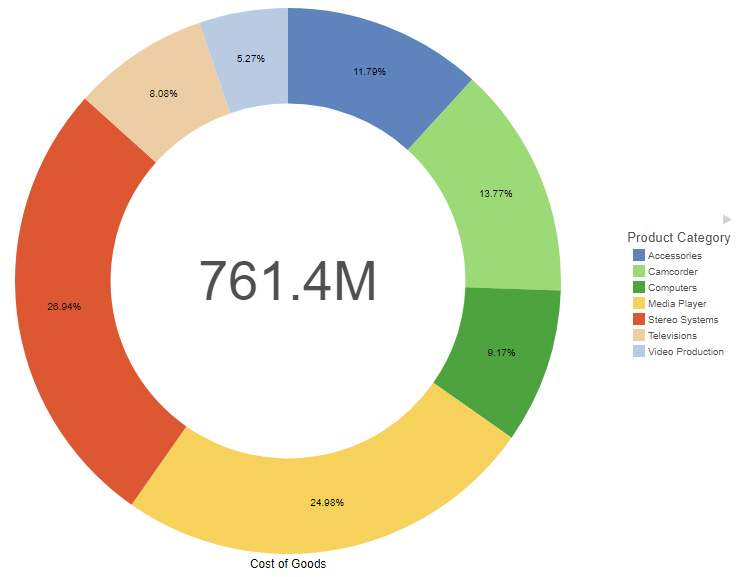
You can also choose Percent, which shows the percentage of the whole for each riser or slice. This is very useful for a pie or stacked bar chart, as these are the charts that are best used to visualize the concept of percentage-related content, as shown in the following image.
You can also display the Value, which is the riser/slice value. This is often the same thing you will get if you choose Auto.
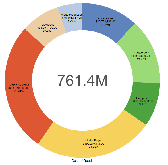
There are also options for you to combine three choices, such as Value, Label, and Percent. This allows you to display all three items, as shown in the following image.
Click Wrap Data labels to display the content on three separate, unique lines, or clear the Wrap Data labels check box to display all label information on a single line.
Procedure: How to Format a Series
- Open WebFOCUS Designer. On the WebFOCUS start page, click the plus menu and then click Create Visualizations, or, on the WebFOCUS Home Page, click Visualize Data.
WebFOCUS Designer opens in a new browser tab.
- Select a workspace and a data source available from that workspace.
Once you select a data source, WebFOCUS Designer loads with options to create a single content item.
- Create a Vertical Stacked Area chart.
- Add a measure to the Vertical bucket, a dimension (for example, a time based dimension with month or year values) to the Horizontal bucket, and another dimension to the Color bucket, as shown in the following image.
- On the Format tab, open the quick access menu and then click Series.
- In the Data labels section, in the Show label group, turn data labels on by changing the setting from Automatic to On.
Since All series is selected by default, labels are displayed for every series in your chart.
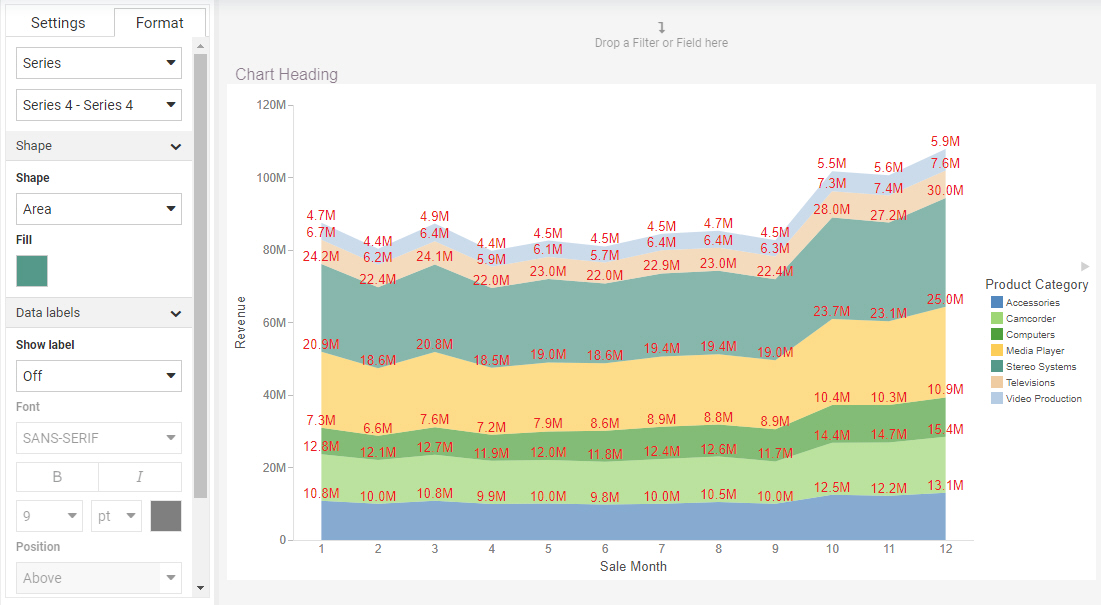
- Format the labels with 10 point, red font using the font options.
The values in the chart reflect your custom formatting, giving you a better view of your data, as shown in the following image.
- Change the color of one of the risers.
- From the series selection drop-down menu, on the Format tab, directly below the quick access menu, select a single series. Each series represents a value from the field in the Color bucket.
If your chart contains multiple measure fields, then each series represents a measure field in addition to or instead of a dimension value.
- In the Shape section, change the color selected for the Fill option to a color of your choice.
The selected series riser updates to show the new color, as shown in the following image.
- From the series selection drop-down menu, on the Format tab, directly below the quick access menu, select a single series. Each series represents a value from the field in the Color bucket.
- Release: 8207
- Category: Visualizing Data
- Product: WebFOCUS Designer
- Tags: How-to's