Summarizing Numeric Data Using Filters
When you create a filter for a measure field in new content, you can choose to filter by aggregated values, using a Summary filter, or by individual records, using a Detail filter. This enables you to review data from a high level or based on a more granular view.
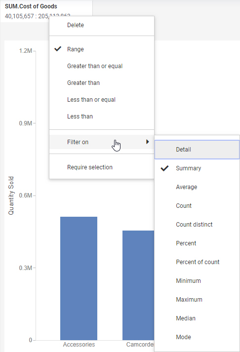
To specify one of these options in a new prompted filter, when you place a measure on the Filter toolbar, right-click it and point to Filter on to access the Detail and aggregated filter options, which are shown in the following image.
To choose between detail and aggregated filter options when creating a static filter, drag a measure to the Filter bucket and select an option from the Apply aggregation drop-down menu.
Summary filters are indicated by an aggregation prefix operator on the filter control label.
The Summary option, which is the default for measure fields, allows you to select records based on the summed, aggregated value of a field. All values for the chart, report, or page are calculated, and then the aggregated values are filtered based on whether they meet the filter requirements. For example, if you create a chart that shows Revenue sorted into Product Categories, you can use a summary filter to display only the Product Categories that meet the selected filter requirements.
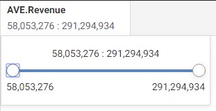
If you create a new summary filter in a visualization with multiple content items, the minimum and maximum values available in the filter control are the minimum and maximum values across all combined sort fields in the entire visualization. For example, if you created a chart that was sorted by Product Category, and then added a second chart that was sorted by Sale Year and colored by Sale Quarter, then the values in the summary filter would reflect the range of values for each product category and each combined sale year and sale month. In the following image, the minimum available value for the summary filter on the Revenue field is 11,047,133, which is the revenue from Q1 2014 in the bar chart on the right. This is the smallest value on the page. The maximum available value, 291,294,934, is the revenue for stereo systems in the pie chart on the left. This is the largest value on the page.
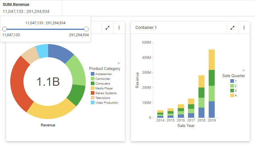
All of the other values in the pie chart and the bar chart on the page fall between these two points. As a result, certain summary filter selections may exclude all values from one chart, but not another.
You can also filter using Detail values, which represent each record of your data source. In this case, filtering occurs before the values are calculated for each sort value. If you create a chart that shows Quantity Sold sorted by Product Category and add a Detail filter, the individual record values from the data source are filtered based on whether they meet the filter requirements, and then sorted into product categories and aggregated to display the quantity sold for each.
You can also filter using Detail values, which represent each record of your data source. In this case, filtering occurs before the values are calculated for each sort value. If you create a chart that shows Quantity Sold sorted by Product Category and add a Detail filter, the individual record values from the data source are filtered based on whether they meet the filter requirements, and then sorted into product categories and aggregated to display the quantity sold for each.
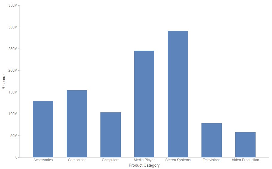
Consider the following two charts, each of which uses a filter for Revenue greater than $10,000. The first chart uses a Summary filter, so it is filtered after aggregation. It displays Revenue values for every product category that had over $10,000 in total revenue. Each of the seven product categories met this criterion, and are therefore displayed in the chart, as shown in the following image.
In the second chart, the Summary filter has been changed to a Detail filter where Revenue is greater than $10,000. This filter is applied before data aggregation. Since each record in the data source represents a single sale, the data is filtered for individual sales that earned revenue of over $10,000. Those values are then grouped by Product Category into the chart shown in the following image.
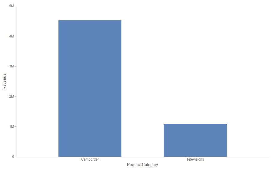
In this case, the only individual sales for more than $10,000 were for camcorders and televisions.
In addition, when working with numeric filters, you can select the type of aggregation to be used in a Summary filter. By default, a Summary filter, created using the Summary option, uses the sum aggregation. You can also apply standard aggregation methods including average, count, count distinct, minimum, and maximum to a Summary filter. Selecting one of these options filters your content for aggregated values matching the specified criteria, as shown in the following image of a filter control using the average aggregation method.
If you create a filter for a field in your chart or report that already uses a prefix operator aggregation, by dragging the field from a bucket to the filter toolbar or by right-clicking it in a bucket and clicking Add to filter toolbar, a Summary filter is created with the prefix operator aggregation applied.
If the field with the prefix operator is a dimension field, which can use the count, count distinct, or percent of count prefix operator aggregations, then you can create two filters for the field, one for the non-aggregated dimension field and one for the aggregated version of the field.
If your request produces a single aggregated value before applying a Summary filter, such as when there are no sort values, the filter control shows a single Summary value instead of providing a range. If you point to the filter value on the Filter toolbar, a tooltip appears that says, Summary filter irrelevant. Change to Filter on Detail or add a sort field to your request.
If you create a Summary filter and then changes are made to the request such that the minimum or maximum value on the Summary filter range falls outside the range of values in your data, then that filter value appears in red in the control. If you point to it, a tooltip indicates that it is outside the range of your data. The filter is still valid, but may not be applicable to the current state of your content. Similarly, when creating a static filter, you can type a value that is outside the range of values in your data. In this case, the text box displaying the value is outlined in purple and a message indicates that the value is out of range.
If you create a numeric range in a static filter where the minimum value is greater than the maximum value, the filter is not valid, and you cannot save it. A warning appears alerting you that the start and end points are invalid.
- Release: 8207
- Category: Visualizing Data
- Product: WebFOCUS Designer