Using the Column Menu for Reports
The column menu displays when you click a column heading in a report. This provides you with access to formatting tools, chart type options, and filters, giving you more control over what displays in your report.
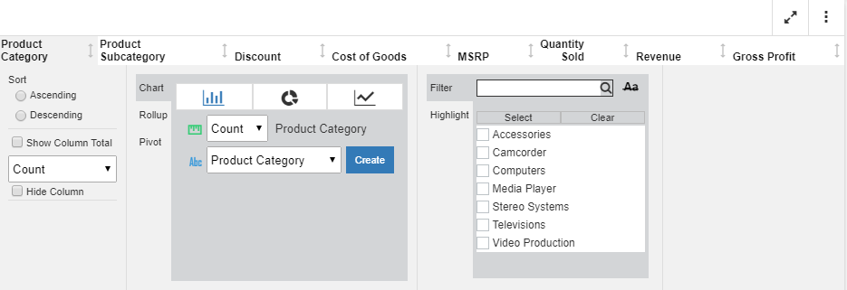
For a non-measure or dimension column, there are three primary sections to the column menu, as shown in the following image.
You can customize each column in your report. For example, you may want to filter on specific product categories while displaying column totals for others. This allows you to create and customize your report column by column.
You can use the following information to identify column menu components as you build your report:
Show Column Total. Displays the column total for the currently selected column. Column totals display at the bottom of the report.
Freeze Column. Freezes the selected column in place, allowing you to easily scroll the columns to the right.
Hide Column. Hides the currently selected column. This removes the currently selected column from view.
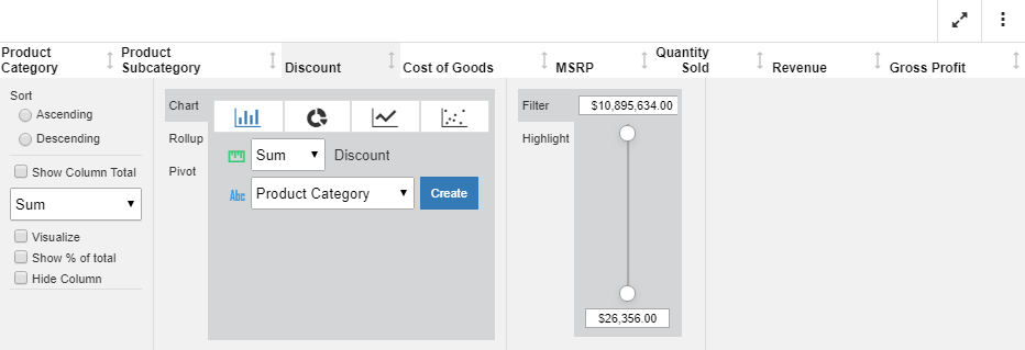
Chart Rollup. Select a chart type and, optionally, specify an aggregation other than the default value, Sum. Select a column for which to create the chart and click Create. The chart is created in a separate dialog box, enabling you to interact with the chart using the chart features and options.
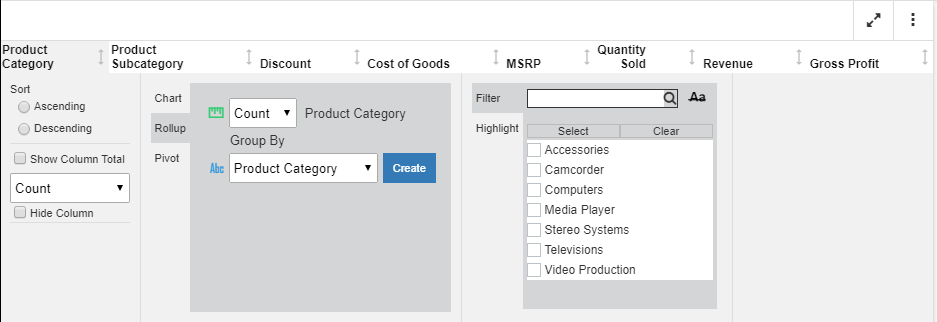
Rollup. Use the Rollup option to select an aggregation for the currently selected column. You can also select a Group By value, options for which include the list of different columns in the report. Once you have made your selections, click Create to create the rollup, as shown in the following image.
Pivot. Use the Pivot option to create a cross-tab Pivot table. You can select an aggregation for the currently selected column. Next, specify a column value by which to group the report. Indicate an Across value to create the across values in your table. Click Create to create the pivot table, which displays in the analysis panel, as shown in the following image.
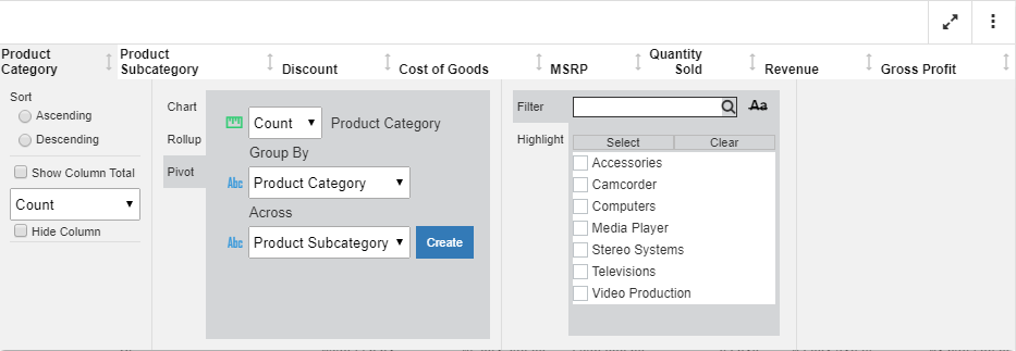
Note: The available group and across values include the dimension column values in your report (for example, Product Category).
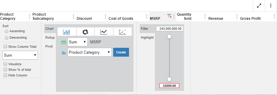
Numeric Slider. If you are working with a measure value (for example, MSRP), you can use the slider tool to narrow the values you want to display. The slider shows the lowest to highest values in your measure, as shown in the following image.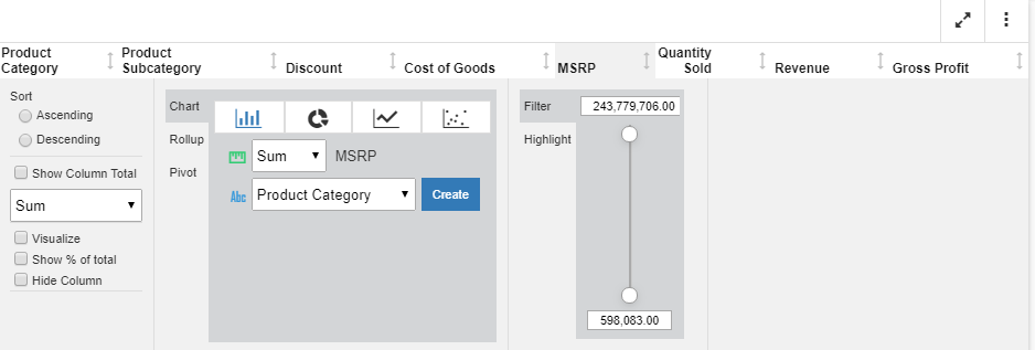
You can specify a range of values by entering the values into the text boxes. This allows you to specify a range of values for a specific measure. If a value falls outside of the range of the data values, it will be crossed out, indicating that the value is invalid, as shown in the following image.
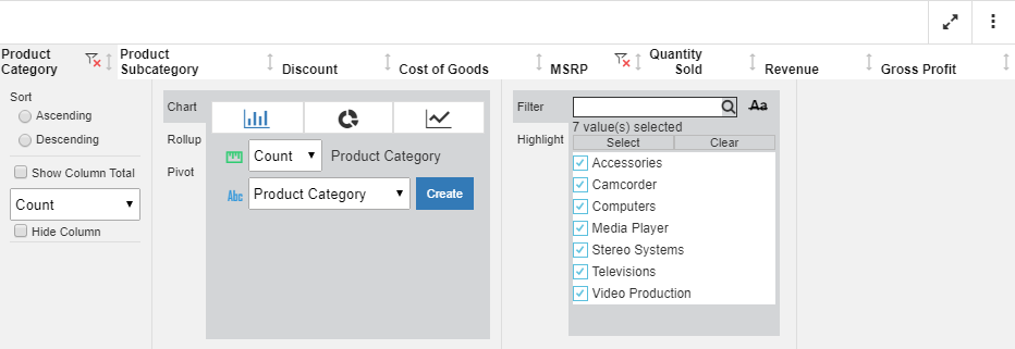
Filter. Use the filter option to narrow the data in your report. The filter option allows you to search on a value, or use the check boxes to select one or more values. You can use the Select option to select all values in your data hierarchy. Click Clear to clear the selected values. Once a filter is in place for a column, you can use the funnel-shaped icon, located next in the column heading, to clear the filter. This icon is shown in the following image.
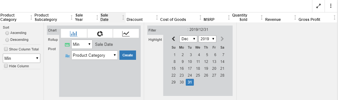
If you are working with a date field, you can filter on a specific date using the filter control in the column menu. The filter control enables you to filter on a specific date or a range of dates, which you can indicate by holding the Ctrl key and clicking, while indicating the starting and ending dates. The range of dates is highlighted after you make your selection. The calendar filter is shown in the following image.
Note: When a calendar filter is specified, you can remove the filter by clicking the Remove Filter icon,
 , at the top of the date column.
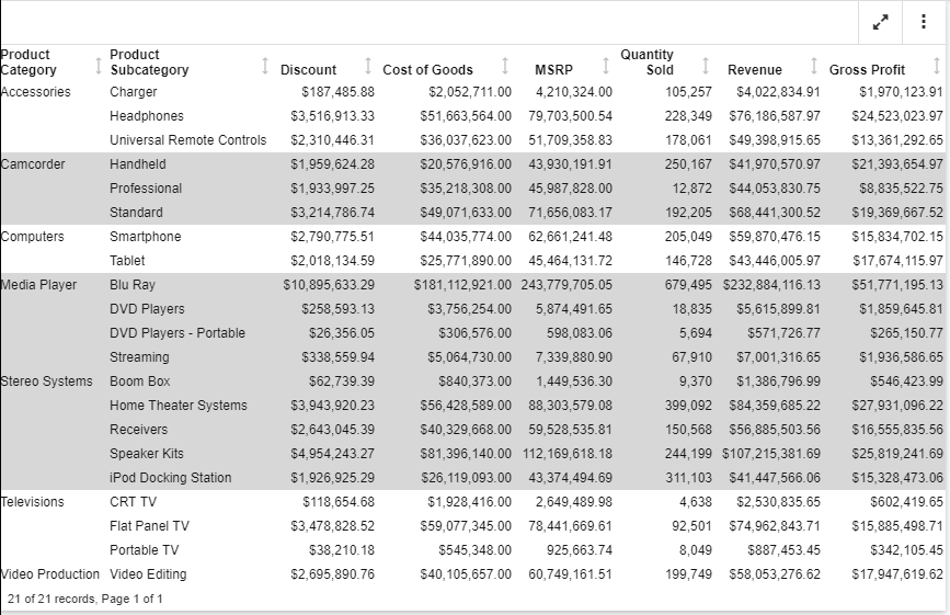
Highlight. Select Highlight to highlight select components of your report. For example, Camcorder, Media Player, and Stereo Systems are highlighted in the following image.
Once the highlight filter is in place, you can remove it by clicking the Remove Highlight filter icon,  .
.
For measures, there are two additional options:
- Visualize. Adds visualization bars to, or removes them from, the selected column.
- % of Total. This is a calculation of the current value against the total for the values in a column.
When you click Create, a new column is added, showing the calculated values.
These options are shown in the following image:
- Release: 8207
- Category: Visualization and Analytics
- Product: In-Document Analytics
- Tags: Enhancements, How-to's