Using Quick Transforms to Apply Analytical Functions to Data Fields
With quick transforms, you can easily apply the most commonly used analytical functions to measure fields in your content. This allows you to quickly apply a function to a field as you create content, expanding your options for incorporating aggregated data.
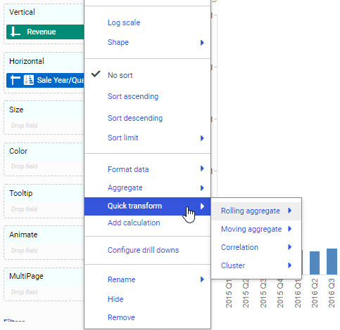
Quick transforms are robust and support a variety of functions. For example, you can perform a rolling or moving aggregation or correlation (both COMPUTEs) on a measure field. This makes it easy to perform the calculations you need to understand the distribution and patterns in your data with just a few clicks. To access these options, right-click a measure field in your chart or report, point to Quick transform, and then point to one of the quick transform options. Each quick transform allows you to configure how the calculation is performed. The following options are available:
- Rolling aggregate. Reaggregates the total values in the request at each sort value.
- Moving aggregate. Reaggregates subtotal values in the request, for a fixed number of previous sort values, at each sort value.
- Correlation. Calculates the correlation coefficient between two numeric fields.
- Cluster. Partitions values into a specified number of clusters, based on the nearest mean value.
You can do this from the shortcut menu for a measure field added to a non-sorting bucket in a chart or report, such as the Vertical bucket in a bar chart. Placing a measure in the Horizontal bucket, which is used to sort a bar chart, creates entries for each underlying value. In this case, you do not have access to the Quick transform option.
Other examples include the use of the correlation function, which calculates the correlation between two numeric fields. This is often used to display how strongly two variables are related to each other. In addition, the cluster (KMEANS) function partitions observations into a specified number of clusters based on the nearest mean value. The goal of cluster analysis is to group, or cluster, observations into subsets based on their similarity of responses on multiple variables.
Quick transforms create post-aggregation (COMPUTE) virtual fields. A calculated value (COMPUTE) is evaluated after all of the data that meets the selection criteria is retrieved, sorted, and summed. This means that the quick transform calculation is performed using the aggregated values of the fields.
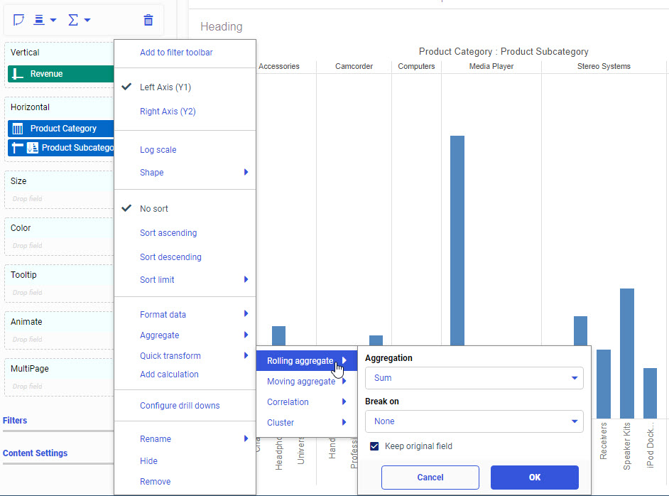
Performing a basic aggregation with a quick transform allows you to convert a field value from its raw state into a calculated field. With the Discount field, you can create a rolling sum that shows the cumulative sum of the field as it changes for each value in the chart. The Quick transform options are shown in the following image.
Note: You can perform multiple quick transforms using the same originating field.
Here, you can specify the type of aggregation (for example, Sum, Average, Count, and others) and indicate whether you want to keep the original field. The Keep original field option is selected, by default, if the bucket supports multiple measure fields, and serves the purpose of preserving the original field for other use in your chart. You can also choose to replace the field in favor of the transformed field, by deselecting this check box.
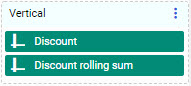
When you perform a quick transform on a field, a new, unique field is created and placed in the same bucket as the originating field, as shown in the following image.
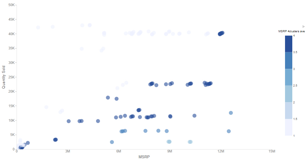
The transformed field is now a COMPUTE, which is a post-aggregation function. It is a separate field, labeled with the aggregation that was applied. You can move the transformed field into a different measure bucket to make it easier to analyze your data. For example, the following image shows a scatter chart with Model values plotted based on Quantity Sold and MSRP values. The Cluster quick transform was performed on the MSRP field using the Average aggregation, creating four groups of models with similar average MSRP values. The cluster field has been moved into the Color bucket, making it easy to identify which cluster each model falls into.
Procedure: How to Apply a Rolling Aggregation to a Report Using Quick Transforms
A rolling aggregate, or cumulative moving aggregate, is a cumulative aggregation of values. The aggregation is recalculated for each data record, allowing you to see totaled or recomputed values at various points in a chart or report.
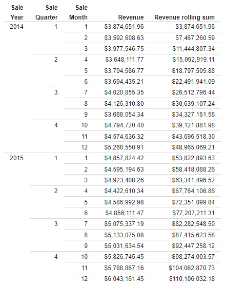
You can add a rolling sum to a report that is sorted by year, quarter, and month values, allowing you to see the total sales data for different points in time. You can also break the rolling sum on a lower-level sort field, allowing you to view a separate rolling sum for different categories.
- Open WebFOCUS Designer. On the WebFOCUS start page, click the plus menu and then click Create Visualizations, or, on the WebFOCUS Home Page, click Visualize Data.
WebFOCUS Designer opens in a new browser tab.
- Select a workspace with access to the wf_retail sample data, and select wf_retail_lite.mas as the data source.
WebFOCUS Designer loads with options to create a single content item.
- On the Content picker, select one of the report layouts as the content type.
- With the Fields tab selected on the sidebar, on the Resources panel, in the Dimensions section, expand Sales_Related and Transaction Date, Simple, and double-click Sale,Year, Sale,Quarter, and Sale,Month, in order, to add them to the report in the Rows bucket.
- On the Resources panel, in the Measures section, expand Sales and double-click Revenue to add it to the Summaries bucket.
The report now shows Revenue by Sale Year, Sale Quarter, and Sale Month.
- To see how the total revenue increased over time, add a rolling sum quick transform on the Revenue field.
- In the Summaries bucket, right-click the Revenue field, point to Quick transform, and then to Rolling aggregate.
- Leave the selected Aggregation option as Sum.
You can select a different aggregation option to recalculate that aggregation at each row of the report.
- Leave the Break on option set to None. The rolling sum will continue accruing throughout the entire report, without resetting.
- Leave the Keep original field check box selected, so that you will still be able to see the Revenue values for each month.
- Click OK.
The quick transform field, called Revenue rolling sum, by default, is added to the report. It displays the total revenue that has been accrued up to each month, as shown in the following image
- Add a new rolling sum quick transform field that breaks on the Sale Year field, thereby showing the accrued revenue at different points within each year.
- In the Summaries bucket, right-click the Revenue field, point to Quick transform, and then to Rolling aggregate.
- Open the Break on drop-down menu and select Sale,Year.
- Click OK.
A new quick transform field, called Revenue rolling sum Sale Year, by default, is added to the report. Notice that the values continue increasing until the end of each year, at which point they reset and start accruing again, as shown in the following image
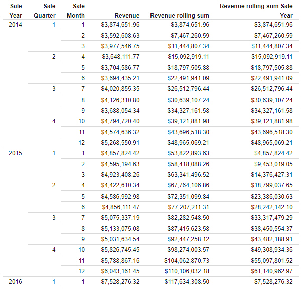
Using this report, you can see when certain revenue goals and thresholds were met.
Procedure: How to Apply a Moving Average to a Chart Using Quick Transforms
You can use a rolling or moving average to smooth out the data in your chart or report, making it easier to identify trends and patterns.
While, a rolling aggregate is a cumulative aggregation of all of the values in a chart or report, a moving aggregate is a cumulative aggregation that is performed on a limited selection of the most recent values. As the moving aggregate proceeds through the sequence of values in your chart or report, earlier values are gradually discarded from the calculation as they fall outside the scope of the moving aggregation. A moving average, therefore, is an average that is recalculated at each value for that value and a specified number of prior values.
To create a moving average based on a measure field in your content:
- Open WebFOCUS Designer. On the WebFOCUS start page, click the plus menu and then click Create Visualizations, or, on the WebFOCUS Home Page, click Visualize Data.
WebFOCUS Designer opens in a new browser tab.
- Select a workspace with access to the wf_retail sample data, and select wf_retail_lite.mas as the data source.
WebFOCUS Designer loads with options to create a single content item.
- Use the Content picker to change the chart type to a vertical side-by-side bar chart.
The moving average will be added to the chart as a second measure, and since we want to compare it directly to the non-transformed field, the bars should be aligned side-by-side instead of stacked.
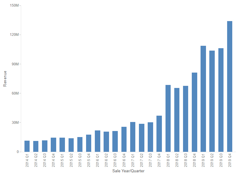
- On the Resources panel, in the Dimensions section, expand Sales_Related and Transaction Date, Components, and double-click Sale,Year/Quarter to add the Sale Year/Quarter field to the chart in the Horizontal bucket.
- On the Resources panel, in the Measures section, expand Sales and then double-click Revenue to add the Revenue field to the Vertical bucket.
The result is a bar chart showing revenue for each quarter of each year, as shown in the following image.
- Right-click the measure field in the Vertical bucket, in this case, Revenue, and point to Quick transform, as shown in the following image.
- To add a moving average to the chart, point to Moving aggregate and:
- From the Aggregation menu, select Average, which is the default. You can alternatively create a moving sum, moving count, and more.
- Since there is only one sort field in the chart, the Break on option is not available.
If we had added a second field to the Horizontal bucket, you would be able to select a field on which to break the moving average.
The default selection is None. When None is selected, the moving aggregation continues for every value, and never resets. If you have multiple sort fields in the chart, and you select a field to break on, the aggregation starts over for each new value of that field. You cannot break on the lowest sort field or the only sort field, since this would cause the rolling aggregation to reset on each value.
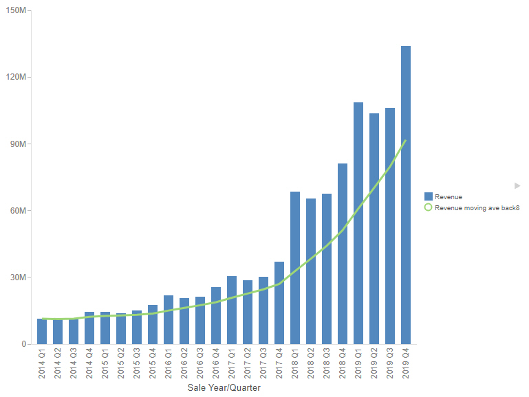
- Set the Look back value to 8. The Look back value determines the number of past values to include when evaluating the moving aggregation. In this case, we will use the last two years of data to calculate the moving average.
Use a higher Look back value to make a smoother moving average. Using a lower value results in a less smooth moving average, but makes the moving average more responsive to changes to the data.
- Leave the Keep original field check box selected. This check box controls if the original field on which you are basing the quick transform is retained in the bucket. This check box is selected, by default.
If you leave it checked, both the original field and the new calculated field will share the bucket from which the quick transform was created, if possible. If you do not want to keep the original field, you can replace the field with the quick transform field by deselecting the box. Single-field buckets, such as Size or Color, always replace the original field, and do not provide this option.
- Click OK.
The field is placed in the measure bucket and displays in your content, by default. The legend is also updated to reflect this new field, as shown in the following image.
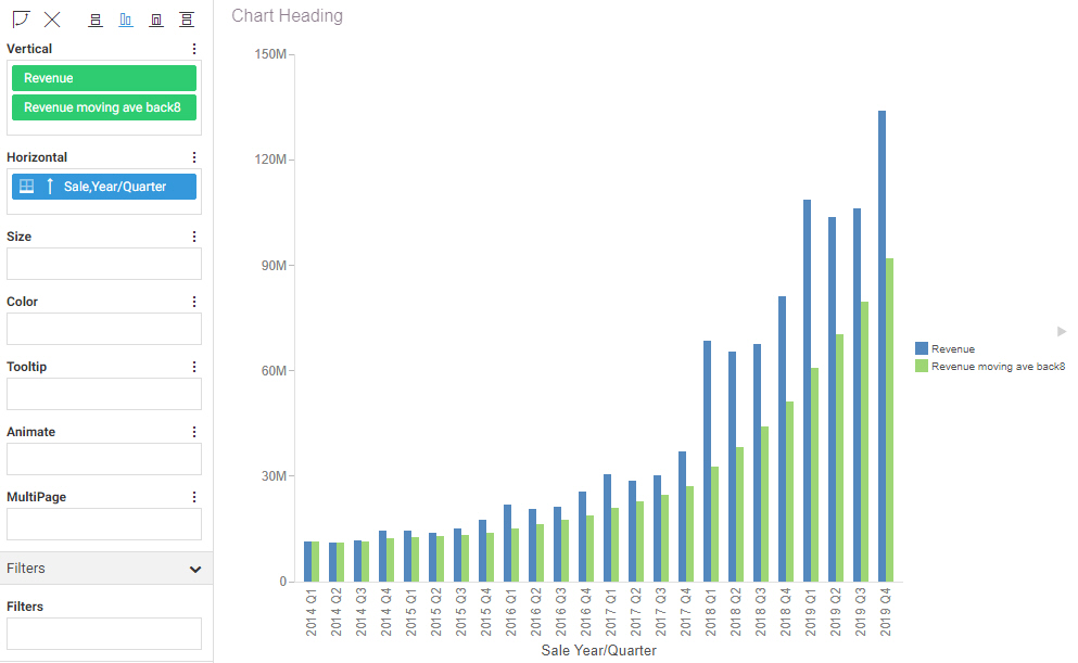
Notice that since we used a fairly high Look back value of 8, the moving average bars have a smooth growth that allows us easily identify a general pattern in the data, but do not increase quite as quickly as the actual revenue values.
- Optionally, you can change the moving average fields to display as a line instead of bars, more clearly differentiating the moving average from the actual revenue values.
In the Vertical bucket, right-click the moving average field, point to Shape, and click Line.
The moving average now displays as a line, as shown in the following image.
Note: For information on the PARTITION_AGGR functions, see the Developing Reporting Applications technical content.
- Release: 8207
- Category: Visualizing Data
- Product: WebFOCUS Designer
- Tags: How-to's