Working With Toggle Controls
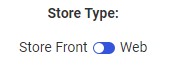
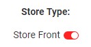
In some cases, instead of having a list of several possible filter values, you may want to create a filter in which only two values are available. Sometimes, this will be a Boolean expression, in which a pre-defined flag can be set to true or false. At other times, you may have a field that has only two available values, and you may want only one or the other to be available at a given time. In each of these cases, a toggle control can be a straightforward way to present these filters. The toggle control is available in pages assembled from existing content items. A toggle control is shown in the following image.
To create a toggle control, add a parameterized chart or report to an assembled page, generate filter controls for it, and convert one of those controls from a drop-down list to a toggle control by right-clicking the control and clicking Convert. The first two highest-sorted, unique values in the filtered field are added to the toggle control automatically. Only filter controls for alphanumeric fields can be converted into toggle controls.
Toggle controls are most useful for single-select parameters with only two available values, such as filters for flag columns that indicate whether a condition is true or false. However, toggle controls can be created for fields with more than two values, as well. In this case, the first two unique values in the data source are used, by default. If only one unique value is present in the field, then that value and an All value are available for selection using the toggle control, by default. If there are no available values in the selected field, then an All value is used for both sides of the toggle control. The first value in the toggle control is selected when the page loads. At run-time, click the toggle slider to select the second value, and click it again to switch back to the first value.
You can set the two values that are available from the toggle control by selecting it and then using the options in the Control Settings area of the Settings tab. You can set whether the toggle control displays one or two values, and you can set the display and actual values available in the toggle control. The Data Settings area when a toggle control is selected is shown in the following image.
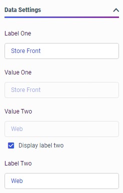
The display value is the value that appears in the control itself, while the actual value is the value that is actually applied when a filter value is selected. To change the display values, change the text in the Label One and Label Two fields. To change the actual values, change the text in the Value One and Value Two fields. If you change the actual values, make sure that they match the values in the filtered data source exactly. Otherwise, the filtered content may not return any values when the filter is applied.
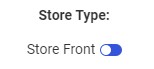
To display only the first value, which reduces the amount of horizontal space needed by the toggle control, clear the Display label two check box. In this case, when the toggle slider is switched off of the first value, the non-displayed second value is selected. Therefore, it may be best to show the label for the second value, unless the two available values are commonly juxtaposed opposites, so users can be expected to understand what the second value should be. A toggle control with only the first value displayed is shown in the following image.
You can style a toggle control using cascading style sheet properties. For example, you can use the background-color CSS property to change the color of all toggle sliders on a page based on the selected value. To set the color of the toggle sliders when the first value is selected, use the CSS selector .ibx-switch-slider.round, and to set the color of the toggle sliders when the second value is selected, use the CSS selector .ibx-switch.checked .ibx-switch-slider.round. For example, to set the slider color to green when the first value is selected and red when the second value is selected, you can add the following code to the CSS text editor for a page in Designer, which you can access from the Outline.
.ibx-switch-slider.round {
    background-color: #77cc77;
}

.ibx-switch.checked .ibx-switch-slider.round {
    background-color: #ff2323;
}
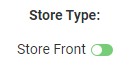
When the page is run and the first value is selected, the toggle slider displays a green background, as shown in the following image.
When the second value is selected, the toggle slider displays a red background, as shown in the following image.
Procedure: How to Add a Toggle Control to a Page
In pages assembled from existing content, you can use the toggle control to quickly switch between two filter values. These are especially useful for dimension fields with Boolean values, or that have two available values that represent all of your data.
- Create a new page assembled from existing content. On the WebFOCUS start page or Home Page, click the plus button and then click Assemble Visualizations.
WebFOCUS Designer opens and prompts you select a page template.
- Select a page template.
The WebFOCUS Designer canvas opens.
- Add a content item with a parameter filter for a dimension field to the page.
A count of available filter controls appears on the Filters tab on the sidebar.
- Open the Filters tab and then click Add all filters to page to add all available filter controls, or right-click a single filter parameter in the list and click Add to page to select one or more specific filter controls.
The default filter control, a drop-down menu for dimension fields, appears for the selected alphanumeric filters.
- Select and then right-click a drop-down menu filter control and click Convert.
The Convert Control To dialog box opens.
- Click Toggle to transform the control into a toggle control.
- Optionally, on the Settings tab, in the Data Settings section, clear the Display label two check box to show only the first value in the toggle control.
- Optionally, on the Settings tab, in the Data Settings section, change the display values that appear in the toggle control, and the actual values that are passed from the control. If you change the actual values, make sure that they match the values in the filtered data source exactly. Otherwise, the filtered content may not return any values when the filter is applied.
- Save and run the page. When you click the toggle slider, the filter selection switches from the first value to the second value.
- Release: 8207
- Category: Visualizing Data
- Product: WebFOCUS Designer
- Tags: Enhancements, Release Features