Charting


Creating HTML5 Charts With WebFOCUS Language

This content explains how to use the JavaScript® Chart Engine (Js:Chart). Js:Chart draws a chart in an HTML environment using a defined data set and JavaScript® Object Notation (JSON) definitions. The JSON object(s) define chart properties that control the appearance of the chart and chart objects.

Creating HTML5 Charts With TIBCO WebFOCUS® Language PDF

This content explains how to use the JavaScript® Chart Engine (Js:Chart). Js:Chart draws a chart in an HTML environment using a defined data set and JavaScript® Object Notation (JSON) definitions. The JSON object(s) define chart properties that control the appearance of the chart and chart objects.

Using Your Extension in a WebFOCUS Request

If you have installed and configured your extension as described, your extension will be available for use in the WebFOCUS tools as a chart type in the Other format category under HTML5 Extension, as shown in the following image.

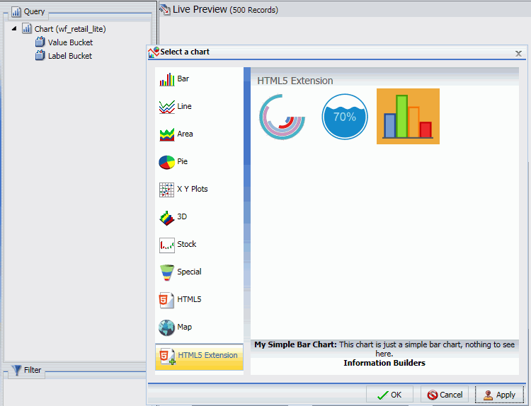
When creating a chart using WebFOCUS Designer, chart extensions are available in the Custom category when you expand the chart picker, as shown in the following image.

Controlling Font Display in a Chart

You can use the font formatter in WebFOCUS Designer to control how fonts are displayed in your chart. This is a quick way to apply styling, colors, or a specific font type for any text within your chart. The font formatter displays in different areas of the Style tab (for example, Legend, Axis, Series, and Matrix options). Depending on the chart type and what you want to format, you can use these options to enhance the fonts in your charts. The font formatter is shown in the following image.

Using Axis Options in a Chart

Depending on the chart type (for example, bar chart), you can format the axes to customize the display of the information. This includes items such as labels, titles, and font formatting. For example, you can choose to hide the labels in your chart or format the font to add clarity to your chart. You can easily customize the X and Y axis with options that suit your needs.

Adding a Theme to a Chart

A theme is used to determine the coloring and hues that display in the charts you configure using WebFOCUS Designer. For example, the default border color and chart colors are determined by the theme.

The default theme is called Warm, but you can select a different theme as required. For example, you may want to apply a corporate standard theme to your chart. You can add and change themes to suit your requirements (for example, branding).

Available themes that are called by WebFOCUS Designer are located in the Global Resources domain, as shown in the following image.

Creating Absolute Line Charts

Use absolute line charts when you want to show trend data over time. For example, monthly changes in employment figures, or yearly sales of an item in your inventory.

Note: Absolute line charts require at least one measure and one dimension. Adding multiple measures or adding fields to the Color bucket will create additional lines on the chart.

The following display options are available for a line chart:

Creating Vertical Stacked Area Charts

Use vertical stacked area charts when you want to distinguish your data more dramatically by highlighting volume with color. In a vertical stacked area chart, each area is stacked on top of the sections below it.

Note: Vertical stacked area charts require at least one measure and one dimension. Adding multiple measures will create additional shaded areas on the chart.

The following display options are available for an area chart:

Creating Circle Plot Charts

Use circle plot charts to display differing values in rows, enabling you to draw inferences as to how the values overlap.

Note: Circle plot charts require at least one measure and one dimension, as well as one for the Detail and Color buckets. Optionally, add a dimension to the Size bucket to view the concentration of data.

The following display options are available for a circle plot chart: