Using Axis Options in a Chart
Depending on the chart type (for example, bar chart), you can format the axes to customize the display of the information. This includes items such as labels, titles, and font formatting. For example, you can choose to hide the labels in your chart or format the font to add clarity to your chart. You can easily customize the X and Y axis with options that suit your needs.
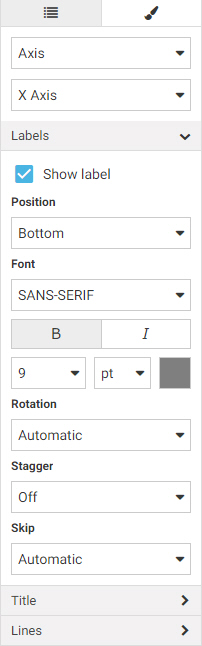
You can rotate the labels in your axes as well as stagger them. This allows you to shift the display of information, which is particularly useful when your chart is very dense. You can also modify the lines for individual axes, enhancing the frame of the axis on the chart. You can also show ticks, which allows you to view milestones in your data. You can also change the position of an axis, enabling you to dictate where your axis information will display (for example, right). The options for formatting an axis are shown in the following image.
Procedure: How to Format Axes
You can format the axes of your chart to customize the display of information, including labels (rotated and staggered), titles, and axis-specific fonts.
- Create a chart using WebFOCUS Designer, or open an existing WebFOCUS Designer chart.
- On the Style tab, click General and then click Axis.
The options for editing your axes display.
- Optionally, select the Y-axis or accept the X-axis.
Note: The axis selection determines where changes are applied.
- On the X-axis, perform the following formatting tasks:
- Change the font format of the label to bold.
- Change the size of the font for the Title to 16. Change this to bold as well.
- Select the Y-axis option and perform the following formatting tasks:
- Change the font format of the label to italic.
- Change the size of the font for the Title to 16. Change this to bold as well.
Information on the axes has been modified, giving you a custom look and feel for your chart, as shown in the following image.

-
You can rotate the labels on the X-axis. In the Labels group, use the Rotation option to rotate the labels by 45 degrees, as shown in the following image.

-
You can also modify the line size of the axes. In the Lines group, use the Axis lines option to change the line size for both axes to 5. Making the axes lines bigger creates a more definitive frame, as shown in the following image.

With the axes of your chart formatted, you can continue making modifications or apply similar formatting to the axes in other chart types.
- Release: 8206
- Category: Creating Content
- Product: Charting
- Tags: How-to's