Formatting Series in a Chart
A series, which is a set of data, represents the set of values for one field in the request (for example, a measure). These numbers are plotted in a chart. You can format the series in your chart, which includes font formatting, display options for labels, and other options, including the ability to hide overlapping labels. Using the Series options, you can select a specific series in a chart to which to apply changes, or you can select All Series, which applies changes to all series in the chart.
Having the ability to format by series gives you control over your content and allows you to customize display options at the series level. For example, you might want to color code a chart based on a range of values. You can also specify options for the data labels of the series. These are enabled by default, but can be turned on or off. You also have the standard suite of font options, as shown in the following image.
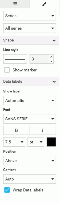
When working with series in a chart, you can also set an option to control the display of content in your chart. The default is Auto. This gives you the ability to specify how your data will be presented (for example, Value or Percentage), which is particularly useful in cases where you want to save real estate when using data labels in your chart. You can click the drop down to access a full list of content options, as shown in the following image.
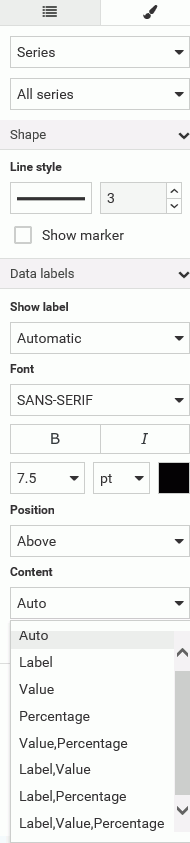
You can use the following terms to decide the best way to display your content.
- Auto. The chart engine decides what data label information to show. This is usually the value.
- Label. Shows the series label of the rise, marker, or slice (same as legend label).
- Value. Shows the value of the riser, marker, or slice, using the numeric format of the field. For example, if the field defined in the master file is US Currency with two decimal places of precision, then that is what the dataLabel will be ($123.45).
- Percentage. Shows the percentage of the riser/slice based on the group to which it belongs.
- Value,Percentage. Shows the value of the riser, marker, or slice, with numeric formatting and the percentage of the riser/slice based on the group to which it belongs.
- Label,Value. Shows the series label of the riser, marker, or slice (same as legend label) and the value of the riser, marker, or slice, with numeric formatting.
- Label,Percentage. Shows the series label of the riser, marker, or slice (same as legend label) and the percentage of the riser/slice based on the group to which it belongs.
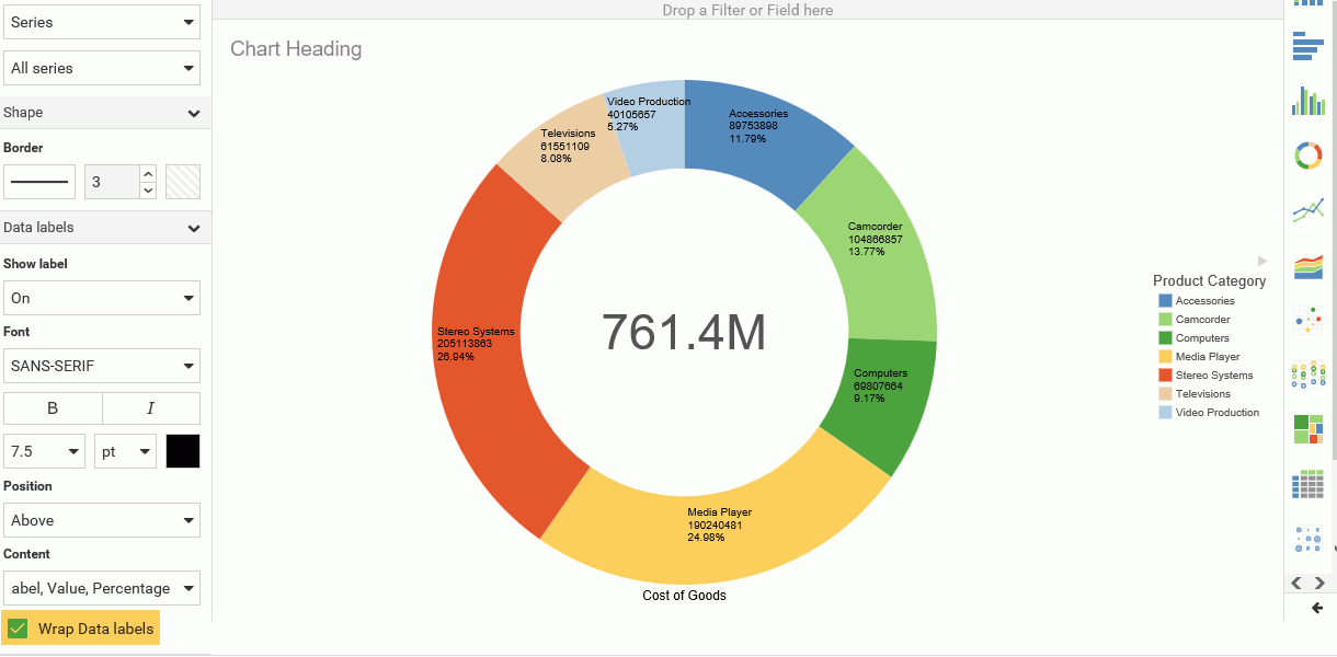
- Label,Value,Percentage. Shows the series label of the riser, marker, or slice (same as legend label), as well as the value of the riser, marker, or slice, with numeric formatting. It also shows the percentage of the riser/slice based on the group to which it belongs.
You can also Wrap Data labels, which allows you to truncate available chart space or show your data on multiple lines. The following examples show how the wrapping option works.
Example of WrapDataLabel=True:
"France
$123.4
23.4%"
Example of WrapDataLabel=False:
"France, $123.4, 23.4%"
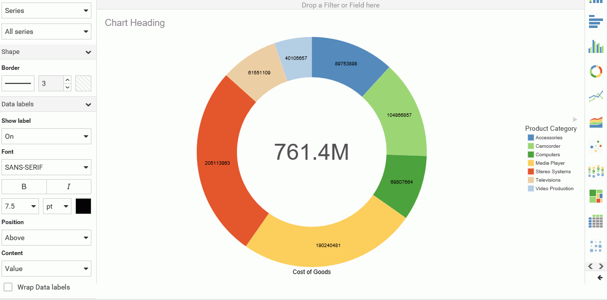
Specifically, the data label options allow you to determine what is shown when Show label is ON. For example, Label,Value,Percentage. If the option is set to Auto, the chart engine decides what it thinks is the best content to show. Typically, this is the value of the riser or slice. For example, on a basic pie chart, the Auto Setting produces the following result.

You have additional content choices. For example, you can select Label, which corresponds to the series label that is shown in the legend. When you select the Label option, you also have the option of turning the legend off, so as not to duplicate the information that is displaying in your chart. The Label option is shown in the following image.

You can also select Percent, which shows the percentage of the whole for each riser or slice. This is very useful for a pie or stacked bar chart, as these are the charts that are best used to visualize the concept of percentage-related content, as shown in the following image.

You can also display the Value, which is the riser/slice value. This is often the same thing you will get if you select Auto, as shown in the following image.
There are also options for you to combine three choices, such as Value, Label, and Percent. This allows you to display all three items, as shown in the following image.
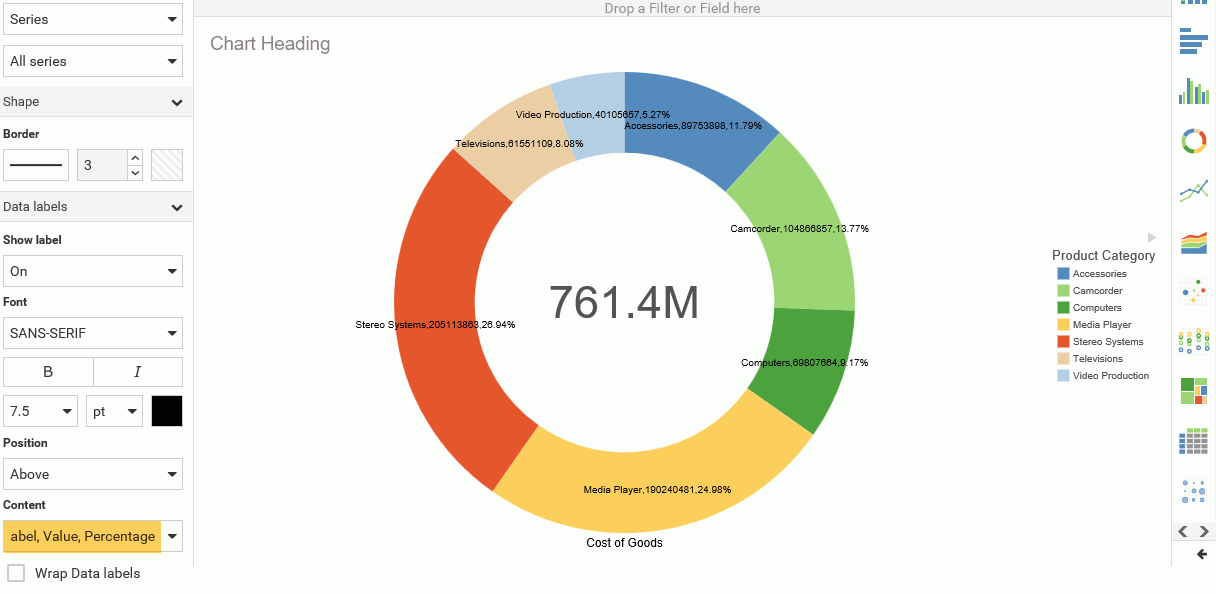
By default, these items display on a single line. They are separated by a comma. If you want to display them in a word-wrapped format, click Wrap Data Labels to display the content on three separate, unique lines, as shown in the following image.
Procedure: How to Format a Series
- On the WebFOCUS Home Page, click the Designer tab.
- Click Chart.
- Choose a data source and click Select.
- Create a Vertical Stacked Area chart.
-
Specify three measures and one dimension, as shown in the following image.
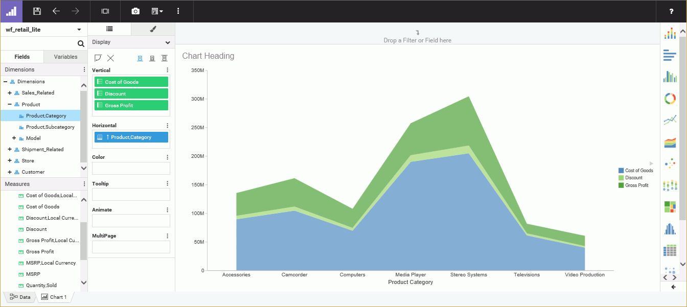
- On the Style tab, click General and then click Series.
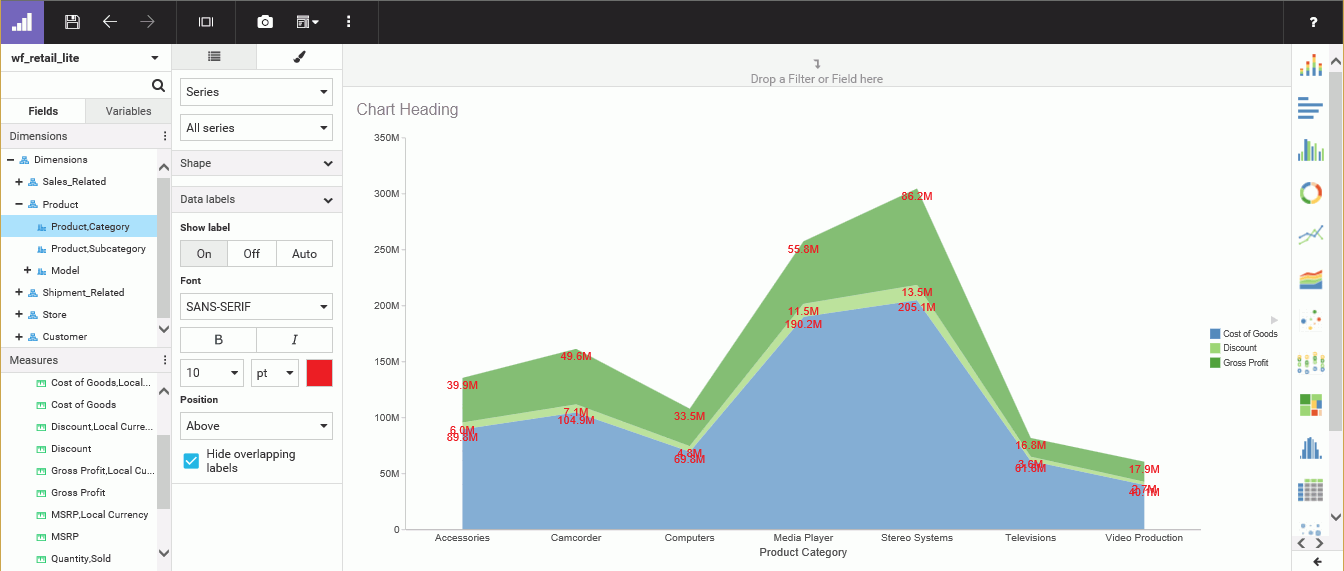
- In the Data labels section, in the Show label group, turn data labels on.
- Format the labels with 10 point, red font.
The values in the chart reflect your custom formatting, giving you a better view of your data, as shown in the following image.
- Release: 8206
- Category: Creating Content
- Product: WebFOCUS Designer
- Tags: How-to's