Customizing Charts
As you work with your chart, you can make modifications that improve the display of your chart, highlighting the layout and presentation of the chart components. Some of the formatting options include:
- Controlling font display
- Customizing headers and footers
- Changing the format of your legend
- Formatting the axes of your chart
- Formatting the series of your chart
- Customizing the format of your matrix chart
- Enhancing your grid
- Adding a theme
- Adding color to your chart
You can access the formatting options from the Style tab, as shown in the following image.

General options display, by default, as shown in the following image.

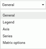
You can use the General menu to select a different aspect of your chart, for example, Legend, Axis, Series, or Matrix options, as shown in the following image.
Once you select an area of your chart to modify (for example, Axis), you can use the intuitive options and menus to make selections, as shown in the following image.

Note: If you are working with a map, reference lines, or data grids, additional tabs will display, enabling you to make formatting changes to these components. These tabs do not display, by default.
By streamlining formatting options in one place, you can quickly format charts to enhance the display of your data. Whether it be color-coding a series in a chart or changing the font size of your data labels, a customized, formatted chart is just a click away.
- Release: 8206
- Category: Creating Content
- Product: WebFOCUS Designer