Using Prefix Operator Aggregation Functions
You can use prefix operator aggregation functions to instantly apply a number of different aggregation operations to fields, unlocking significant insight into your data without writing your own calculations.
To apply a prefix operator, right-click a field in a measure bucket in a chart or report, point to Aggregate, and select one of the following options:
- None. Does not explicitly apply a prefix operator. In a chart, or when the Summary display option is selected in a report, the Sum aggregation is used. When the Count display option is selected in a report, the Count aggregation is used. When the Detail or Detail with counter display options are are used, no aggregation is used.
- Sum. Adds record values together for the selected field with each sort value.
- Average. Calculates the average of record values for the selected field within each sort value.
- Count. Provides the number of record values for the selected field within each sort value. If there are no missing values in the data source, the count aggregation returns the same value for every field.
- Count distinct. Provides the number of distinct record values for the selected field within each sort value.
- Percent. Calculates a percentage for each sort value based on the summed total value for the selected field.
- Percent of count. Calculates a percentage for each sort value based on total record count for the selected field.
- Minimum. Provides the minimum value for the field within each sort value.
- Maximum. Provides the maximum value for the field within each sort value.
- Median. Provides the median field value with each sort value.
- Mode. Provides the most common value of the field within each sort value.
The operation is instantly applied to the field, indicated by a prefix in the measure bucket.
When you add an alphanumeric field to a measure bucket, the only available aggregations are Count, Count distinct, and Percent of count. These options allow you to understand the distribution of values in alphanumeric dimension fields. When you add an alphanumeric dimension field to a chart as a measure, the Count aggregation is applied automatically in order to generate aggregated values for the chart.
When creating a report, most prefix operators work best when used with the Summary or Count display options, since prefix operators provide alternative methods to aggregate or summarize your measure data. The Count display option applies the Count prefix operator by default, but other operators, including Sum, can also be applied. When using the Detail and Detail with counter display options, measure values are not aggregated. As a result, most prefix operators are applied to individual values, and may not provide meaningful results.
You can use the same field multiple times in a chart or report with different prefix operators get enhance your understanding of your data set. For example, the report in the following image shows columns for average revenue and median revenue, which helps to understand the skewness of the data.
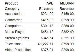
Since the average revenue values for each product category are all greater than the median revenue values, we can see that the data is skewed to the right. This means there are a higher proportion of records with lower than average revenue, and that the average revenue is brought up by some outlying high revenue values.
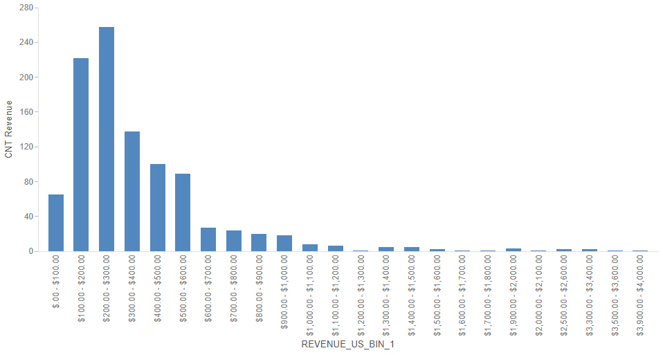
Similarly, you can use the Count prefix operator in combination with the binning feature to see the distribution of your data, such as in a histogram, which is a good way to view the distribution of your data. To create a histogram, create a new chart, right-click a measure field in the Field panel, point to Bin values, set a bin size and labeling option, and click OK. The bins appear as a field in the Dimensions area of the Field panel. Drag the bin field into the sort bucket of your chart, such as the Horizontal bucket in a bar chart. Next, drag the same field for which you created your bins from the Measures area of the Field panel into the bucket used to aggregate measure data in the chart, such as the Vertical bucket in a bar chart. Finally, right-click that measure field, point to Aggregate, and click Count. The result is a histogram showing the distribution of values for the selected field, as shown in the following image.
- Release: 8206
- Category: Creating Content
- Product: WebFOCUS Designer
- Tags: How-to's