Using the Options Toolbar in Insight
The Options toolbar is located in the upper-right corner of the Insight interface. These options control your interactions with your data, including options such as pivoting and filtering. You can also change your chart type using the Chart Picker option.
Reference: Options Toolbar Icons
The following section describes the icons that display on the Options toolbar.
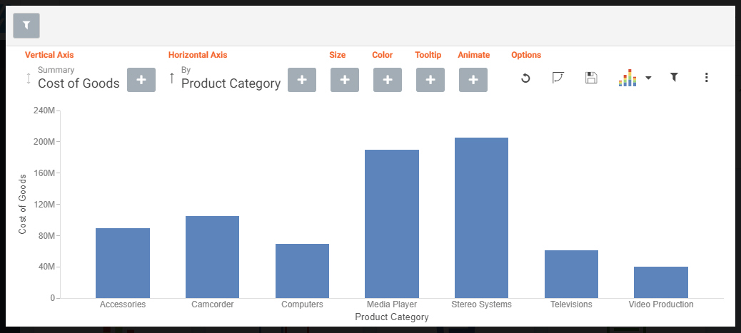
 , which is located in the Options section of the toolbar. This opens the filter shelf that renders above the bucket shelf, as shown in the following image.
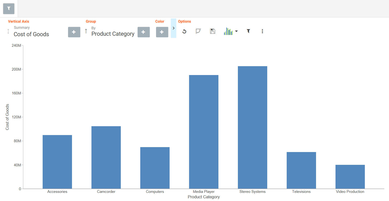