Creating Content


Creating Data Grids

Data grids can be used to present data in tabular form. For example, you can create a grid (table) that summarizes your data.

Note: Data grids require at least one measure and one dimension. Additional measures create unique columns. You can add multiple dimensions in the Row bucket to create customized rows based on the structure of your selection.

The following display options are available for a data grid:

Creating Matrix Marker Charts

Matrix marker charts can be used to analyze one or two measures against a crosstab of two categorical dimensions. The result is a color scaled matrix chart that shows categorized trends.

Note: Matrix marker charts require at least two measures and two dimensions. It also requires a field in the Color and Size buckets, which allow you to see the concentration of data for that intersection of the chart.

The following display options are available for a matrix marker chart:

Creating Proportional Symbol Maps

Proportional symbol maps, or bubble maps, use symbols of different sizes to represent data associated with different areas or locations within the map.

Note: Proportional symbol maps require at least one measure and one Georole, which contains geographic location information. You can add a field to the Color bucket to color the map.

The Clear buckets content display option is available for a proportional symbol map. It removes the fields from all buckets.

You can add fields to the following buckets for a proportional symbol map:

Creating Choropleth Maps

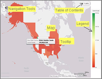
Choropleth maps can be used to create geographically-based heat maps. They are useful for visualizing location-based data, trends, and distributions across a geographic area.

Note: Choropleth maps require at least one measure and one Georole, which contains geographic location information. You can add a field to the Color bucket to color the map.

The Clear buckets content display option is available for a choropleth map. It removes the fields from all buckets.

You can add fields to the following buckets for a choropleth map:

Creating Calculations

When you create a chart, you are not restricted to the fields that exist in your data source. You can add calculations to automate summations and other mathematical tasks related to your data fields. You can specify operators, fields, variables, and functions when creating a calculation. If you can generate the information you want from the existing data, you can create a temporary field to evaluate and display it. A temporary field is a field whose value is not stored in the data source, but can be calculated from the data that is there.

Using Insight in Phone Mode

Phone mode, which is available in Insight, allows you to take advantage of the features of Insight on your phone. The interactive heading that is available in Insight on a tablet or desktop is replaced by a static heading that displays the field names in the chart, in blue text. These become summary fields that allow you to see what fields are included in the chart.

A Brief History of Mapping

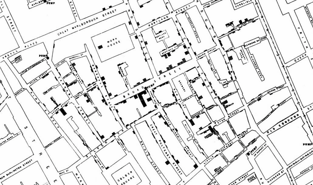
An early example of how maps can be used to illustrate trends is the case of Dr. John Snow, an epidemiologist who was one of the first to use data to map occurrences of cholera to find the cause of infection. By plotting the cholera data on a map of a town, Dr. Snow was able to visualize a trend that showed higher incidences of cholera closest to water pumps. This example is shown in the following image.

Creating Maps to Illustrate Trends

You can create maps to identify patterns or trends in your data. By converting data into values that can be displayed on a map, you are able to visualize scenarios, illustrate hot spots, and identify potential problem areas. For example, a law enforcement agency may use mapping functionality to identify areas of higher crime within the locations they cover. You can also use maps to determine how places are related, understand where things are located, and identify the best actions to take.

Adding a Custom Geographic Role

The GEO configuration editor In the Reporting Server Console provides a tool for editing or adding properties for geographic roles.

Click Workspace on the sidebar. Click Settings, point to Geo Services, then click Edit Configuration. The GEO configuration editor opens displaying the configured geographic roles, as shown in the following image.