Using Insight in Phone Mode
Phone mode, which is available in Insight, allows you to take advantage of the features of Insight on your phone. The interactive heading that is available in Insight on a tablet or desktop is replaced by a static heading that displays the field names in the chart, in blue text. These become summary fields that allow you to see what fields are included in the chart.
Insight is mobile aware and mobile friendly. Full functionality is available on tablet devices and other high-resolution touch displays. On smaller devices, such as an iPhone, Insight enters a special phone mode which has a useful, but more limited, set of options and features that are tuned for the small screen real-estate of the device. In this mode, you can add or modify filters to narrow your data as needed. You can also hover over data points to see the underlying data.
Measures are shown first. The first measure displays with a summation attribute (for example, Sum or Avg) and then displays of and then the name of the measure, as shown in the following image.
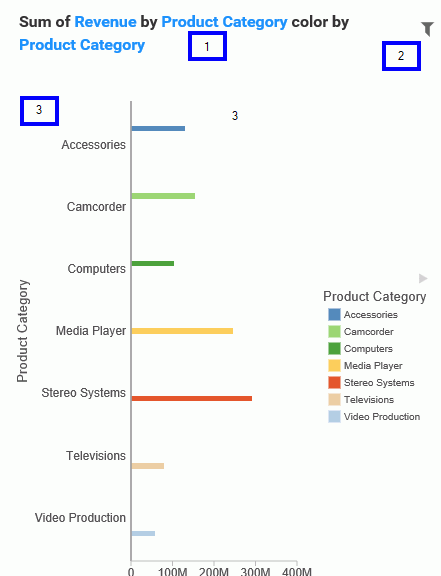
In the above image, area one is the static heading. Area two marks the filtering side option button. Lastly, area three shows the conbody of the chart.
Numeric measures are displayed after the measures in the order of Y-Axis and then X-axis. If you define fields in your Grouping bucket, they display after the collective measures and are preceded by the word by. If you have created a matrix marker chart, the relevant buckets for these display next. They also use the word by, as do any Detail buckets that are populated in the chart. If your chart specifies a field for color, Phone mode precedes the display of this item with color by. Lastly, if you have populated the Size bucket, this displays last and is introduced by size by.
User Options in Phone Mode
You have a number of options in Phone mode, including robust filtering and hover capabilities.
Filtering
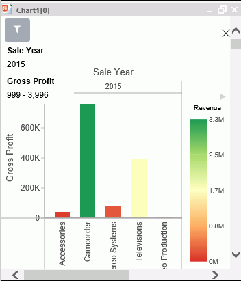
In Phone mode, you can filter just like in regular desktop mode. The primary difference is that the filter shelf stacks the available filters in a vertical row, as shown in the following image.
You click the filter icon to bring up the filter shelf and then you click the X to close it. If you have defined filters, closing the filter shelf merely collapses it. The filters that you defined remain intact. To remove a filter, hover over it and click the X in the upper-right corner.
General Usability
Phone mode allows you to view your chart and filter it to refine it based on your own unique scenario.
You can hover over a data bar a segment of a chart to obtain additional, detailed information from the underlying data. The tooltips that display are based on your data selections.
You can also show and hide the legend using the right arrow above the legend. When you collapse the legend, you can see more of your chart.
The opportunities for dynamic charting are vast with Insight. Using dynamic menus, filtering options, and search features, you can quickly and effectively create charts that communicate your data.
- Release: 8206
- Category: Creating Content
- Product: WebFOCUS Designer
- Tags: Release Features