Enhancements


Video: WebFOCUS Designer Content Enhancements

WebFOCUS Designer makes it easy to enhance your content by providing additional content creation and customization options.  You can create calculated fields using an expanded set of functions, allowing you to manipulate your data in nearly endless ways. You can also filter your report using aggregated measure and dimension fields and use a slider to select values for those filters in a page. Once you’ve created your content, you can then output it in a variety of browser-based and standard office suite formats, and even allow users to select the format that they want to use.

Video: In-Document Analytics Enhancements

Hello, and welcome to this Key Feature video on In-Document Analytics, a tool that provides an interactive interface, giving you the ability to generate real-time, dynamic reports, charts, and dashboards. Its versatility allows you to package a data set with a combination of analytical views, resulting in highly intuitive and interactive self-service business intelligence. This gives you an edge in presentation and analysis, making it easy to develop and share concepts, ideas, and scenarios.

Exploring Workbook Creation Options

A workbook combines a page and multiple charts and reports into a single file. Using a workbook, you can create a data flow to engage in data discovery, create charts and reports to analyze that data, and add multiple charts and reports to a page for a broader perspective. Using a workbook is a quick way to explore your data in a single session, providing the ability to save multiple content components together for easy access.

Exploring Page Creation Options

You can create interactive responsive pages using content that you or other members of your organization create. Content can be added to a page by utilizing drag-and-drop actions. With the interactive canvas, you can resize and rearrange resources with ease. Additionally you can use the integrated filter control capability to create instant, compelling applications and InfoApps from your content.

Using the Fields Tab

The fields in your data source are available from the Fields tab. By default, if the data source uses folders to organize the fields that it contains, these folders are reflected in the Fields tab. This folder organization is called a business view. For dimension fields, these folders could be field hierarchies defined in the data source or segments in the data based on different tables that have been joined together. Measures can also be grouped based on segments.

Video: Interface Differences - Developer Studio to App Studio

App Studio allows you to access more options directly from the main interface by using the ribbon and dynamic panels.
In Developer Studio, you use menus, dialog boxes, toolbars, and windows to create content. The main interface components include the menu bar, the main toolbar, the commands toolbar, and the Explorer window.
The Menu bar contains context-sensitive pull-down menus that become available as you select objects in your workspace or navigate through the product.
The Main toolbar provides quick access to commonly performed functions. These buttons

Integration Points for In-Document Analytics

In-Document Analytics (IDA) provides an interactive interface that allows you to generate real-time, dynamic reports, charts, and dashboards. When working in InfoAssist, you can set the output format to HTML Analytic Document format or PDF Analytic Document format, which will enable you to interact with your content. You can also change options on the Analytic Document Options dialog box. You can use the following integration points to get the full picture of the changes that display as of Release 8206:

Working with In-Document Analytics Output Formats in InfoMini

As of Release 8206, new output formats have been added to enhance your experience with select self-service products. For example, when working with InfoMini at run time via InfoAssist, you can select an output format for your content. Depending on the options that are enabled in the Administration Console, you may have access to two new formats: HTML Analytic Document (formerly known as AHTML) and PDF Analytic Document (formerly known as APDF).

Creating Content Using the Chart Rollup Tool

You can access the Chart Rollup Tool from the column menu in an interactive report that uses In-Document Analytics. There are three tabs: Chart, Rollup, and Pivot.  As you create charts, rollups, or pivot tables, each artifact displays in the analysis panel.

You can use the Chart Rollup Tool to select multiple group fields to generate the chart, rollup or pivot table. 

For the Chart tab, you can select a chart type, an aggregation, and a column for the chart, as shown in the following image.
 

In-Document Analytics Options for Charts

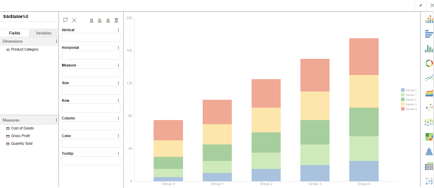
If you are working with a chart using the Chart Rollup Tool and you subsequently create a new chart, the new chart launches with a metadata tree, buckets, and the chart picker. This look and feel is similar to the common interface of WebFOCUS Designer, as shown in the following image.

The interface loads with the fields that you had originally selected. This makes it easy to select different fields to create different types of charts at run time.