Adding Content to Pages


Video: How to Use the Explorer and Link Tile Widgets

Welcome to this video on repository widgets in WebFOCUS Designer.

The repository widgets provide additional innovative ways of using your content and incorporating it into your Designer page.
There are two widgets currently available in the WebFOCUS Designer: 
•    Explorer, and
•    Link tile.

You can access both widgets from the Content tab of the Resource Selector.
The Explorer widget allows you to put the WebFOCUS Explorer onto your page and use the WebFOCUS Home Page features to navigate your content. 

Configuring Filter Control and Filter Grid Properties

You can configure the properties of the filter grid using the Properties panel, which is context-sensitive. For example, when you click a filter cell, the cell style properties open in the Properties panel. When you click a filter control, the general and style properties for this control open in the Properties panel.

The Properties panel for a cell is shown in the following image. When you configure these properties, you modify the alignment of content within a cell or change the style layout of the filter grid.

Video: How to Hide Content From Devices

In this video, you can learn how to hide certain content items from specific devices. 

This feature is especially useful if you need to hide large or complex items from smaller devices.To hide a content item from specific devices, highlight it on the canvas, and, in the Properties panel, configure the Show On property. 

Notice that all device buttons are selected by default. Manually clear the buttons to hide the item from specific device types. Here we are hiding a large map from tablets mobile phones.

Exploring Page Creation Options

You can create interactive responsive pages using content that you or other members of your organization create. Content can be added to a page by utilizing drag-and-drop actions. With the interactive canvas, you can resize and rearrange resources with ease. Additionally you can use the integrated filter control capability to create instant, compelling applications and InfoApps from your content.

Video: Using the Global Name Feature to Synchronize Filter Controls

The Global Name feature of WebFOCUS Designer offers a quick and easy way to link control selections between pages.
To activate the feature, simply populate the Global Name field on the Properties panel for the filter controls that you want to link. You can enter any text that makes sense to you.
 
In our example we are assigning a Global Name to the Region and Dates controls. Notice that Dates is a combined control that consists of From and To controls. In case of combined controls, only one Global Name value can be assigned.

Editing Page, Section, and Container Properties

The Properties panel displays the properties for the element that is selected. To access container properties, click a container or item with the Properties panel open. To access section properties, click the grid inside the canvas. To access page properties, click the page header or the toolbar. If the page header and the toolbar are hidden, you can access page properties by clicking the canvas outside a grid section.

The following properties are available for pages.

Settings tab:

Working With Slider Controls in a Page

A slider control is a horizontal track with a marker that you can slide between a minimum and maximum value. This versatile control is often used to choose a numeric value within a fixed range. An example of a slider control is shown in following image.

Procedure: How to Create a Slider Control Using WebFOCUS Designer

  1. On the WebFOCUS Home Page, on the Common tab or Designer tab of the Actions bar, click Chart.

    The Open dialog box opens.

Video: How to Create Pages in WebFOCUS Designer

You can create responsive pages, filtered dashboards, and InfoApps using WebFOCUS Designer to bring a wide variety of existing content together in one place.  


InfoApps are a great way to provide a large amount of information in a single page, while still remaining clear and easy to navigate.  

Automatically Advancing Slides in a Carousel Container

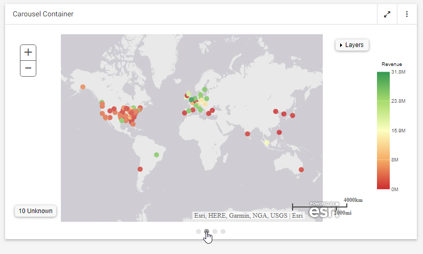
Using a carousel container is one way to put multiple charts, reports, and other content items into a single container. Carousel containers include an unobtrusive control that allows users to cycle through the items added to it, as shown in the following image.

Unlike tabbed or accordion containers, carousel containers also include the option to autoplay the content within them, allowing you to show all of the content in the carousel container without requiring user interaction.

Video: How to Use Info Mode

In this video, you can learn how to use the Info Mode feature of WebFOCUS Designer.

The information mode allows developers to easily find and edit content, determine whether each item is correct for the page, or quickly preview parameters before building a filter grid.To enable the information mode, click the Info Mode button on the Designer Toolbar.

Notice that the view of all content items on the canvas changes to display their paths in the repository and parameters configured for these items.