Filtering Data in Profile Bar Charts
From the Web Console, when viewing data profile charts in a data flow, you can select one or more values to see how your selection affects the other fields. This allows you to preview how a filter will affect your data, before you create a filter in the data source. You can then use your selection to create a permanent filter that includes or excludes the selected fields when your data is loaded into a target.
Procedure: How to Preview and Filter Data
- Create a simple data flow.
- Double-click the SQL object on the canvas.
The metadata query panels open, as shown in the following image.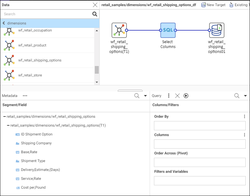
- Right-click the fields in the Segment/Field panel that you want to extract from the source and copy into the target, point to Add to Query, and select Column, as shown in the following image.
Note: To automatically select all fields, right-click the table name, point to Add to Query, and select Column.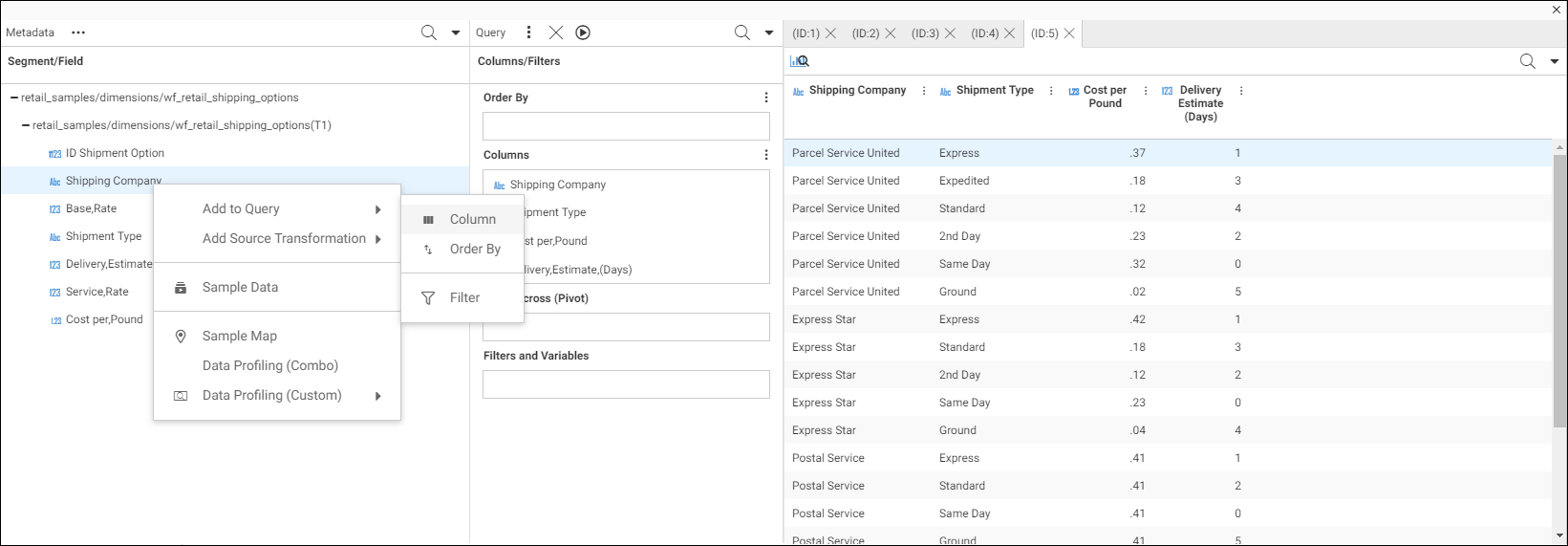
- In the data profiling panel, click the Show profiling icon
 .
.
Profile horizontal bar charts display your selected data, as shown in the following image.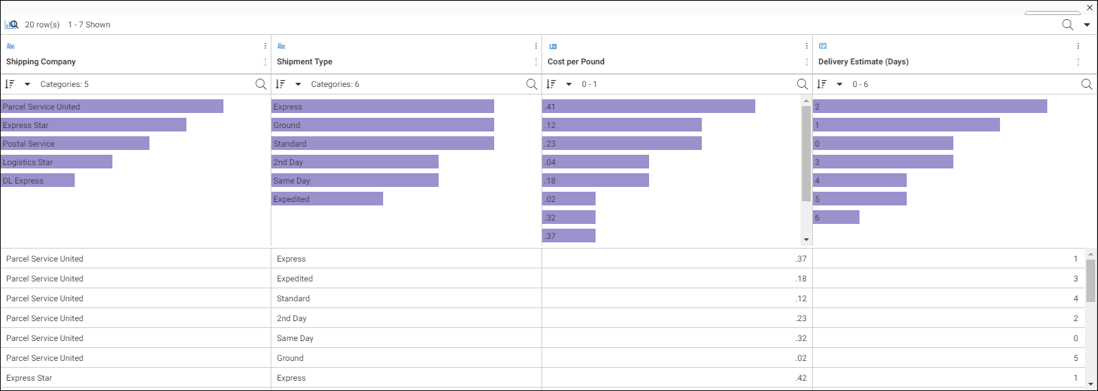
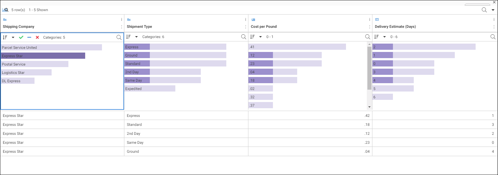
- Select a bar chart value to highlight the corresponding values in the other charts, as shown in the following image.
- Click the filter icons
 to create a permanent filter that includes or excludes your selection.
A permanent filter with the included selection is shown in the following image.
The permanent filter can now be applied when loading the data into your target.
- Release: 8206
- Category: Data Management
- Product: WebFOCUS Application and Enterprise Editions