Release Features


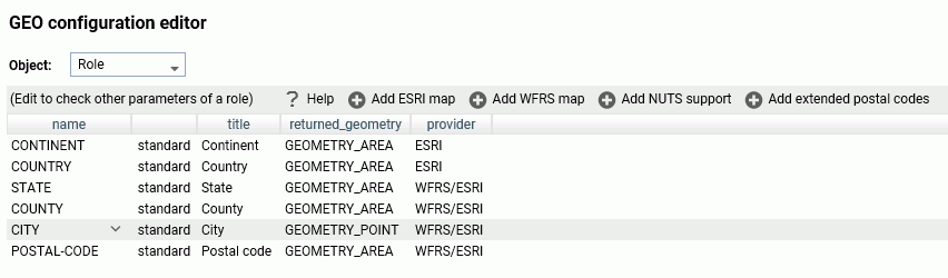
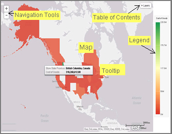
Introducing WebFOCUS Infographics

When you pair infographics with the power and reporting capabilities of WebFOCUS InfoAssist, you can populate your visuals with data from your corporate sources and adopt key elements that are specific to different audiences. You can take full advantage of WebFOCUS Reporting Objects, which enable you to create all of your filters and WHERE conditions once and then quickly apply them to different data elements in your infographic. You can also reuse the same infographic template and modify it using different parameters in your Reporting Objects to quickly show changing data narrative.

Creating Infographics

An infographic is a way to convey an idea or metric in a compelling visual format. It uses images to share information and present complex concepts, such as business analytics, in a simple and approachable manner. Through the narratives of infographics, you can go beyond dashboards and visualizations, and extend your communication to the level of data storytelling, increase understanding of the subject matter, and make a lasting impression.

Creating Storyboards

The Storyboard feature allows you to capture and preserve snapshots of your visualizations as you create them.

Each time you add something to the storyboard, it is placed onto a unique PowerPoint slide. When you click Show, you can open and review your slides in PowerPoint.

Since storyboards give you the ability to turn your visualizations into a PowerPoint presentation, you can modify your storyboard to create a customized demo. For example, you can rearrange or delete slides, or add titles and text.

Creating Workbooks

A workbook is a compound page that makes it possible for users to create charts and incorporate these embedded charts along with external content into a compelling display. The ability to create workbooks extends the role of the advanced user, empowering this user to build data narratives while employing the powerful combination of chart and page modes of WebFOCUS Designer. Workbooks can be run as content items directly from a browser, they can be published or shared with specific users and groups.

Adding a Custom Geographic Role

The GEO configuration editor In the Reporting Server Console provides a tool for editing or adding properties for geographic roles.

Click Workspace on the sidebar. Click Settings, point to Geo Services, then click Edit Configuration. The GEO configuration editor opens displaying the configured geographic roles, as shown in the following image.

A Brief History of Mapping

An early example of how maps can be used to illustrate trends is the case of Dr. John Snow, an epidemiologist who was one of the first to use data to map occurrences of cholera to find the cause of infection. By plotting the cholera data on a map of a town, Dr. Snow was able to visualize a trend that showed higher incidences of cholera closest to water pumps. This example is shown in the following image.

Creating Maps to Illustrate Trends

You can create maps to identify patterns or trends in your data. By converting data into values that can be displayed on a map, you are able to visualize scenarios, illustrate hot spots, and identify potential problem areas. For example, a law enforcement agency may use mapping functionality to identify areas of higher crime within the locations they cover. You can also use maps to determine how places are related, understand where things are located, and identify the best actions to take.

Using Insight in Phone Mode

Phone mode, which is available in Insight, allows you to take advantage of the features of Insight on your phone. The interactive heading that is available in Insight on a tablet or desktop is replaced by a static heading that displays the field names in the chart, in blue text. These become summary fields that allow you to see what fields are included in the chart.