Creating Pages
You can create a page in two ways. When you create a visualization with new content using the Create Visualizations option on the plus menu of the WebFOCUS start page or the Visualize Data option on the WebFOCUS Home Page, and then add a second item to it by clicking Add visualization, it transforms from a single item into a page. Alternatively, transform a single item into a page without adding a second container by clicking Convert to page. You can then create new charts and reports directly withing the page. Alternatively, you can create a page from existing content by clicking Assemble Visualizations on the plus menu of the WebFOCUS start page or WebFOCUS Home Page to open WebFOCUS Designer in assemble mode. Once you select a page template, you can start adding content from your repository to the page. This content can include images, embedded URLs, and other existing content that is unavailable when you convert a single chart or report to a page.
Pages can include multiple sections, each with multiple containers for your content. Each of these containers can also be configured to contain multiple content items, providing a thoroughly comprehensive overview of your data. Pages also include run-time filtering, content navigation, and content customization, allowing users to analyze, explore, and enhance the information provided on each page.
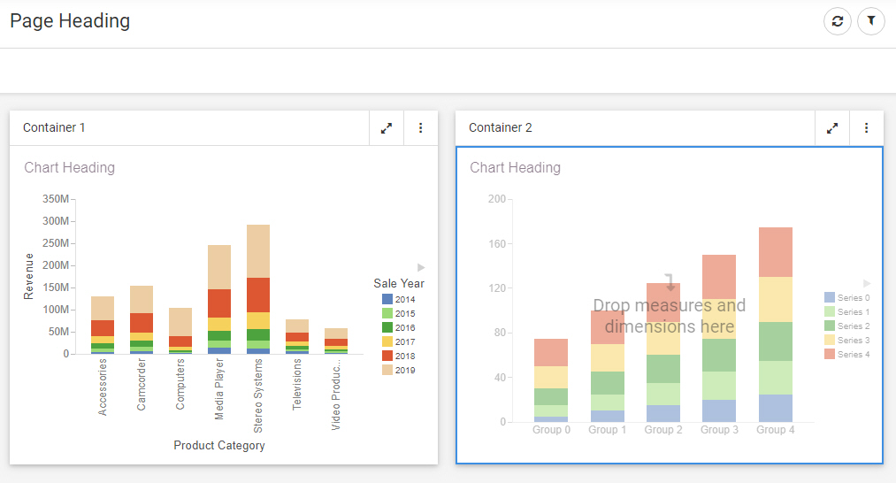
To add a second item to a visualization, such as a chart or report, click Add visualization on the Visualization toolbar. This transforms the single content item into a page. The first content item is moved into a container, and a second container is added where you can create new content. A visualization to which a second content item has just been added is shown in the following image.
Select an item on the page from the canvas or the outline to edit it using a relevant set of tools and options, whether the item is a content item or a page component. The Settings and Format tabs on the Properties panel update accordingly. When assembling a page from existing content, you can also select multiple components, sections, or filters while holding down the Ctrl key in order to edit or style multiple items of the same type at once. Additionally, some options are applied hierarchically. For example, setting a theme for the page applies that theme to any sections, containers, and content items that use the default style option.
You can add more new content to the page by clicking Add visualization, or by clicking the Container tab on the sidebar and dragging a container onto an empty area of the page from the Resources panel. You can then select the content are of the new container and create a new chart or report within it. You can also drag a field onto an empty area of the page to create a new container and content item in the location where you dropped the field.
If you are creating a page from existing content, you start by selecting a page template. Select the Blank template to add content and containers to the page yourself, or select a preset layout with containers to which you can add your content. The InfoApp 1 template provides a collapsible filter panel and movable filter grid to which you can add filter controls, which are generated when you add parameterized content to the page. The Workbench template provides a resource tree that you can use to navigate to content items in your repository, which you can then run in the target container on the right. You can also create your own templates and save them in the Global Resources area of your repository.
Once you have selected a page template, you can add existing content from your repository to the page by clicking Content on the sidebar, and then navigating to and dragging an item onto the page or into a container. These items can be external charts, reports, HTML pages, URLs, images, and more. You can navigate between folders in the Resources panel and locate an item by name using the search bar.
You can also duplicate an item by right-clicking the container or subsection that contains it and clicking Duplicate. This makes it easy to develop content by maintaining the styling, fields, and other properties from the existing content item and container. The title of the duplicated item is reused, with the text (Copy) added to the end. If you duplicate the content in a single-item panel container, a new container with the same content is added to the page. If you duplicate a content item in a multi-content container, such as a tab, carousel, or accordion container, a new subsection is added to the container with the selected content item duplicated.
You can move and resize containers on the page to organize them, or select a preset layout from the content picker to automatically create and arrange containers into a preset pattern.
You can save space on the page by placing multiple content items together in a tab, carousel, or accordion container.
If you are creating a page from existing content, to change a standard panel container into a tab, accordion, or carousel container, select Content on the sidebar and then drag a content item onto the container, already populated with content, on the canvas. The entire container is highlighted, indicating that the item will be dropped into the container. When you release the item into the container, you are prompted to replace the existing content, add the item in a new tab, accordion panel, or carousel slide, or cancel the operation.
Alternatively, to instantly convert a container to another type, you can right-click it on the canvas and point to Convert to, then select a container type of your choice. If you convert a container with multiple items into a panel container, which only supports one content item, each content item from the original container is added to a separate panel container. For example, if you convert a tab container with three tabs into a panel container, three panel containers are created.
You can also combine multiple containers on a page into a single, multi-content container. Hold the Ctrl key and click the toolbars of multiple containers to select them, then right-click a container, point to Combine, and select a multi-content container type to combine them into. The Combine option is unavailable for the link tile, grid, and panel group containers, and for the Explorer widget, since these are special containers that do not contain standard content.
To delete a container from a page, right-click it and click Delete container. If the container includes multiple items, you can click Delete Tab, Delete slide, or Delete Area to delete a single sub-component, depending on the container type. You can also delete the selected container or sub-component by pressing the Delete key.
When creating new content in a page, you can filter the entire page by dragging a field from the Resource panel into the Filter toolbar, just like when you create a content item. You can select default values for the filter from the resulting filter control, and right-click it to change other filter properties. If you are creating a page with existing content, then when parameterized items are added to a page, the Quick Filter button appears, allowing you to create filter controls. These controls will apply filters to any items that are parameterized for the same amper variable and field.
As you create your page, you can click Run in new window to see a run-time view of your page, allowing you to interact with filtering, built in container controls, In-Document Analytics, and any unlocked or interactive content on the page. You can check these variables by clicking Info on the Visualization toolbar.
Be sure to periodically save your page by clicking Save on the Designer toolbar.
- Release: 8207
- Category: Adding Content to Pages
- Product: WebFOCUS Designer