8207


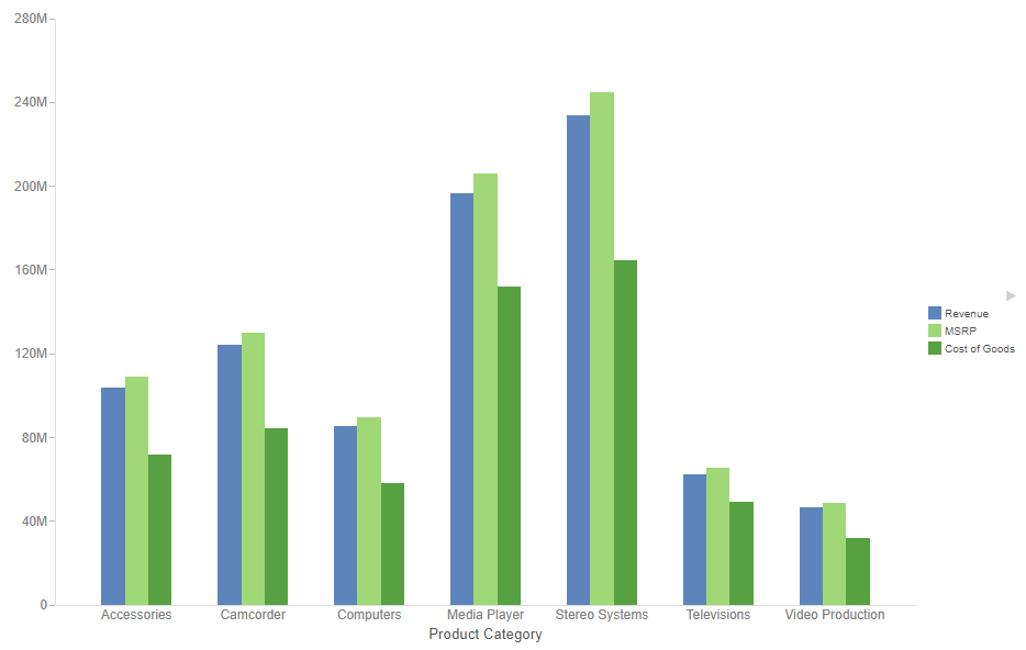
Creating Treemap Charts

Treemap charts can be used to display large amounts of hierarchically structured data. Using a set of nested rectangles to illustrate data relationships, sections of a treemap represent branches of a tree. A treemap is shown in the following image.


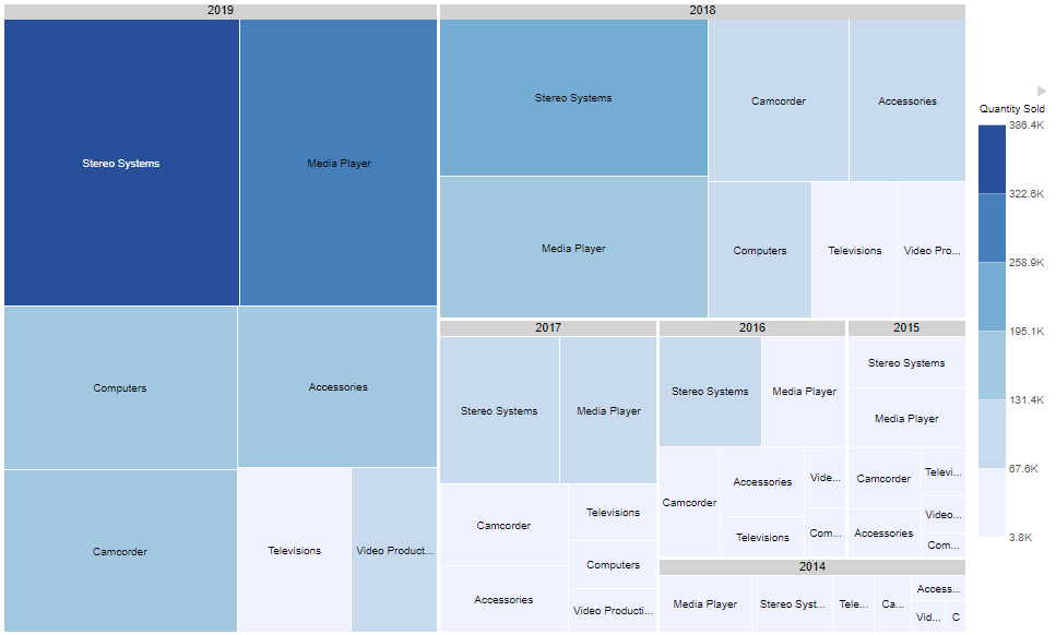
Note: Treemap charts require at least one measure and one dimension, to be placed in the Size and Color buckets. Groups are determined by those fields specified in the Grouping bucket.

Creating Circle Plot Charts

Use circle plot charts to display differing values in rows, enabling you to draw inferences as to how the values overlap. An example of a circle plot is shown in the following image.


Note: Circle plot charts require at least one measure and one dimension, as well as one for the Detail and Color buckets. Optionally, add a dimension to the Size bucket with the count aggregation to view the concentration of data.

Creating Vertical Stacked Area Charts

Use vertical stacked area charts when you want to distinguish your data more dramatically by highlighting volume with color. In a vertical stacked area chart, each area is stacked on top of the sections below it, as shown in the following image.


Note: Vertical stacked area charts require at least one measure and one dimension. Adding multiple measures will create additional shaded areas on the chart.

The following display options are available for an area chart:

Creating Absolute Line Charts

Use absolute line charts when you want to show trend data over time. For example, monthly changes in employment figures, or yearly sales of an item in your inventory.

Note: Absolute line charts require at least one measure and one dimension. Adding multiple measures or adding fields to the Color bucket will create additional lines on the chart, as shown in the following image.


The following display options are available for a line chart:

Creating Ring Pie Charts

Use a ring pie chart when you want to review the value of each segment, which represents the measure value for the selected dimension, as it relates to the total for the selected measure. The total value represented by all segments displays in the middle of the ring pie chart. The following image shows a ring pie chart.


Creating Vertical Side-by-Side Bar Charts

Vertical side-by-side bar charts can be used to show additional measure or dimension values for each horizontal axis value using differing identifying colors. Side-by-side bar charts are useful to directly compare the values for different measures or categories within each horizontal axis sort value. The following image shows a vertical side-by-side bar chart with one dimension field and multiple measure fields.


Creating Horizontal Bar Charts

Use a horizontal bar chart when you want to emphasize a ranking relationship in descending order. This chart type can also be used when the x-axis label is too long to fit legibly side-by-side.

If you add additional measure fields to the Horizontal bucket or add dimension fields to the Color bucket, additional bars are placed in groups for each vertical axis value. A horizontal bar chart with multiple dimension fields is shown in the following image.

Creating Charts

Charts communicate overall trends quickly with eye-catching and intuitive graphics. Charts come in many different varieties that allow you to communicate information with varying degrees of complexity and specificity. You can use simple charts to effectively communicate simple metrics, and more complex charts to clearly display relationships between different aspects of your data, making it easy to identify less obvious trends.