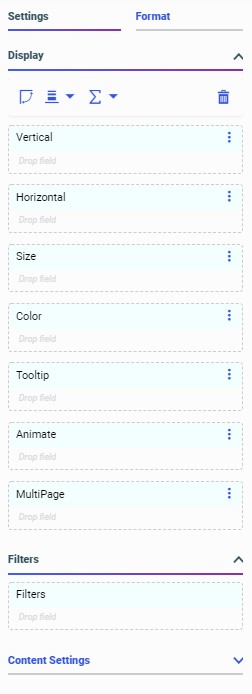
Visualizing Data


Creating a Visualization With New Content in WebFOCUS Designer

WebFOCUS Designer provides a wide variety of content creation options, allowing you to create new charts and reports in a page, or create a page with existing content. If you create a visualization with new content, you can also customize the data that you use in your content by joining additional tables to your original data source.

The following are a general set of steps that you can use to create new content in WebFOCUS Designer:

Changing Content Types

You can use the Content picker, on the right-side of the Designer interface, to change chart and report types in your visualization.

When a chart or report is selected, the Content picker allows you to select a chart type or report layout. This includes the ability to change your content from a chart to a report in addition to changing to different varieties of each content type.

By default, the Content picker is collapsed, allowing you to scroll through common options, as shown in the following image.

Filtering a Visualization From the Filter Toolbar

Filters in WebFOCUS Designer can utilize one of two behaviors. These are static filters and prompted filters. Static filters are always applied to your content whenever it is run, and allow you to apply consistent filter values without prompting the user to make filter selections. They are applied to a single content item at a time, and can only be added to new content. Prompted filters, on the other hand, allow users to select the filter values to use in your visualization at run time.

Modifying Object Properties

You can view and modify the properties of an item on the page, including content, containers, filter controls, and pages, from the Properties panel. The Properties panel includes configuration options on the Settings tab and styling and formatting options on the Format tab. The Properties panel appears to the right of the Resources panel, and changes based on the item that you have selected in the canvas.

The Properties panel for a bar chart is shown in the following image.


Accessing Fields and Variables

You can click the Fields tab to display fields from the data source in the Resources panel. The Resources panel with the Fields tab selected is shown in the following image.

You can use these fields to create content by double-clicking them, dragging them into a bucket on the Properties panel, or dragging them directly onto your content on the canvas. The bucket to which the field is added determines how the values display in your content.

Using the Visualization Tab

The data flow defined in the Data tab is used to create content in the Visualization tab. In the Visualization tab, you can create charts and reports and arrange them on a page in different types of containers, or you can create a visualization from charts, reports, images, and more that you have created and saved previously. If you are creating a visualization with existing content, you can access items in your workspaces and add them to your visualization.