Modifying Object Properties
You can view and modify the properties of an item on the page, including content, containers, filter controls, and pages, from the Properties panel. The Properties panel includes configuration options on the Settings tab and styling and formatting options on the Format tab. The Properties panel appears to the right of the Resources panel, and changes based on the item that you have selected in the canvas.
The Properties panel for a bar chart is shown in the following image.
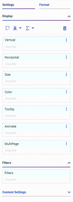
When you select a chart or report, the Properties panel shows a list of buckets on the Settings tab. Drag a field from the Resources panel with the Fields tab selected into a bucket to add it to your content. The buckets that you place your fields into determine how they are displayed.
When creating a chart, depending on the type of chart that you create, you may see some of the following buckets:
- Vertical
- Horizontal
- Size
- Color
- Tooltip
- Animate
- MultiPage
- Measure
- Detail
- Location
- Group
When creating a report, you can use the Rows and Column Groups buckets to sort a report based on the values of the fields in those buckets. The Summaries bucket aggregates measure field values based on these sort values.
The Settings tab also includes the Filter bucket. The Filter bucket allows you to create static filters specific to a content item, as opposed to the Filter toolbar, which creates prompted filters that affect the entire visualization. To create a static filter, drag a field from the Resources panel into the Filter bucket. You can specify filter values using the Add Filter dialog box with a set of controls appropriate to the type of field that you are filtering.
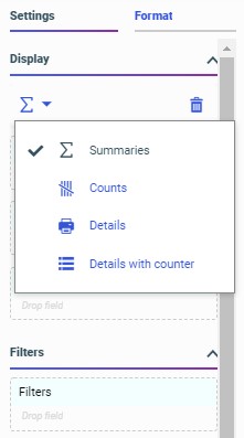
You can use the display options, available from menus above the buckets on the Settings tab, to change the display of values in your content. When creating a report, the display options allow you to change the Summaries bucket to the Counts, Details, or Details with counter bucket to display different information for the fields within it, as shown in the following image.
When creating a chart, the display options additionally allow you to modify its structure, depending on the chart type. The layout display options for a bar chart are shown in the following image.

In addition to changing the display of measure values and the layout of the chart, you can swap the axes in eligible charts and clear the fields from all buckets.
The menu to the right of each bucket label also provides different options for charts and reports, depending on the bucket. These options include the ability to clear the bucket, create a new calculation in a report, or split the y-axis for multiple measures in a bar, line, or area chart.
When placed in certain sort buckets, fields display icons indicating the sort order of the field and provide an option to use the field as a matrix row or column if it is used as a dimension, or switch y axes to create a dual-axis chart, if the field is used as a measure in certain chart types. In the following image, the Vertical bucket contains a matrix row field and a vertical axis measure field.
You can also right-click a field in a bucket to access options pertaining to that field. These options include field format, sorting, aggregation options, and more.
Below the field container buckets in the Display area, you can access the Filters and Content areas. The Filters area includes the Filters bucket. You can drag a field into the Filters bucket to create a static filter. Static filters affect only the selected content item, and cannot be modified at run time.
The Content area includes a variety of options to modify the structure and behavior of the chart. You can show or hide the header and footer areas for charts and reports, add row and column totals to reports, and enable Auto Drill and Auto Linking for single content items. For single-content charts only, you can also enable automatic refresh and enable Insight. Auto Drill, Auto Linking, and Insight provide run-time interactivity to your content, expanding the amount of information accessible from a single item. Automatic refresh allows you to reflect changes to your data source in real time by updating your content at set intervals.
When editing content, the Format tab provides access to options to style your content and change the output format. For a report, you can change the theme and, for a stand-alone report, the output format. The theme applies an overall set of styling properties to the entire report, while the output format allows you to change the type of file generated at run time.
When editing a chart, the Format tab provides access to even more options. You can use the Quick Access menu at the top of the Format tab to access styling options for different sections of a chart, such as the legend, axes, or different series. You can also access options for different sections of a chart by right-clicking an area of the chart on the canvas and clicking Style. The General options include the ability to change the theme and output format, as well as styling the chart frame and background color.
When you select a container in a visualization that has been transformed into a page, the available options on the Properties panel allow you to style the container and configure its behavior within the visualization as a whole. On the Settings tab, you can change display settings such as whether to include a title or toolbar on the container and on which types of devices the container should be visible. You can also allow content customization and provide cascading style sheet class names that you can use in custom CSS and JavaScript code. The Format tab allows you to change the style of the container. The Style options are based on the selected theme, which you can change using the Theme option on the Format tab when you select an entire page. The selected theme is also applied to content in the visualization, by default, although you can specify a different theme for each chart or report.
When you select a section of a page, which is a horizontal area of the visualization that contains one or more rows of containers, you can use the Settings tab to assign CSS classes, make the section collapsible, and set the height of the section. On the Format tab, you can select a style to change the background color of the section. You can add more sections to the visualization by right-clicking the first section, in the space directly surrounding the containers in the visualization, and clicking Insert section above or Insert section below.
You can select an entire page of a visualization by clicking the page toolbar or the area of the canvas below all of the sections on a page, or by using the Outline. When you select the page, you can use the Settings tab to assign CSS classes and show or hide the title and toolbar for the page. On the Format tab, you can change the theme for the entire page, the page margins and maximum width of the page, and the appearance of the page heading text.
- Release: 8207
- Category: Visualizing Data, Adding Content to Pages
- Product: WebFOCUS Designer