Working With Single and Multiple Select Lists
There are two types of list controls in WebFOCUS Designer:
- Single Select List. Allows you to pick a single value at run time.
- Multiple Select List. Allows you to pick multiple values at run time.
An example of a single select list control is shown in the following image.
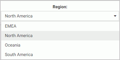
Once you have made a selection in a single select list, your content instantly refreshes to reflect that selection.
An example of a multiple select list control is shown in the following image.
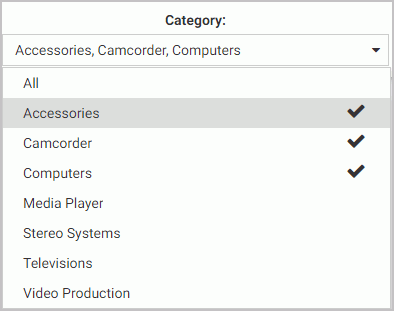
Once you have made all your selections in the multiple select list, you must click outside of the control for the content to refresh.
You can customize your list controls with the search feature by enabling the Search setting in the Properties panel. Once enabled, it adds the search field to your list and allows you to quickly navigate to a specific value. Simply start typing any word or syllable and all values that contain it will display. When a list contains 50 or more values, the search feature is enabled automatically. You can disable it at any time by disabling the Search setting in the Properties panel.
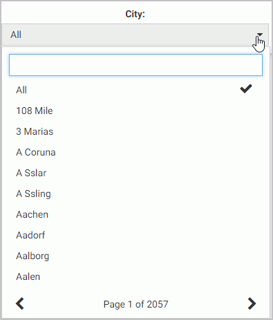
If a list contains 200 or more values, the paging feature is added to the bottom of the control. When paging is active, 10 values display per page. An example of a long list with the paging feature enabled is shown in the following image.
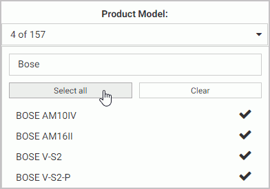
You can further enhance a multiple select list by enabling the Selection controls option in the Properties panel. Once enabled, it adds the Select all and Clear buttons to the list. This feature is especially useful when you need to eliminate just a few values from your results. You can click Select All, clear the values that you need to eliminate, and click outside of the control to refresh your content.
If the Selection controls and Search features are enabled at the same time, you can use the Select all button to select all search results, as shown in the following image.
- Release: 8205
- Category: Adding Content to Pages