How-to's


Video: How to Build a Visualization

Today, we are going to show you how you can create a visualization to illustrate trends in your data. 

Visualizations are comprised of two or more visuals and provide you with a quick glance of information on a single screen. 

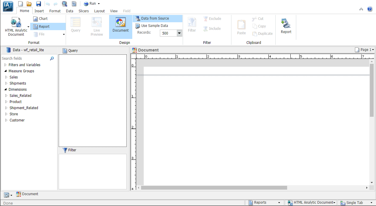
Enabling In-Document Analytics Format

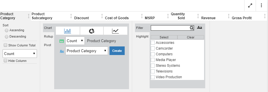
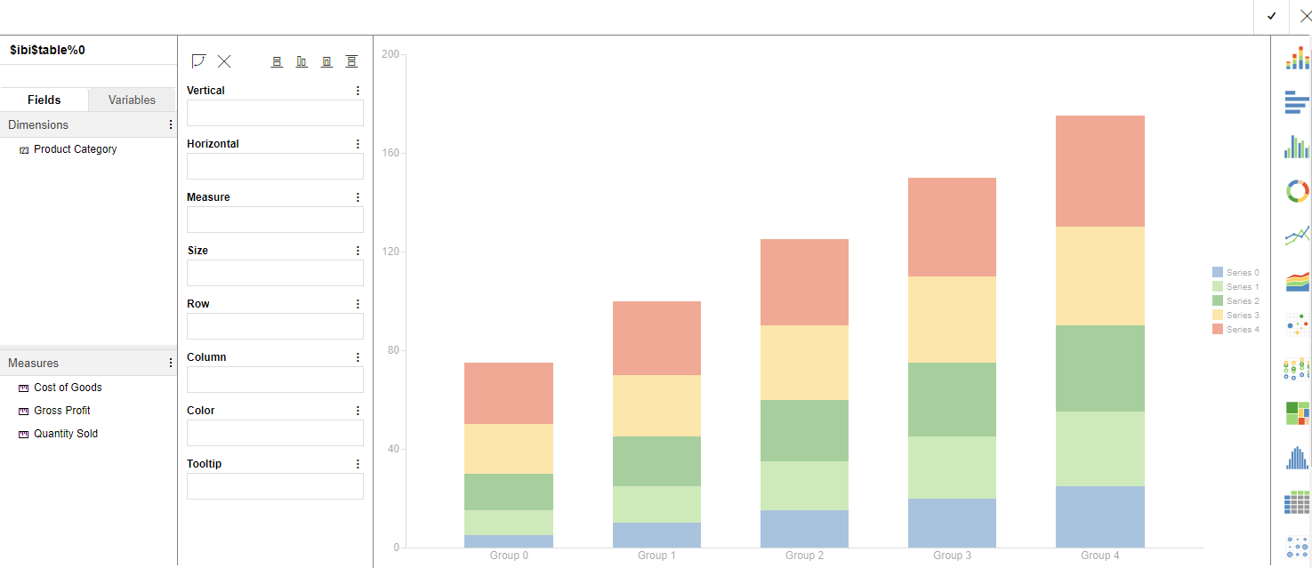
In InfoAssist, you can create content, including reports, charts, and dashboards that leverage the interactive capabilities of In-Document Analytics. Enabling this option provides your users with the ability to interact with and modify the content you created for their own analysis.

Note: If you use the Designer style, you will only be able to select the AHTML output format. 

How to Enable In-Document Analytics in InfoAssist

Using the Column Menu for Reports

The column menu displays when you click a column heading in a report. This provides you with access to formatting tools, chart type options, and filters, giving you more control over what displays in your report.

For a non-measure or dimension column, there are three primary sections to the column menu, as shown in the following image.

Running Content in Full-Screen Mode

When you run interactive content in maximized (full-screen) mode, there are a number of navigational features that you can use. For example, you can change the position of report and chart components in full-screen mode using drag and drop. To drag and drop, simply click the toolbar of any component and, holding the mouse, drag the object to the desired position.

In-Document Analytics Options for Charts

If you are working with a chart using the Chart Rollup Tool and you subsequently create a new chart, the new chart launches with a metadata tree, buckets, and the chart picker. This look and feel is similar to the common interface of WebFOCUS Designer, as shown in the following image.

The interface loads with the fields that you had originally selected. This makes it easy to select different fields to create different types of charts at run time.

Creating Content Using the Chart Rollup Tool

You can access the Chart Rollup Tool from the column menu in an interactive report that uses In-Document Analytics. There are three tabs: Chart, Rollup, and Pivot.  As you create charts, rollups, or pivot tables, each artifact displays in the analysis panel.

You can use the Chart Rollup Tool to select multiple group fields to generate the chart, rollup or pivot table. 

For the Chart tab, you can select a chart type, an aggregation, and a column for the chart, as shown in the following image.
 

Using In-Document Analytics on a Mobile Device

You can use In-Document Analytics technology on a mobile device, including various types of phones and tablets. This enables you to review content, offline, that is shared with you by a developer or other similar individual within your organization. You can review your data anywhere, anytime.

Mobile devices support various gestures, including swipe and drag. In-Document Analytics supports the following standard interactive gestures for multi-touch screens:

Accessing Document Mode

In Document mode, you can:

  • Build a new document.
  • Open an existing document.
  • Generate a new document from an existing single report.

A blank InfoAssist canvas in Document mode is shown in the following image.

Blank InfoAssist Canvas in Document View

Procedure: How to Access Document Mode to Build a New Document

You can build new documents by accessing Document mode from the InfoAssist splash screen.

Creating Customized Report Outputs

You can create customized report outputs in InfoAssist. The standard output formats, which are found in the Format group on the Home tab, include: HTML, HTML Analytic Document, PDF, PDF Analytic Document, Excel, and PowerPoint. For charts, HTML5 is the default output format. For reports, you can also create the following custom report output formats from the Navigation group on the Format tab, including: Table, Table of Contents, Freeze, Pages on Demand, and OLAP.