Working With Content Containers
When you add content to a page, it is automatically placed in a container. To move and resize the content item, move and resize the container into which it was placed by dragging the container or its resizing handles. You can also configure and style a container by selecting it on the page and then using the options on the Settings and Format tabs of the Properties panel. Note that the options for a container are separate from those for the content item inside the container. To select the container, click the container toolbar, or select a container from the Outline tab of the sidebar. Empty containers can be added to the page by selecting the Container tab on the sidebar and dragging the selected container type into the canvas. A highlighted area shows where the container will be placed.
There are several types of containers. The default container for a single item is a panel container. The panel container is a basic container type that includes a title bar and toolbar with a run-time menu, as shown in the following image.
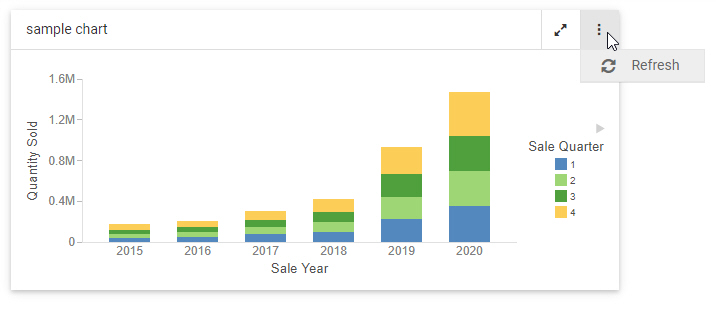
The run-time menu provides the ability to refresh the content in the container by default. If the content currently visible in the container uses the AHTML output format, additional In-Document Analytic run-time options are added to this menu. For more information about In-Document Analytics, see Overview of In-Document Analytics. You can also add custom options to the run-time menu and to the container toolbar using embedded JavaScript. For more information, see Enhancing Pages With Custom JavaScript.
To add multiple items, such as charts, reports, and images, to a single container, use the tab, carousel, or accordion container types. These container types include the same features as the panel container, as well as controls to navigate between multiple content items. You can add another content item to a container by selecting the Content tab on the sidebar, navigating to an item, and dragging it onto the existing container. You are given options to add the new item to a new tab, panel, or slide, or replace the visible, existing item in the container.
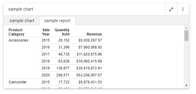
In a tab container, navigate between items using the tabs below the title bar. You can double-click the text in a tab to change it, and right-click a tab to delete, duplicate, or reorder it. A tab container is shown in the following image.
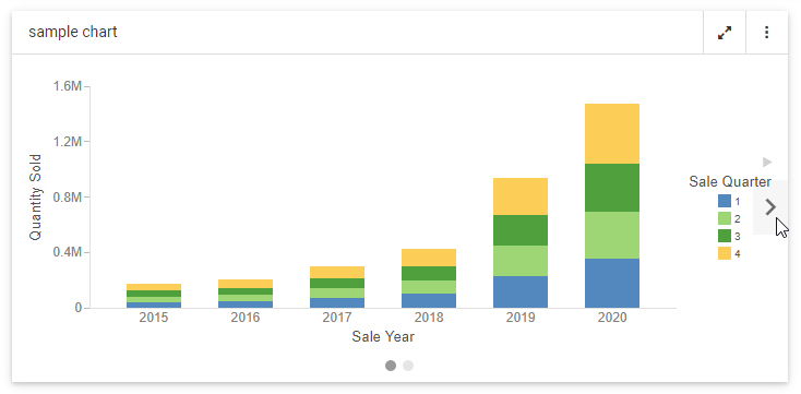
A carousel container allows you to switch between content items by clicking a dot at the bottom of the container, or by clicking arrows that appear when you point to the left or right side of the container. When creating a page, right-click a carousel container to duplicate, reorder, or delete a slide. You can set a carousel container to automatically cycle between content items using the options described in Automatically Advancing Slides in a Carousel Container. A carousel container, with navigation arrows, is shown in the following image.
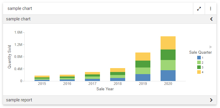
Accordion containers place content in collapsible panels. You can expand and collapse items in an accordion container by clicking a panel label. When creating a page, right-click an individual panel in an accordion container to rename, reorder, duplicate, or delete the panel. An accordion container is shown in the following image.
Other types of containers serve more specific purposes. The grid container type, only available in pages assembled from existing content, can be used as a filter container, as an alternative or in addition to the filter toolbar. Once you add filter controls to a page assembled from existing content, you can drag them from the default location in the filter toolbar into the grid control. Select the filter bar within the panel from the outline, and then select the Format tab to change the number of columns in the grid container. You can also drag a text label or submit button to the grid from the Control tab on the sidebar.
You can use a panel group container to keep a set of vertically arranged panels together when responsive folding occurs as the size of the page changes. To use a panel grid container, add it to the page, then drag new containers, content items, or fields into it. For more information, see Adding Panels to a Responsive Container.
A link tile container allows you to display a content item or image on a page that can be clicked to access additional, outside content. Drag the link tile container onto the page, then, from the Settings tab, use the link tile Background, Content, Attach all parameters, and Target properties, to set the displayed and target content, and configure how the link tile behaves. For more information, see Linking to External Content From a Page.
You can use the Explorer widget to provide access to the Workspaces view of the WebFOCUS start page or WebFOCUS Home Page. This allows anyone accessing the page, or a portal containing the page, to open and run content items and create new content, depending on their privileges. In the Explorer widget, you can navigate through workspaces, folders, and content items from the Resources tree and Content area, and create new content using options on the Action bar. For more information, see Providing Access to Content Items and WebFOCUS Tools.
Right-click any type of container to access a shortcut menu of options. These include the ability to refresh the container content, change the title of the container, access the Settings or Format tabs, duplicate the visible content item, change the container type, or delete the container. If you select multiple pages, you also have the option to combine them into a tab, accordion, or carousel container.
- Release: 8207
- Category: Adding Content to Pages
- Product: WebFOCUS Designer