Accessing Containers and Widgets
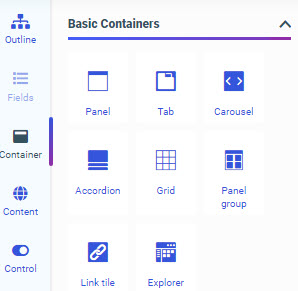
The Container tab provides a selection of container types and widgets that you can use in your visualization.
The Container tab is shown in the following image.
Using this tab, you can select empty containers and widgets that you can drag to the canvas and populate with the content of your choice.
The types of containers available to you include the following:
- Panel
- Tabbed
- Carousel
- Accordion
- Grid
- Panel group
The panel, tabbed, carousel, and accordion container types are used to hold content, such as charts, reports, or images. You can add multiple content items to a tabbed, carousel, or accordion container and navigate between them using the paging behavior of the container.
When assembling a visualization from existing content, you can add multiple filter controls to cells in a grid container as an alternative to or in addition to the Filter toolbar, providing more freedom in the placement of your filter controls. The panel group container, meanwhile, can contain multiple other containers within it, allowing you to keep them together when responsive folding occurs in the visualization.
The Container tab also allows you to access the Link Tile and Explorer widgets. The Link Tile widget allows you to click through from a content item displayed on the page to a target item from your Repository. You can configure the Link Tile using the Link Tile options on the Settings tab of the Properties panel. The Explorer widget allows you to embed the Workspaces view of the start page into a Designer page that can be added to a portal, allowing users to create new content and access existing files in the Repository.
- Release: 8207
- Category: Adding Content to Pages
- Product: WebFOCUS Designer