Styling Filter Controls in a Visualization
When creating a page from external content, you can configure the properties of the filter toolbar, a filter grid panel, or single filter control by using the Properties panel, which is context-sensitive. For example, when you click a filter cell on the toolbar or in a filter grid, the cell style properties open in the Properties panel. When you click a filter control within a cell, the configuration and style properties for this control open in the Properties panel. You can access properties for the entire Filter toolbar or a filter grid by selecting it from the outline. When creating a page from new content, a smaller set of options are available for a filter control or for the filter toolbar.
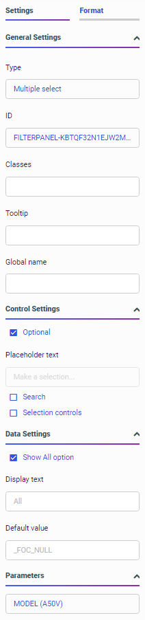
The Properties panel consists of the Settings tab and the Format tab. The Settings tab includes options to configure the behavior of the Filter toolbar, a filter cell, or a filter control. The Settings tab on the Properties panel for a filter control created for external content is shown in the following image.
When you select the entire page, if it was assembled from existing content, you can change the position of the filter toolbar using the following options:
- Include Page Filters. Select this check box to add a filter toolbar to the page, even if no filters have been added yet. Clear this check box to remove the filter toolbar.
If Include Page Filters is selected, you can select one of the following options to change the position of the filter toolbar:
- Below Header. The filter toolbar is placed below the page toolbar and header. This is the default.
- Above Header. The filter toolbar is placed above the page toolbar and header.
- Modal. The filter toolbar is accessible in a modal window overlaid onto the page. Click the Show filters button on the page toolbar to open the modal window and make filter selections.
When the Filter toolbar or a filter cell is selected, the Settings tab includes two properties:
- ID. Contains a read-only unique CSS identifier.
- Classes. Allows you to add one or more custom CSS classes that you can reference in custom JavaScript and CSS code.
Filter controls created within a page have different configuration and styling options than filter controls added to the page from referenced, external content. When you select a filter control that you created directly within the page, the Settings tab contains the following properties:
- General Settings. This section includes the following options:
- Type. Displays the type of the control.
- ID. Contains a read-only unique CSS identifier.
- Classes. Allows you to add one or more custom CSS classes that you can reference in custom JavaScript and CSS code.
- Tooltip. Displays a tooltip when you hover over the filter control.
When you select a filter control that was generated from external content using the Filters tab on the sidebar, the Settings tab contains the following additional property:
- Global name. Designates a global name to the control, allowing you to synchronize control values on different pages in a portal. For more information, see Using Global Name to Synchronize Filter Controls.
- Control Settings. This section includes the following options:
- Optional. Toggles between optional and required control.
- Allow reordering. If selected, allows you to reorder values inside the control at run time. The default order is alphabetical. This property is only available for check box controls.
- Placeholder text. Enables a configurable placeholder text that you can show users inside a required control when it has no value. The default text is Make a selection. This property is only available for drop-down list controls.
Note: The Placeholder text property is only used for required controls. The placeholder text appears before a selection has been made. To change the default text for an optional control, if the Default value for the control is _FOC_NULL, meaning all values, enable the Show All option property and type a value for the Display text property. The Display text option in the control represents the _FOC_NULL, or all values, filter value.
- Search. Adds a search field to the filter drop-down menu. This option is available for drop-down list, check box, and radio button controls.
Note: If the select list contains 50 or more values the Search option is enabled automatically.
- Selection controls. Adds Select all and Clear buttons to the filter drop-down menu. This property is only available for multiple select lists and check box controls.
Note: The Selection controls and Show All options cannot be selected at the same time.
- Data Settings. This section includes the following options:
- Show All option. Adds an All option to the control that the user can select.
Note: Choosing this option results in the parameter receiving a _FOC_NULL value. If this parameter is used in a WHERE condition, it results in the WHERE condition being removed from the request and all data values for this field displaying the page.
- Display text. Allows you to specify a custom value for the Show All option in the control. The default text is All.
Note: The Display text property is available when the Show All option is selected. The display text option in the control represents all values. To supply a placeholder value for required controls that appears before a selection is made, use the Placeholder text property.
- Default value. Displays the default value of the control. For optional parameters you can edit this field and override the control value.
The following options are available for toggle controls only:
- Label One. Is the label that displays on the left side of the toggle control.
- Value One. Is the actual filter value represented by the label on the left side of the toggle control. This is the default value of the toggle control.
- Value Two. Is the actual filter value represented by the label on the right side of the toggle control.
- Display label two. Allows you to hide or show the label on the right side of the toggle control. Hiding the label saves horizontal space, but provides less information to users.
- Label Two. Is the label that displays on the right side of the control. This label only appears if the Display label two check box is selected.
- Show All option. Adds an All option to the control that the user can select.
- Parameters. Shows the name of the parameters that are associated with this control.
When creating a visualization using external content, the Format tab of the Properties panel provides layout and styling options for the Filter toolbar, a filter cell, or a filter control. These options differ depending on the origin of the filter and the item selected. Format options are not available for new prompted filters created in a visualization.
The Format tab of the Properties panel, for the filter bar on the Filter toolbar or in a grid container, is shown in the following image. You can use these options to change the layout of the cells in the Filter toolbar or grid container, and change the theme style it uses.
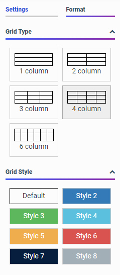
The Format properties for the Filter toolbar are:
- Grid Type. Controls the grid layout of the filter bar. The options include 1-Column, 2-Column, 3-Column, 4-Column, and 6-Column.
When you are using a columnar layout and the number of filters exceeds the number of columns, the extra filter controls are added to new rows in the Filter toolbar.
- Grid Style. Controls the style of the filter grid. The available styles are defined in the theme used for the page. When you select a style for a cell, the entire Filter toolbar is affected.
The Format tab for a cell is shown in the following image.
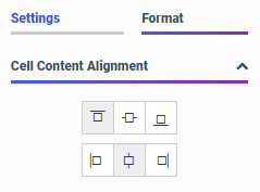
When you configure these properties, you modify the alignment of a control or other object within a cell. Cell format properties are only available for cells in the columnar grid or toolbar layout used in a visualization with external content. The cell and filter control in the carousel style layout used in a visualization with new content are not separate components, so the cell cannot be selected for formatting.
The properties for a filter cell are:
- Cell Content Alignment. Controls the alignment of the label and control inside the cell. The options include top, middle, bottom, left, center, and right. These options are available when using a columnar filter grid layout.
The Format tab for a filter control created for external content is displayed in the following image. You can modify the positions of labels in a control, define the alignment, and set the object width.
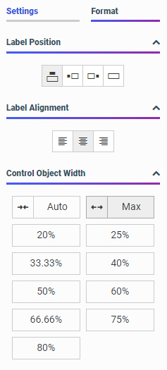
The style properties for filter controls in a page with external content are:
- Label Position. Controls the position of the filter label in the relation to the control. The options are above, right, left, and no label.
- Label Alignment. Controls the alignment of the filter label. The options are left, right, and center.
- Direction. Controls the alignment of the elements inside the control. This property is available for radio button, check box, and button set controls. The options are horizontal and vertical. The vertical option is enabled, by default, when the control has five or more values.
- Label/Control Split. Controls the space ratio between the label and control inside the cell. This option is only available when the label position is set to right or left.
- Control Object Width. Sets the width of the control in relation to the filter cell. The options are:
- Auto. Adjusts the width of the control automatically to accommodate the name of each value.
- Max. Fills the entire filter cell. This is the default value.
- Percentages. Set the control width to various percentages, as they relate to the filter cell.
- Control Object Height. Sets the maximum height of the control. If the list of elements exceeds the maximum height of the control, a scrollbar is added to this control. This property is available for radio button, checkbox, and button set controls when their Direction property is set to vertical. The default value is 150px. You can change this value as necessary.
Prompted filter controls created in a visualization with new content always use a predefined, simple filter style. No format options are available for these controls.
- Release: 8207
- Category: Adding Content to Pages
- Product: WebFOCUS Designer