Creating Funnel Charts
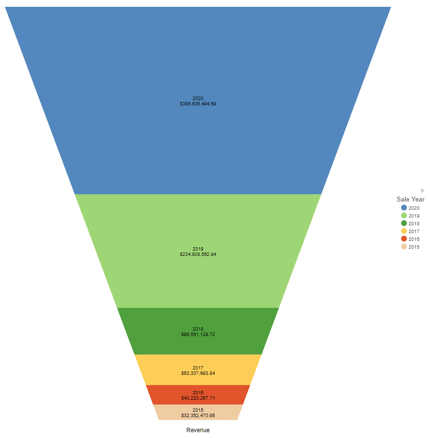
A funnel chart shows values of a dimension field as a proportion of the whole, similar to a bar in a stacked bar chart. The shape of the funnel makes it useful to show information about processes that involve cascading or narrowing down due to the hierarchy it implies. For example, the following image shows revenue by year in a funnel chart. The entire funnel can be taken to represent all sales, with the top segment representing the most recent year, the top two segments the two most recent years, and so on.
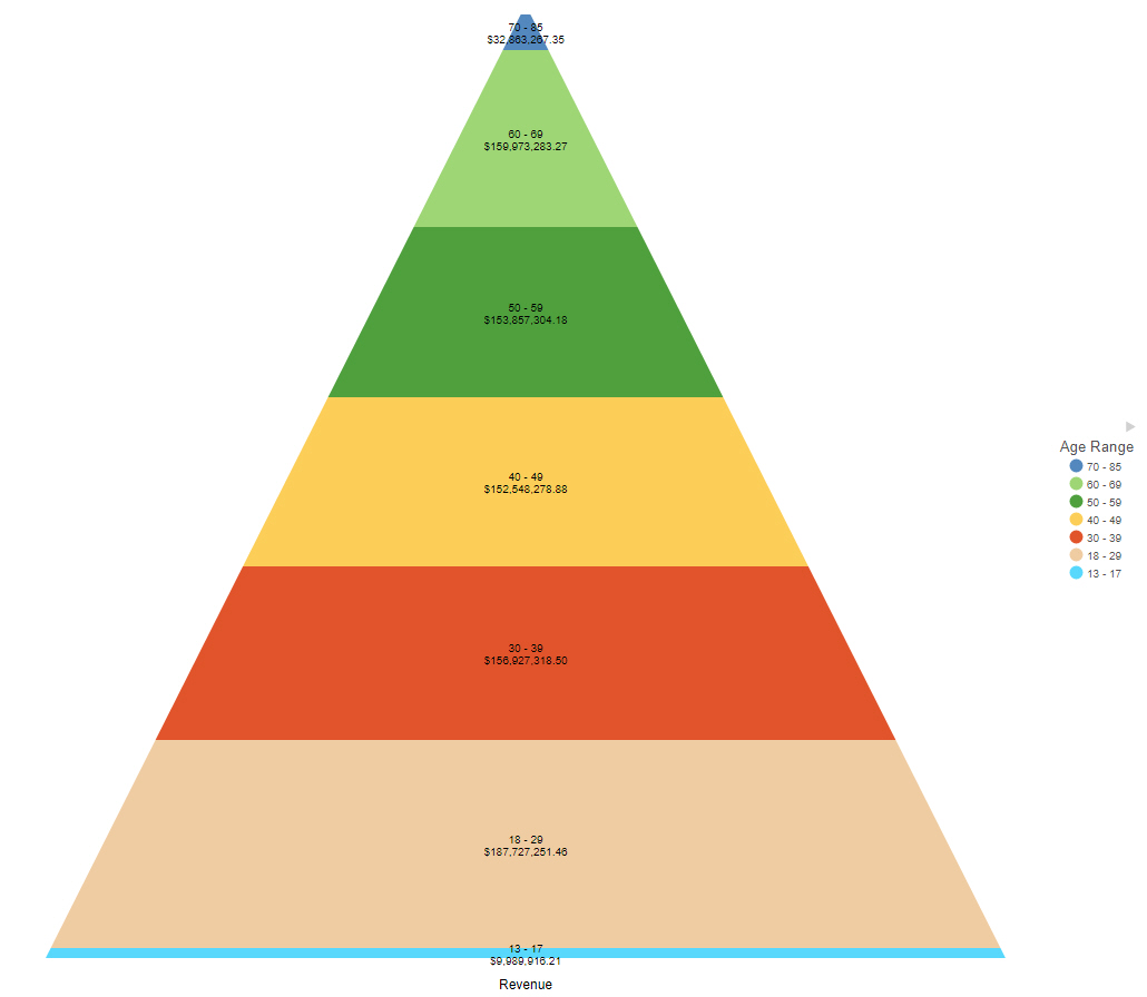
Conversely, you can use the pyramid option to show values in an implied hierarchy, as shown in the following image of a pyramid chart showing revenue by age rand. The oldest range, 70-85 is at the top, and the youngest range, 13-17, is at the bottom.
The following display options are available for a funnel chart:
- Chart layout options:
- Funnel. The default value, arranges the chart in a funnel shape, wide at the top and narrow at the bottom.
- Pyramid. Arranges the chart in a triangle, wide at the bottom with a point at the top.
- Calculation options:
- Summaries. Sums measure values for each sort value. This is the default.
- Counts. Provides a count of records in the selected measure field, for each sort value.
- Details. Displays the value of each individual record.
- Clear buckets content. Empties all buckets.
You can add fields to the following buckets for a funnel chart:
- Measure. The measure field whose values are represented by each layer of the funnel chart.
- Color. A dimension field that determines the layers of the funnel chart.
- Tooltip. The data placed in this bucket displays in the tooltip at run time. Can be used to make additional information available without changing the appearance of the chart.
- Animate. Enables you to animate time progression using a slider control. As you move the control along the slider bar, an animation effect results. The slider control has a Play button that allows you to play and pause the animation. When you click Play, the Pause option is activated, enabling you to pause the progression and analyze your data. Slider controls are limited to one sort field and should be time or sequence related, such as month or year.
- MultiPage. Enables the creation of multiple graphs based on the field that you place in this bucket. The MultiPage bucket is available for stand-alone charts. If you convert the chart to a page created from new content, the MultiPage bucket disappears.
Procedure: How to Create a Funnel Chart
- Open WebFOCUS Designer. On the WebFOCUS start page, click the plus menu and then click Create Visualizations, or, on the WebFOCUS Home Page, click Visualize Data.
WebFOCUS Designer opens in a new browser tab.
- Select a workspace and a data source available from that workspace.
Once you select a data source, WebFOCUS Designer loads with options to create a single content item.
- On the Content picker, change the chart to a funnel chart.
- Add at least one measure to the Measure bucket and a dimension to the Color bucket.
The funnel chart loads, showing each dimension field as a layer with height based on the value of the measure field.
- You can make the following additional customizations to your funnel chart:
- Change the funnel chart to a pyramid chart.
- Add additional measures or dimensions to the Tooltip, Animate, or MultiPage buckets of the chart, where applicable.
- Change the fields to obtain different information.
- Format the chart (for example, customize the header and footer or change the series color).
- Save your funnel chart.
- Release: 8207
- Category: Visualizing Data
- Product: WebFOCUS Designer
- Tags: How-to's