Creating Statistical Box Plot Charts
A box plot, also known as a box-and-whisker plot, is a chart type that provides distribution information about your data. The box represents the range between the upper and lower quartiles, and the line inside the box represents the median. The whiskers represent the maximum and minimum with outliers excluded, and outliers are represented by individual points. An example of a box plot is shown in the following image.
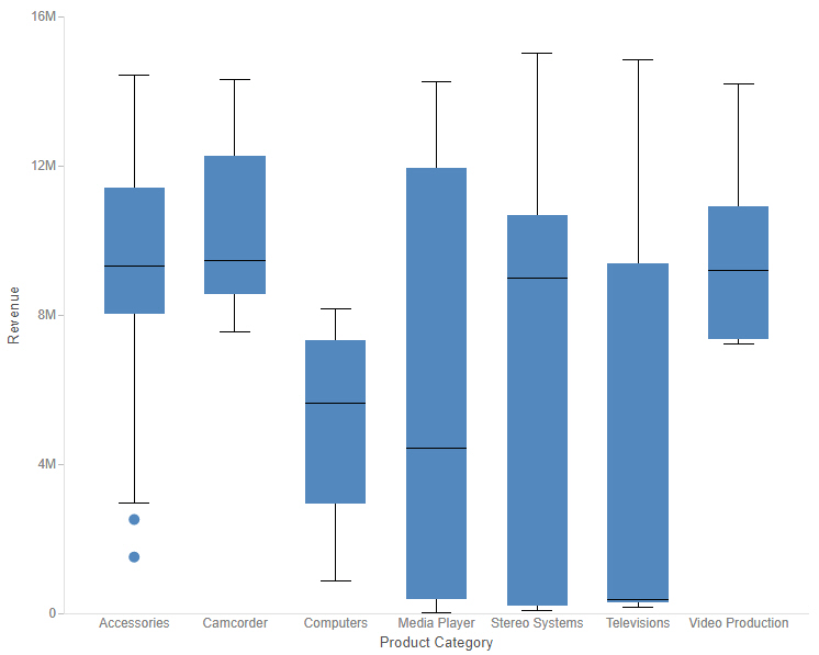
Since box plots display the distribution of points in your data, you need to provide detail values. You can do this in one of two ways. One option is to add a dimension field to the Detail bucket. This field should have a large number of distinct values in order to generate a sufficient spread of data for the box plot. For example, in the image above, a separate box plot is created for each Product Category to show the distribution of values in the Model field, which has been placed in the Detail bucket.
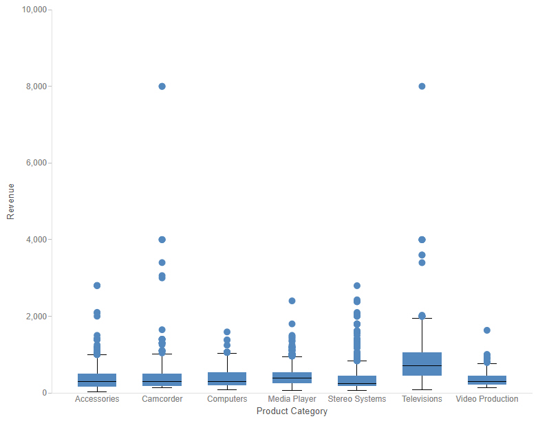
Another option is to incorporate your entire data set into the box plot. You can do this by changing the calculation method from Summary to Detail. In this case, you do not need a field in the Detail bucket to generate the box plot. The following image shows a box plot chart in which separate box plots are still generated for each product category, but which uses the Detail calculation option instead of using Model as the Detail field. Since more data values are used in this chart, there are more outliers.
The following display options are available for a box plot:
- Change chart orientation. Switches the vertical and horizontal axes.
- Calculation options:
- Summaries. Sums measure values for each sort value. This is the default. Add a dimension field to the Detail bucket to create a box plot when using the Summary option.
- Counts. Provides a count of records in the selected measure field, for each sort value. Add a dimension field to the Detail bucket to create a box plot when using the Count option.
- Details. Displays the value of each individual record. You do not need to add a field to the Detail bucket when using the Detail calculation option.
- Clear buckets content. Empties all buckets.
You can add fields to the following buckets for a box plot chart:
- Vertical. A measure field whose values constitute the set of data for the box plot. The outliers, maximum, minimum, median, and upper and lower quartile are calculated for these values.
- Horizontal. Add a dimension field to the Horizontal bucket to generate a separate box plot for each value, allowing you to compare the distribution of each.
- Detail. When using the Summary of Count calculation options, use the Detail bucket to provide individual values for the measure field in the Vertical bucket. The Detail bucket should provide multiple values for each value of the field in the Horizontal bucket.
- Tooltip. The data placed in this bucket displays in the tooltip at run time. Can be used to make additional information available without changing the appearance of the chart.
- Animate. Enables you to animate time progression using a slider control. As you move the control along the slider bar, an animation effect results. The slider control has a Play button that allows you to play and pause the animation. When you click Play, the Pause option is activated, enabling you to pause the progression and analyze your data. Slider controls are limited to one sort field and should be time or sequence related, such as month or year.
- MultiPage. Enables the creation of multiple graphs based on the field that you place in this bucket. The MultiPage bucket is available for stand-alone charts. If you convert the chart to a page created from new content, the MultiPage bucket disappears.
How to Create a Box Plot Chart
- Open WebFOCUS Designer. On the WebFOCUS start page, click the plus menu and then click Create Visualizations, or, on the WebFOCUS Home Page, click Visualize Data.
WebFOCUS Designer opens in a new browser tab.
- Select a workspace and a data source available from that workspace.
Once you select a data source, WebFOCUS Designer loads with options to create a single content item.
- On the Content picker, change the chart to a statistical box plot.
- Add a measure to the Vertical bucket and a dimension to the Horizontal bucket.
A single measure value displays as a line in each column.
- Use one of the following methods to generate a set of data for each column:
- Add a dimension field to the Detail bucket. This field should provide multiple records for Horizontal bucket value.
- Change the calculation option from Summary to Detail
 . If you have a very large data source, this may generate too many records to evaluate in the box plot.
A set of box plots appears on the canvas, showing indicators for outliers, maximum and minimum, median, and upper and lower quartiles.
- You can perform the following tasks with your box plot chart:
- Add additional measures or dimensions to the Tooltip, Animate, and MultiPage buckets, where applicable.
- Change the fields to obtain different information.
- Format the chart (for example, customize the header and footer, change the series colors, or set box plot-specific properties).
- Save your box plot chart.
- Release: 8207
- Category: Visualizing Data
- Product: WebFOCUS Designer
- Tags: How-to's, Release Features